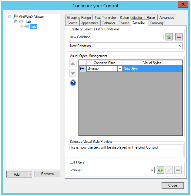
Use the GridWorX configurator's Condition tab to configure the visual cues that display for all values in the grid. To do this, you must specify a list of conditions under which a value appears normally and all levels under which the data escalates to warning and critical stages. Two predefined sets of conditions are already defined for you: Real Time Conditions and Historical Conditions. Both of these sets of conditions are read-only. and cannot be modified, but you can apply them to prototypes to see how they work.
A condition is made up of a filter and a visual style. In runtime, if the filter is true for a row, then the related visual style is applied to the row. You can create as many conditions as you have filters and visual styles. When creating a new condition, you specify the values, the condition level's name, and how each condition appears at runtime.
Condition Tab
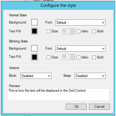
If you double-click within the Visual Styles column, you'll see an ellipsis button appear. Click on the ellipsis button to access the Configure the style window shown below. In this window, you can update the Normal State (including Background color, Font, Text Fill color, Text size and style), Blinking State (including Background color, Font, Text Fill color, Text size and style) and Actions (Blink [Disabled, Slow, Normal or Fast] and/or Beep [Disabled, Slow, Normal or Fast]). The Preview section at the bottom of the window will show your text changes will be displayed in the Grid Control.
Configure the style Window
See also: