This topic describes how to work with SmartPins. You can click on any of the following topics.
Add a SmartPin to a Display or Map
Configure a SmartPin and Its SmartIcons
Set Default and Common Values for Your SmartIcons
Work with the Grid in the SmartPin Editor
Add SmartIcons to the SmartPin Grid
Configure Each SmartIcon in the Grid
Move SmartIcons Within the SmartPin's Grid
Add Pick Actions to SmartIcons
Change a SmartPin's Properties
Additional topics that are relevant include:
Adding a Glow, Shadow, Blur, or Opacity Effect
To create a SmartPin:
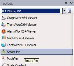
From the Controls ribbon, click the SmartPin icon, then click the design surface to create a SmartPin at the default size (the eight SmartIcons shown in the figure below).
Alternatively, from the Toolbox you can click SmartPin and drag the cursor to your work surface to add the same default shape.
Default SmartPin Shape from the Controls Ribbon (Left) and Toolbox (Right)
Once you have added a SmartPin to the display or map, you can create its shape, add SmartIcons, and configure each SmartIcon. Here's a summary of how you might do that. Detailed explanations are provided following this summary.
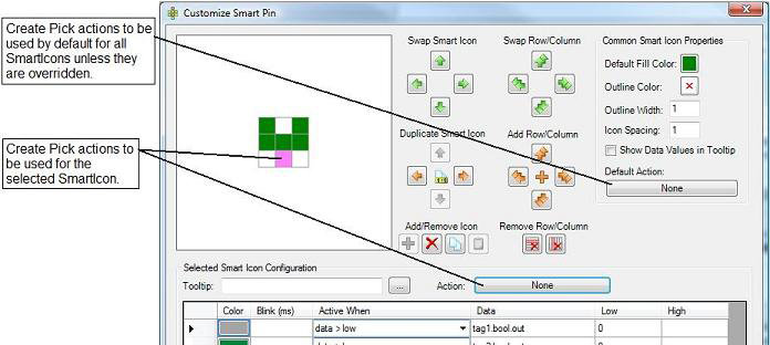
Double click the SmartPin object in the design surface; alternatively, you can click the  button above the SmartPin's Properties tab. The Customize SmartPin editor (shown below) appears. The following illustration highlights some of the features that are available in the Customize SmartPin editor.
The SmartPin Editor
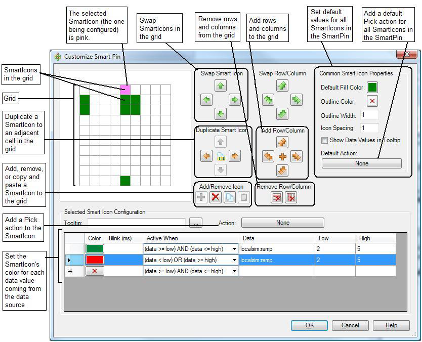
If there are default values or common properties that you want to set up for all of the SmartIcons in the grid, enter them now using the Common SmartIcon Properties section at the upper right of the SmartPin editor. Note that you can override these values for each SmartIcon.
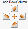
Now create the SmartIcon's shape by working with the grid in the upper left of the SmartPin editor. To change the grid, click on a cell in the grid then click buttons in the Add Row/Column and Remove Row/Column section. These buttons add or remove rows above or below the selected cell, or they add or remove columns to the left or right of the selected cell. (The selected cell is always pink.)
Next, add SmartIcons to the cells in the shape or format of your choosing. Use a configuration that is easily "decoded" or understood by your runtime users. To do this, click on the desired cell in the grid, then click the green plus sign  icon in the Add/Remove Icon section. Each SmartIcon that you add will connect to a data source.
Now configure each SmartIcon in the grid. To do this, select the SmartIcon you are configuring (the selected icon is the pink square in the grid), then use the Selected Smart Icon Configuration section at the bottom of the SmartPin editor.
Repeat the prior step until every SmartIcon in the grid is configured.
When you are done, click OK to save and close the editor.
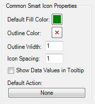
Use the Common SmartIcon Properties section in the upper right corner of the SmartPin editor to set default and common values for your SmartIcons.
Default Fill Color: The color in which all SmartIcons in the grid will display by default if you don't specify another color for each. You can override this color for each SmartIcon.
Outline Color: The border color to be used for all SmartIcons. The border is uniform for all SmartIcons and cannot be overridden.
Outline Width: The border's width to be used for all SmartIcons. The border is uniform for all SmartIcons and cannot be overridden. The default is 1; entering 2 makes the border wider. The higher the number, the wider the border.
Icon Spacing: The number of pixels of white space between cells in the SmartPin, to be used as padding. The spacing is uniform for all SmartIcons and cannot be overridden. The default is 1; entering 2 makes the spacing wider. The higher the number, the wider the spacing.
Show Data Values in Tooltip: Putting a check mark in this check box populates each SmartIcons' tool tips with the current data values from the SmartIcon's data sources. Including data values in the tool tips gives additional runtime information to the operator. This option cannot be set for individual SmartIcons. However, if you leave this check box empty, the SmartPin's Description (see the discussion of SmartPin Properties below) is used as the default tool tip for the SmartPin, which can be overridden for individual SmartIcons.
Default Action: Click this button to create one or more Pick actions that will be used, by default, for all SmartIcons in the grid. You can override these actions for each SmartIcon.
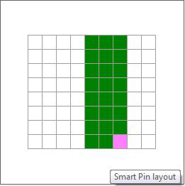
The SmartPin grid can be altered so that it has more or fewer rows and columns. This lets you create the visual configuration that you are trying to construct in the SmartPin. The SmartPin can have any number of rows and columns in the grid; you can even reduce the SmartPin to a single cell with a SmartIcon in it, if you like. Below is a grid with nine columns and eight rows. Note that the selected cell is pink.
This Grid Has Nine Columns and Eight Rows
To add a row or column to the grid:
Select the cell next to where you want to add a column or row, and then click the appropriate Add Row/Column button.
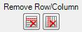
Select the cell that you want to delete a column or row next to, and then click the appropriate Delete Row/Column button.
By default, a new SmartPin has an existing configuration of SmartIcons. It is unlikely that this is a configuration that you will be using, so now you must add SmartIcons to the cells where you want them positioned, and remove any SmartIcons that you don't want.
To add or remove a SmartIcon:
Select the cell then click the Add/Remove Icon section's button.
Click the Add/Remove Icon section's  button to delete the cell.
To copy an existing SmartIcon and paste it to another cell, use the remaining two buttons in the Add/Remove Icon section. Doing this copies all of the features that are already specified for the SmartIcon.
If you are using the keyboard (and not a mouse) to configure your SmartIcons, moving from the grid the SmartPin editor's command buttons can be tricky. To tab the cursor from the grid to the SmartPin editor's command buttons:
Select the cell you want to act on, then press the Ctrl+Tab keys to move to the other sets of controls in the dialog box.
Press the Tab key to move from cell to cell in the grid, and from button to button outside the grid.
Once you have added the SmartIcons to the SmartPin grid you must configure them. Each SmartIcon can have one or more conditions that need to be evaluated in order to set the status which would appear as additional lines in the data grid.
Click in the grid to select the SmartIcon you are configuring. The selected SmartIcon is highlighted in pink and the Selected SmartIcon Configuration section (at the bottom of the SmartPin editor) becomes available.
In the Tooltip field, you can optionally enter a tool tip for the SmartIcon; to use the Data Browser to select a value that populates the tool tip, click the ellipsis button  . If the Show Data Values in Tooltip check box has a check mark in it, the SmartIcon's data source data values will display in the tool tip along with your entry here; your entry appears at the top of the tool tip. But if the Show Data Values in Tooltip check box is empty, entering a tool tip here overrides the default tool tip defined in the SmartPin Properties' (see below) Description field.
To define a Pick action for the SmartIcon, refer to Add a Pick Action to a SmartIcon, below. Pick actions are optional.
Using the table, you must configure the color scheme for the data source's status values along with the conditions in which each color is to display during runtime. The remaining steps describe how to do this. (If you are adding multiple data sources for the SmartIcon, "refer to "Multiple Data Sources for a SmartIcon," below, before proceeding.)
In the table, click the Color button on the first row and select the color to be displayed. By default, the color is white; you must select a different color if you want to be able to add others.
Enter a value for the Blink rate in milliseconds. You can also click on the ellipsis button and select the data source from the Data Browser that will control the blink rate of the cell if you want a dynamic blink rate assignment.
In the Active When box, specify the range conditions that must be met in order for the SmartIcon status color to change and (optionally) blink.
In the Data box, select the data source whose data values will be evaluated. Click the ellipsis button to use the Data Browser to select a data source.
Set the Low and High values that define the boundary conditions of the range so that conditions for the values of low and high can be evaluated.
To set a different color for a different set of values, repeat steps 2 through 6 until each color scheme is defined.
Click the OK button to save the SmartPin.
Multiple Data Sources for a SmartIcon
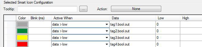
You will need to assign multiple data sources to a SmartIcon if the icon is monitoring a device that provides each state as a separate boolean (bit) tag. If you do this, the sequence in which you list the data sources in the Selected SmartIcon Configuration table determines which color state displays for the SmartIcon.
For example, four tags that show the states of a motor are as follows:
|
Tag: |
Value: |
Motor State: |
Color: |
|
tag1.bool.out |
1 |
Off |
gray |
|
tag2.bool.out |
1 |
On |
green |
|
tag3.bool.out |
1 |
Too fast |
yellow |
|
tag4.bool.out |
1 |
Critical failure |
red |
When more than one state is true simultaneously, the state is resolved by prioritizing based on the order of the list of states. The first state in the list is considered to be the lowest priority, and the last state is considered the highest priority. In the following example, tags 2 and 3 test true (with a value of 1) simultaneously; the highest priority state (tag3) is used and the SmartIcon displays the color yellow  .
.
|
Tag: |
Value: |
Motor State: |
Color: |
|
tag1.bool.out |
0 |
Off |
|
|
tag2.bool.out |
1 |
On |
|
|
tag3.bool.out |
1 |
Too fast |
yellow |
|
tag4.bool.out |
0 |
Critical failure |
|
In the Selected SmartIcon Configuration table, these data sources would be listed in the following sequence:
How to Sequence Multiple Data Sources for a SmartIcon
If runtime operators need to be able to take action based on a SmartIcon's status, you can assign Pick actions to each SmartIcon. The Pick actions can be different for each SmartIcon, but you can set up a default Pick action for the entire SmartPin that you override for individual SmartIcons if you need to. These instructions describe how to create a Pick action for an individual SmartIcon, but the steps to create a default Pick action for all SmartIcons in the SmartPin except that you click the Default Action button in the Common SmartIcon Properties section of the dialog box.
Pick Action Features in the Smart Pin Editor
Select the SmartIcon in the Customize Smart Pin dialog box.
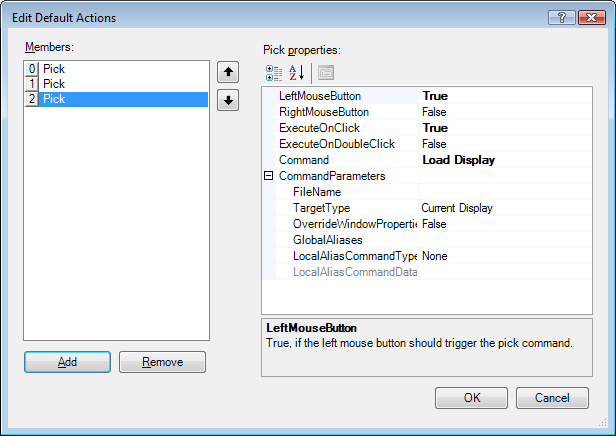
Click the Action button in the Selected SmartIcon Configuration section to create a Pick action. This opens the Edit Default Actions dialog box.
On the Edit Default Actions dialog box, click the Add button to add the Pick action to the Members list.
Set the properties of the action in the Pick Properties grid, as shown in the figure below.
Add other Pick actions, as required.
Click the OK button to save the Pick actions. When you close the window, the Action button's label changes from "None" to the first Pick action assigned to the SmartIcon. For example, Popup Menu  .
.
Once you have configured a SmartPin's SmartIcons, you can easily move them around inside the grid.
To swap a SmartIcon with the content of an adjacent cell, use the arrow buttons in the Swap SmartIcon section. First, select the SmartIcon, then click the arrow that points in the direction of the cell you want to swap with. If the cell has a SmartIcon in it, the two SmartIcons are swapped; but if the cell is empty, the SmartIcon simply moves into that cell. (If the buttons are not available, it is because you haven't selected a cell.)
Note that if you select a cell that is on the edge of the grid, it will be swapped with the cell on the opposite edge. For example, if you select a cell in the bottom row of the grid and then click the down arrow, the cell will be swapped with the cell in the same column at the top row of the grid.
To swap an entire row of SmartIcons, use the arrow buttons in the Swap Row/Column section. Select a SmartIcon in a row you want to swap, then click the arrow that points in the direction of the row or column you want to swap it with. If the row or column has SmartIcons in it, the two rows or columns are swapped; but if the row or column is empty, the row's or column's SmartIcons simply move.(If the buttons are not available, it is because you haven't selected a cell.)
Note that if you select a row or column that is on the edge of the grid, it will be swapped with the row or column on the opposite edge. For example, if you select a cell in the bottom row of the grid and then click the down arrow, the row will be swapped with the top row of the grid.
You can copy a SmartIcon to an adjacent cell if that cell is empty by using the arrow buttons in the Duplicate SmartIcon section. Select a SmartIcon you want to duplicate, then click the arrow that points in the direction of the cell you want to copy it to. (If the buttons are not available, it is because you haven't selected a cell that has a SmartIcon in it.)
Use caution when using the Remove Row/Column buttons, because there is no undo action if you remove a row or column of configured SmartIcons.
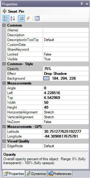
SmartPins are a collection of data controls that are managed as a single object. When you place a SmartPin on the design surface it appears in the object Explorer as a single object with no internal components exposed. Most of the important assignments are performed within the Customize SmartPin dialog box (see the previous section). Use the SmartPin's Properties to make additional changes. The SmartPin Properties tab is used to configure each SmartPin or individual cell that is part of your SmartPin definition. To access a SmartPin's properties, select the SmartPin, then set the Properties of the SmartPin on the Properties tab. Properties that are available in Advanced mode are described below.
Name - A name that will identify the SmartPin uniquely in the Project Explorer. Type a name (using alphanumeric characters but beginning with a letter) that helps you identify the SmartPin and its use.
Description - Enter a description for the SmartPin or click the ellipsis button to select one from the Data Browser. This description is used as the default tooltip for the SmartPin. This description displays for the SmartPin when the DescriptionIn ToolTip property below is False and the Show Data Values in Tooltip check box (in the Customize Smart Pin dialog box) is empty. This description can be overridden for individual SmartIcons.
DescriptionIn ToolTip - Select True to use the Description property above as the default tool tip for the SmartPin. Select False to suppress the default.
CustomData - A free-form field that you can use as you desire, this property is typically used for holding data strings related to the SmartPin; these data strings are typically by with custom scripts that run as part of the display.
ShareKeyword - A free-form field for storing keywords that are used by custom scripts that run as part of the display. This property typically holds a keyword or keywords that identify something specific about this SmartPin that a custom script might need to find when scanning objects in the display.
Locked - True prevents the SmartPin from being modified in configuration mode. False allows the SmartPin to be modified. Once you have finished modifying the SmartPin, set this value to True to prevent further modification.
Visible - True displays the SmartPin in runtime. False hides it. Select False if the SmartPin is not ready for production in a map or display that you are putting into production.
Opacity - The percentage of opacity for the SmartIcon colors in the SmartPin. You can select 0, 25, 50, 75, or 100, or type a number from 0 to 100. 0 makes the icons completely transparent or invisible; 100 makes the icon color completely solid.
Effect - Apply a visual effect to the SmartIcons. For more information, see Creating an Effect for a SmartPin.
Background - Select a color for the background of the SmartPin. The color is applied to all cells in the grid that don't have SmartIcons.
Angle - Displays the SmartPin on an angle. Enter a number from 0 to 360. The default is 0.
Left - Determines the horizontal placement of the top-left corner of the SmartPin's grid. Entering 0 places the SmartPin at the left-most position in the display or map. Alternatively, you can drag and drop the SmartPin to the desired location.
Top - Determines the vertical placement of the top-left corner of the SmartPin's grid. Entering 0 places the SmartPin at the top-most position in the display or map. Alternatively, you can drag and drop the SmartPin to the desired location.
Width - Determines the SmartPin's width. You can change the width by typing a number or you can click and drag an edge of the SmartPin to increase or decrease the width.
Height - Determines the SmartPin's height. You can change the height by typing a number or you can click and drag an edge of the SmartPin to increase or decrease the height.
HorizontalAlignment - Used in an EarthWorX map, this property determines the SmartPin's horizontal orientation in relation to the GPS point when zooming. Options are: the Left edge of the SmartPin aligns to the GPS point, the Center of the SmartPin aligns with the GPS point, the Right edge of the SmartPin aligns to the GPS point, and the SmartPin is Stretched (the default) to align with the GPS point.
VerticalAlignment - Used in an EarthWorX map, this property determines the SmartPin's vertical orientation in relation to the GPS point when zooming. Options are: the Top edge of the SmartPin aligns to the GPS point, the Center of the SmartPin aligns with the GPS point, the Bottom edge of the SmartPin aligns to the GPS point, and the SmartPin is Stretched (the default) to align with the GPS point.
NoZoom - This property is used in an EarthWorX map. When True (the default), the SmartPin maintains its initial size regardless of the zoom level. When False, the SmartPin appears bigger when you zoom in and smaller when you zoom out. For a detailed understanding, refer to Zoom Capabilities in an EarthWorX Map. Setting this value to False is an advantage if you are creating a region. For more information, refer to Limiting an EarthWorX Map to a Region.
Latitude - Available only with an EarthWorX map, this is the latitudinal GPS position of the SmartPin.
Longitude - Available only with an EarthWorX map, this is the longitudinal GPS position of the SmartPin.
EdgeMode - A property you can use for optimizing performance. Default (which is the default value) gives the object smooth, refined edges; choosing Aliased improves performance by removing pixels from the edge, making the edge appear grainy but making the SmartPin more efficient. (Note that this option has nothing to do with aliasing in GraphWorX.)
See also:
Dynamics in the GraphWorX64 Interface
Commands for Pick Actions and Function Keys
Find and Replace Properties in Displays and Symbols