|
|
The features on this page require an add-on to work with GENESIS64 Basic SCADA. |
|
|
The features on this page require an add-on to work with GENESIS64 Basic SCADA. |
Every object in GridWorX has properties which you can set using the GridWorX configurator's Advanced tab. These properties control a number of the finer features you see on your chart. Properties vary from object to object; that is, a different set of properties is available for:
The GridWorX viewer
A GridWorX tab
A GridWorX grid
A GridWorX chart
A GridWorX Chart's Advanced Tab
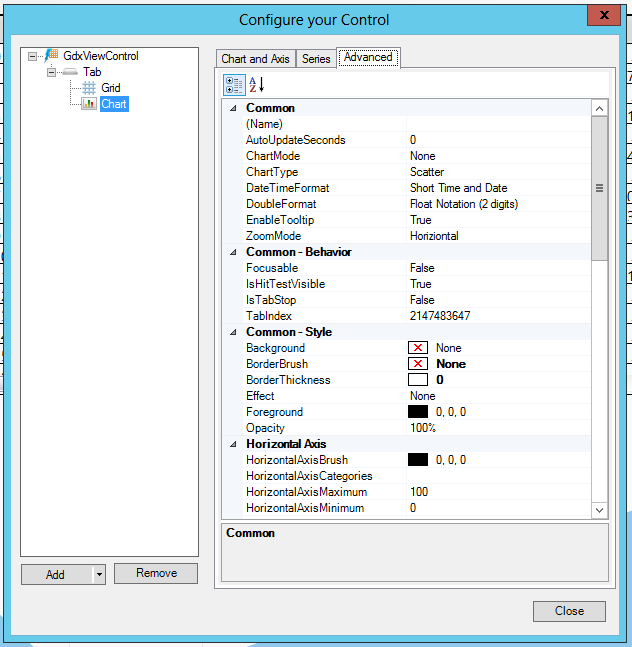
For help understanding a property, select the property and a tool tip at the bottom of the Advanced tab describes the property's use.
Common
(Name) - Unique string identifier for this object.
AutoUpdateSeconds - Specifies the countdown in seconds after which the data will be refreshed. Please note that the countdown will start once the grid will be fully loaded. When automatic updates are enabled, inline changes are disables.
ChartMode - Specifies how the series are combined together. Affects ONLY the series in Categorical Mode.
ChartType - Specifies the type of the chart (Categorical or Scatter).
ClipPlotArea -Clips the plot area. When set to false, the labels and all other elements of the plot area will not be clipped.
DataBufferSize -The maximum amount of data downloaded from the server and visualized in the chart.
DateTimeConversion -Specifies how to convert the DateTime values coming from the server. It's possible to conver the values to the local time, to UTC time or leave them unconverted.
DefaultReportPath -Specifies the file path (without extension) where to save the report. When it's empty, a SaveFileDialog is show in order to save the report. The extension of the file is modified depending on the report format (CSV, HTML, XML, TEXT).
EnableTrackball -Displays a trackball over the chart that shows the values at a specific position.
GridLinesBrush - Color, Gradient or Pattern for the Foreground of the gridlines.
IsEditingEnabled -Allows to drag and drop the markers to change the values of the chart. When the marker is dropped, an update request is sent to the server. Available only for Line, Spline, Area, Spline Area plots.
LegendLocation -The location of the legend.
PageFormat - The default page format of the printed document.
PageMargin - Width of the margin of the printed document.
PageOrientation - The default orientation of the printed document.
ShouldOpenReport -When set to true, it opens the report automatically when the data is exported (if it's possible).
ShouldResetSettings -When set to false, the changes in runtime are permanent even when theuser changes or the control is switched to configuration mode.
ShowBusyIndicator -When set to true, shows a popup when the data in the series is loading. When set to false, the popup is hidden.
ShowGridLinesOnTop -Allow the grid lines in chart view to be drawn over the top of the series. Striplines will also be disabled when the property is set to true.
ShowLegend -Shows/Hiides the legend for the chart. Legend is NOT available for SPC charts and Pies.
ShowPopup - Show the context menu on right-click.
TrackMode - Changes how edit operations are tracked.
ZoomMode - Enables the possibility to zoom into the chart. It's possible to zoom vertically, horizontally or in both directions.
Common-Behavior
Focusable - Gets or sets a value that indicates whether the element can receive focus.
IsHitTestVisible - Indicates whether this object can receive mouse input.
IsTabStop - Indicates whether the user can use the TAB key to give focus to this object.
TabIndex - Determines the index in the TAB order that this object will occupy.
Common-Style
Background - Overall Background color, gradient or pattern of this object.
BorderBrush - Overall Background color, gradient or pattern of the border of this object.
BorderThickness - Width of the border of this object.
Effect - Overall Visual effects (3D-edge, shadow, glow, blur) applied to this object.
Foreground - Overall Foreground color, gradient or pattern of this object.
Opacity - Overall Opacity of the object. Range: 0% (fully transparent) - 100% (fully opaque).
ThumbVisibility - Toggles the visibility for the thumb used to resize the items inside a tab.
Cursor
CursorBackground - Color, Gradient or Pattern for the Cursor Tooltip Background.
CursorBorderBrush - Color, Gradient or Pattern for the Cursor Tooltip Border.
CursorBorderThickness - Width of the border around the Cursor Tooltip.
CursorFontFamily - Specifies the name of the default font used to render the text for the Cursor Tooltip.
CursorFontSize - Specifies the size of the font used to render text for the Cursor Tooltip.
CursorForeground - Color, Gradient or Pattern for the Cursor Tooltip Foreground.
CursorFormat - Specifies the format of the text visualized by the cursor tooltip. you can use %f as a placeholder for the field key (X axis) and %v as a placeholder for the value. For special SPC charts, you can also use %usl, %lsl, %t. For SPC Line Charts, you can use %ucl, %cl, %lcl, %alarm, %note, %ts. For SPC Bar Charts, you can use %distr.
CursorHeader - The header of the text visualized in the cursor tooltip. It's possible to use %x as a placeholder for the field key (X axis).
Horizontal Axis
HorizontalAxisBrush - Color, Gradient or Pattern for the Foreground of the Horizontal Axis lines, labels and title.
HorizontalAxisSortDirection -Sorts the elements on the X axis when the chart type is Categorical.
HorizontalAxisTitle - The title of the horizontal axis.
HorizontalAxisVisibility - Visibility state of the Horizontal Axis.
HorizontalGridInterval - Specifies the number of tick marks after which horizontal grid lines are shown.
HorizontalLabelDegrees - Degrees used to rotate the Horizontal Labels.
HorizontalLabelFormat - String Format of the horizontal labels. Here you can find the most common number format: http://msdn.microsoft.com/en-use/library/0c899ak8.aspx.
HorizontaLabelInterval - Specifies the number of tickmarks after which a label is shown.
HorizontalLabelOffset - Specifies how many labels are hidden starting from the left and the right of the axis.
HorizontalLabelRotate - Specifies if the labels should be rotated on the horizontal axis.
HorizontalStriplineBrush - Color, Gradient or Pattern for the Foreground of the Horizontal Striplines.
ShowHorizontalGridLines - Shows or hides the labels on the horizontal grid lines.
ShowHorizontalLabels - Shows or hides the labels on the horizontal axis.
ShowHorizontalStripline - Shows or hides the Horizontal striplines.
TickMode - Specifies where the points are plotted accordingly to the tick marks. Affects ONLY the series in Categorical and Date Time Mode.
Measurements
Height - Height of the object.
Margin - Amount of space between the boundaries of the object and its container.
Padding - Amount of space between the boundaries of the object and its contents.
Text
FontFamily - Specifies the name of the default font used to render text for the entire object.
FontSize - Specifies the size of the font used to render text for this object.
FontStretch - Specifies the degree to which a font is condensed or expanded on the screen.
FontStyle - Specifies the style of the font used to render text (italic).
FontWeight - Specifies the thickness of the font used to render text (bold).
Title
Title - The text visualized in the title.
TitleFontFamily - Specifies the name of the default font used to render text for the title.
TitleFontSize - Specifies the size of the font used to render text for the title.
TitleForeground - Overall Background color, gradient or pattern of the title.
Vertical Axis
LogarithmBase - The logarithmic base of the Vertical Axis when UseLogarithmicAxis is set to true.
ShowVerticalGridLines - Shows or hides the labels on the vertical grid lines.
ShowVerticalLabels - Shows or hides the labels on the vertical axis.
ShowVerticalStripline - Shows or hides the vertical striplines.
UseLogarithmicAxis - When set to true, the values on the Y axis are logarithmical.
VerticalAxisBrush - Color, Gradient or Pattern for the Foreground of the vertical Axis lines, labels and title.
VerticalAxisLocation - The location of the Vertical Axis.
VerticalAxisOverrideRange - Forces the chart to have a fixed range on the vertical axis.
VerticalAxisTitle - The title of the vertical axis.
VerticalAxisVisibility - Visibility state of the vertical Axis.
VerticalAxisWidth - A specific width for the vertical axis. Disabled when the width is set to 0. Can be used to align two or more charts.
VerticalGridInterval -Specifies the number of tick marks after which vertical grid lines are shown.
VerticalLabelFormat - String Format of the vertical labels. Here you can find the most common number format: http://msdn.microsoft.com/en-us/library/0c899ak8.aspx.
VerticalLabelInterval - Specifies the number of thickmarks after which a label is shown.
VerticalStriplineBrush - Color, Gradient or Pattern for the Foreground of the vertical striplines.
Visual Quality
SnapsToDevicePixels - Determines whether rendering for this object should use device specific pixel settings during rendering.
See Also: