|
|
The features on this page require an add-on to work with GENESIS64 Basic SCADA. |
|
|
The features on this page require an add-on to work with GENESIS64 Basic SCADA. |
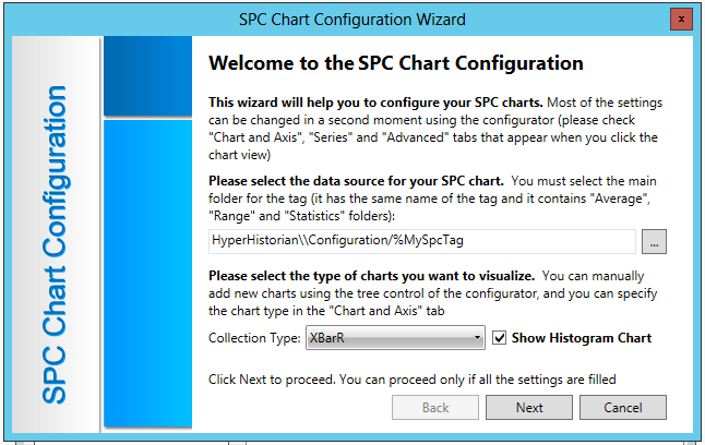
When using the SPC Chart Configuration Wizard within a GridWorX Viewer control, you have the option to 'Show Histogram Chart'.
Setup for the Histogram Chart is similar to a regular SPC Chart, as shown below.
SPC Chart Configuration Wizard First Screen

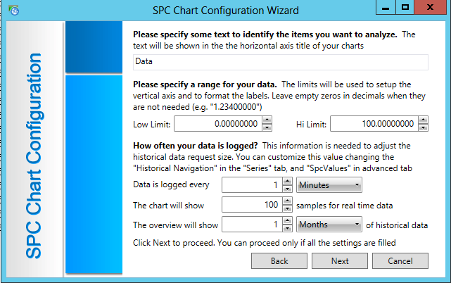
The second window remains the same, as shown below.
SPC Chart Configuration Wizard - Window 2

The third window of the SPC Chart Configuration Wizard does change when 'Show Histogram Chart' has been selected. You will see the additional options of Histogram Bars Color and Histogram Critical Color, as shown below. Note that only solid colors can be selected for both of these options.
SPC Chart Configuration Wizard - Window 3

Click on the Create button to create the SPC Chart with Histogram.
You will then see a placeholder chart, with Histogram, within the GridWorX Viewer as shown below.
SPC Chart with Histogram Sample

Once you view the SPC Chart (with Histogram) in Runtime mode, it will load the connected data (such as from SPC tags configured through the Quality AnalytiX provider) and display it accordingly.
SPC Chart with Histogram in Runtime

The SPC Chart with Histogram in Runtime mode allows you to perform functions similar to other GridWorX charts (Refresh Data, Enable Cursor, Freeze, Export to Image, Print, Print Preview, Load Configuration, Save Configuration, Show/Hide Toolbar).
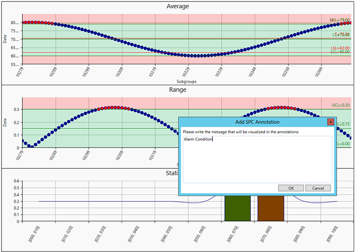
An additional function is the ability to add annotations. Once you click on a point within the Average or range charts, you'll be able to add your relevant note, as shown below.
Add SPC Annotation Window

Once you have entered your note, click OK. You'll then see the following confirmation window.
Annotation Window

In addition, you'll also see a colored dot on your annotated point, as shown below. You can then freeze the chart at any time later on and return back to this or other annotated points to review your note(s).
Annotated Point (Highlighted)

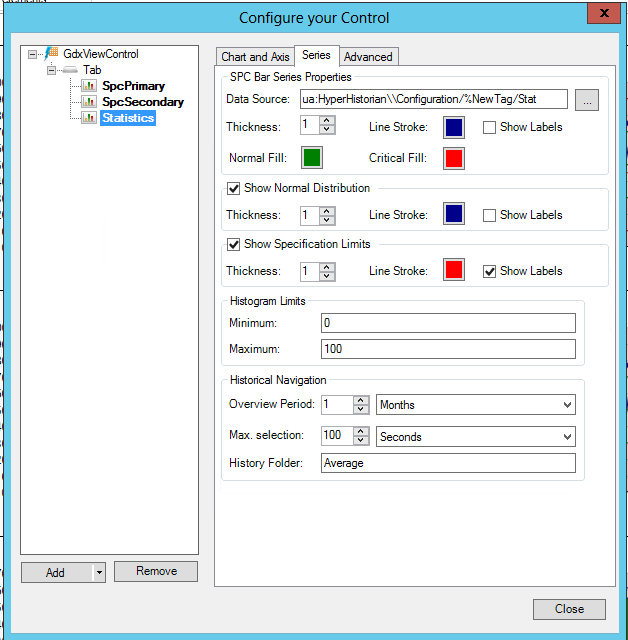
When using a Histogram Chart within the GridWorX Viewer and then returning to Configuration mode, you'll notice an additional set of properties, Statistics, has been added, as shown below. [For info, on SPC Chart configuration without Histograms, see Using SPC Charts in GridWorX - Configurator].
Configure your Control Window

Chart and Axis Tab

Chart Type - Use the pulldown menu to select from Categorical, Scatter, Pie, Polar, Date Time, SPC Line or SPC Histogram.
X-Axis - Click this checkbox to show/hide the X Axis.
Title - Enter a title for the X Axis in the text entry field or click on the  button to navigate to a data point to use for the title. Click on the square to the far right to open the Color Picker window to select a color for the X Axis title.
Show Grid Lines - Click this checkbox to show/hide the horizontal grid lines.
Use stripline - Click this checkbox to show/hide the horizontal stripline. If selected, you can then click on the square to the far right to open the Color Picker window to select a color for the stripline.
The Use specific range property is inactivated for the SPC Histogram Chart Type.
Show Labels on X-Axis - Click this checkbox to show/hide labels on the X Axis.
Offset - Once the 'Show Labels on X Axis' checkbox is selected, you can set the amount of room to offset the Labels either by entering a number in the text entry field or by using the up/down arrows.
Interval - Once the 'Show Labels on X Axis' checkbox is selected, you can set the interval of Labels either by entering a number in the text entry field or using the up/down arrows.
Rotate Labels - Once the 'Show Labels on X Axis' checkbox is selected, you can click this checkbox to allow for rotation of the labels. Once selected, you can set the degrees of rotation by entering a number in the nearby text entry field or by using the up/down arrows.
Y-Axis - Click this checkbox to show/hide the Y Axis.
Title - Enter a title for the Y Axis in the text entry field or click on the  button to navigate to a data point to use for the title. Click on the square to the right to open the Color Picker window to select a color for the Y Axis title. Click on the nearby pulldown menu to set the alignment of the Y Axis (Left or Right).
Show Grid Lines - Click this checkbox to show/hide the vertical grid lines.
Use stripline - Click this checkbox to show/hide the vertical stripline. If selected, you can then click on the square to the far right to open the Color Picker window to select a color for the stripline.
Use Logarithmic Axis with base - Click this checkbox in order to use logarithmic values on the Y Axis. Once selected, you can enter a number for the logarithmic base in the nearby text entry field or use the up/down buttons.
Use specific range - Click this checkbox in order to explicitly specify a range for the Y Axis. One selected you can enter the range in the two text entry fields to the right.
Show Labels - Click this checkbox to show/hide labels on the Y Axis.
Offset - Once the 'Show Labels' checkbox is selected, you can set the amount of room to offset the Labels either by entering a number in the text entry field or by using the up/down arrows.
Interval - Once the 'Show Labels' checkbox is selected, you can set the interval of Labels either by entering a number in the text entry field or using the up/down arrows.
Series Tab

SPC Bar Series Properties
Data Source - Enter a Data Source for your SPC Chart with Histogram in the text entry field or click on the ellipsis button [...], which will launch the OPC UA browser, allowing you to navigate to your selected data source.
Thickness - Enter a number for the plot line thickness in the text entry field or click on the up/down buttons.
Line Stroke - Click on the square to open the Color Picker window to set a color for the line stroke.
Show Labels - Click on this checkbox to show/hide the labels in the plot.
Normal Fill - Click on the square to open the Color Picker window to set a color for the normal fill.
Critical Fill - Click on the square to open the Color Picker window to set a color for the critical fill.
Show Normal Distribution - Click this checkbox to show or hide the normal distribution.
Thickness - Enter a number for thickness of the normal distribution line in the text entry field or use the up/down buttons.
Line Stroke - Click on the square to open the Color Picker window to set a color for the normal distribution line stroke.
Show Labels - Click on this checkbox to show/hide the normal distribution labels in the plot.
Show Specification Limits - Click this checkbox to show or hide the specification limits for normal distribution.
Thickness - Enter a number for thickness of the specification limits line in the text entry field or use the up/down buttons.
Line Stroke - Click on the square to open the Color Picker window to set a color for the specification limits line stroke.
Show Labels - Click on this checkbox to show/hide the specification limits labels in the plot.
Histogram Limits
Minimum - In the text entry field, enter a number for the minimum of the Histogram Limit.
Maximum - In the text entry field, enter a number for the maximum of the Histogram Limit.
Historical Navigation
Overview Period - Enter a number in the text entry field, or use the up/down buttons, for the timespan used to build the chart overview. Use the nearby pulldown menu to select from Seconds, Minutes, Hours, Days, Months or Years.
Max. selection - Enter a number in the text entry field, or use the up/down buttons, for the timespan used to specify the maximum amount of data selectable in the overview. Use the nearby pulldown menu to select from Seconds, Minutes, Hours, Days, Months or Years.
History Folder - Enter the name of the folder used for the historical data used in the SPC Chart with Histogram.
Advanced Tab

Common
(Name) - Unique string identifier for this object
AutoUpdateSeconds - Specifies the countdown in seconds after which the data will be refreshed. Please not that the countdown will start once the grid will be fully loaded. When automatic updates are enabled, inline changes are disabled.
ChartType - Specifies the type of the chart.
DateTimeFormat - Defines the format used by the DateTime objects in the grid. It's possible to select between a pre-defined list of formats. If you want to specify a custom format, manually type it into the field. Format should be in the correct format (e.g. "hh:mm:ss" will print "12:00:00"). The default formats with a "*" are language-independent.
DoubleFormat - Defines the format used by the Double objects in the grid. It's possible to select between a pre-defined list of formats. If you want to specify a custom format, manually type it into the field. Format should be in the correct format (e.g. "{0:0.00}" will print "123.46").
GridLinesBrush - Color, Gradient or Pattern for the Foreground of the gridlines.
PageFormat - The default page format of the printed document.
PageMargin - Width of the margin of the printed document.
PageOrientation - The default orientation of the printed document.
ShowPopup - Show the context menu on right-click.
ZoomMode - Enables the possibility to zoom into the chart. It's possible to zoom vertically, horizontally or in both directions.
Command - Behavior
Focusable - Gets or sets a value that indicates whether the element can receive focus.
IsHitTestVisible - Indicates whether this object can receive mouse input.
IsTabStop - Indicates whether the user can use the TAB key to give focus to this object.
TabIndex - Determines the index in the TAB order that this object will occupy.
Common - Style
Background - Overall Background color, gradient or pattern of this object.
BorderBrush - Overall Background color, gradient or pattern of the border of this object.
BorderThickness - Width of the border of this object.
Effect - Overall Visual effects (3D-edge, shadow, glow, blur) applied to this object.
Foreground - Overall Foreground color, gradient or pattern of this object.
Opacity - Overall Opacity of the object. Range: 0% (fully transparent) - 100% (fully opaque).
ThumbVisibility - Toggles the visibility for the thumb used to resize the items inside a tab.
Cursor
CursorBackground - Color, Gradient or Pattern for the Cursor Tooltip Background.
CursorBorderBrush - Color, Gradient or Pattern for the Cursor Tooltip Border.
CursorBorderThickness - Width of the border around the Cursor Tooltip.
CursorFontFamily - Specifies the name of the default font used to render the text for the Cursor Tooltip.
CursorFontSize - Specifies the size of the font used to render text for the Cursor Tooltip.
CursorForeground - Color, Gradient or Pattern for the Cursor Tooltip Foreground.
CursorFormat - Specifies the format of the text visualized by the cursor tooltip. you can use %f as a placeholder for the field key (X axis) and %v as a placeholder for the value. For special SPC charts, you can also use %usl, %lsl, %t. For SPC Line Charts, you can use %ucl, %cl, %lcl, %alarm, %note, %ts. For SPC Bar Charts, you can use %distr.
Horizontal Axis
HorizontalAxisBrush - Color, Gradient or Pattern for the Foreground of the Horizontal Axis lines, labels and title.
HorizontalAxisTitle - The title of the horizontal axis.
HorizontalAxisVisibility - Visibility state of the Horizontal Axis.
HorizontalLabelDegrees - Degrees used to rotate the Horizontal Labels.
HorizontalLabelFormat - String Format of the horizontal labels. Here you can find the most common number format: http://msdn.microsoft.com/en-use/library/0c899ak8.aspx.
HorizontaLabelInterval - Specifies the number of tickmarks after which a label is shown.
HorizontalLabelOffset - Specifies how many labels are hidden starting from the left and the right of the axis.
HorizontalLabelRotate - Specifies if the labels should be rotated on the horizontal axis.
HorizontalStriplineBrush - Color, Gradient or Pattern for the Foreground of the Horizontal Striplines.
ShowHorizontalGridLines - Shows or hides the labels on the horizontal grid lines.
ShowHorizontalLabels - Shows or hides the labels on the horizontal axis.
ShowHorizontalStripline - Shows or hides the Horizontal striplines.
TickMode - Specifies where the points are plotted accordingly to the tick marks. Affects ONLY the series in Categorical and Date Time Mode.
Measurements
Height - Height of the object.
Margin - Amount of space between the boundaries of the object and its container.
Padding - Amount of space between the boundaries of the object and its contents.
Text
FontFamily - Specifies the name of the default font used to render text for the entire object.
FontSize - Specifies the size of the font used to render text for this object.
FontStretch - Specifies the degree to which a font is condensed or expanded on the screen.
FontStyle - Specifies the style of the font used to render text (italic).
FontWeight - Specifies the thickness of the font used to render text (bold).
Title
Title - The text visualized in the title.
TitleFontFamily - Specifies the name of the default font used to render text for the title.
TitleFontSize - Specifies the size of the font used to render text for the title.
TitleForeground - Overall Background color, gradient or pattern of the title.
Vertical Axis
LogarithmBase - The logarithmic base of the Vertical Axis when UseLogarithmicAxis is set to true.
ShowVerticalGridLines - Shows or hides the labels on the vertical grid lines.
ShowVerticalLabels - Shows or hides the labels on the vertical axis.
ShowVerticalStripline - Shows or hides the vertical striplines.
UseLogarithmicAxis - When set to true, the values on the Y axis are logarithmical.
VerticalAxisBrush - Color, Gradient or Pattern for the Foreground of the vertical Axis lines, labels and title.
VerticalAxisLocation - The location of the Vertical Axis.
VerticalAxisOverrideRange - Forces the chart to have a fixed range on the vertical axis.
VerticalAxisTitle - The title of the vertical axis.
VerticalAxisVisibility - Visibility state of the vertical Axis.
VerticalAxisWidth - A specific width for the vertical axis. Disabled when the width is set to 0. Can be used to align two or more charts.
VerticalLabelFormat - String Format of the vertical labels. Here you can find the most common number format: http://msdn.microsoft.com/en-us/library/0c899ak8.aspx.
VerticalLabelInterval - Specifies the number of thickmarks after which a label is shown.
VerticalStriplineBrush - Color, Gradient or Pattern for the Foreground of the vertical striplines.
Visual Quality
SnapsToDevicePixels - Determines whether rendering for this object should use device specific pixel settings during rendering.
See Also: