You can add tabs to a viewer. Before you can add tabs, you must first add a tabs container, as described here.
To Add a Tabs Container:
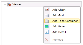
Right-click on your selected Viewer in the left-sided pane of the FDDWorX Silverlight Web Part, then click on "Add Tabs Container", as shown below.
Add Tabs Container

This adds a "TabContainer" branch to the project explorer as well as opens the tabs container properties in the right side of the FDDWorX Silverlight Web Part. These properties are split between the General and Appearance tabs.
TabContainer Properties

The following is a description of the settings that can be changed in the General Tab of the TabContainer properties.
TabContainer - General Tab Properties
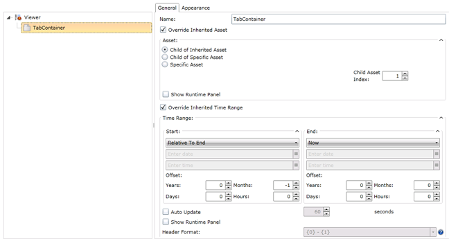
Name - You can enter the name of the tabs container here.
Override Inherited Asset - Click this check box to override inherited assets from your designated data source. You will then have the option of overriding with a:
Child of Inherited Asset - If selected, you will be able to set the Child Asset Index, located at the right side of the window (as shown in the image above), to select the branch level of the asset child that you would like to override the inherited asset.
Child of Specific Asset - If selected, you will be able to use a pulldown menu to select the specific asset whose child you wish to use to override the inherited asset, while also setting the Child Asset Index, as shown below.
'Child of Specific Asset' Settings

Specific Asset - If selected, you will be able to use a pulldown menu to select the specific asset to override the inherited asset.
Specific Asset Settings

Show Runtime Panel -
Override Inherited Time Range - Click this check box to override inherited time/date ranges from your designated data source. You will then have the option of overriding with new time and date info.
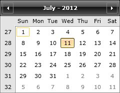
Start and End - Using the pulldown menus, you're able to select options including Now, Inherited, Relative to End, Preset and Custom. Depending on the pulldown selection, you can also enter in new date/time information or use the ![]() buttons. The button to the right of the date entry field brings up a monthly calendar for date selection, as shown below.
buttons. The button to the right of the date entry field brings up a monthly calendar for date selection, as shown below.
Monthly Calendar
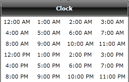
The button to the right of the time entry field brings up a clock window for time selection, as shown below.
Clock Window
Offsets - Beneath the Start and End date and time fields, you can offset the entered info by Years, Months, Days or Hours.
Auto Update - Clicking this check box allows you to set the time to automatically update the date/time-related data.
Show Runtime Panel - Clicking this check box allows you to edit the Header Format setting below.
Header Format - The pulldown menu, as shown below, allows you to set the header format to include date and time information as one of the following:
{0} - {1}
{0:d} to {1:D}
{0} to {1:MM/dd/yy h:mm:ss}
Header Format Settings

The following is a description of the settings that can be changed in the Appearance Tab of the TabContainer properties.
TabContainer - Appearance Tab Properties

Title - Text and Format - Enter a name for the TabContainer that will appear in runtime. You can also set the color, font size, style and justification of your entered text here.
Subtitle - Text and Format - Enter a subtitle for the TabContainer that will appear in runtime. You can also set the color, font size, style and justification of your entered text here.
Border - Color and Thickness - Click on the pulldown handle to select a color for the border that will surround the tab container. Enter (or use the up and down arrows) to set its thickness.
Background - Click on the pulldown handle to select a color for the background to be used behind the tab container.
See Also