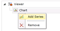
To Add a Chart Series:
Right-click on your selected Chart in the left-sided pane of the FDDWorX Silverlight Web Part, then click on "Add Series", as shown below.
Add Series

This adds a "Series" branch to the project explorer (beneath the chart) as well as opens the series properties in the right side of the FDDWorX Silverlight Web Part. These properties are split between the General, Data and Settings tabs.
Series Properties

The following is a description of the settings that can be changed in the General Tab of the Series properties.
Series - General Tab Properties

Name - You can enter the name of the series here.
Override Inherited Asset - Click this check box to override inherited assets from your designated data source. You will then have the option of overriding with a:
Child of Inherited Asset - If selected, you will be able to set the Child Asset Index, located at the right side of the window (as shown in the image above), to select the branch level of the asset child that you would like to override the inherited asset.
Child of Specific Asset - If selected, you will be able to use a pulldown menu to select the specific asset whose child you wish to use to override the inherited asset, while also setting the Child Asset Index, as shown below.
'Child of Specific Asset' Settings

Specific Asset - If selected, you will be able to use a pulldown menu to select the specific asset to override the inherited asset.
Specific Asset Settings

Show Runtime Panel -
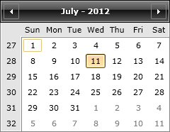
Override Inherited Time Range - Click this check box to override inherited time/date ranges from your designated data source. You will then have the option of overriding with new time and date info.
Monthly Calendar
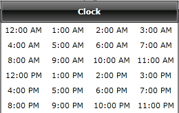
The button to the right of the time entry field brings up a clock window for time selection, as shown below.
Clock Window
Offsets - Beneath the Start and End date and time fields, you can offset the entered info by Years, Months, Days or Hours.
Auto Update - Clicking this check box allows you to set the time to automatically update the date/time-related data.
Override Chart Type - See the Chart Type description for selecting a replacement for the initially selected chart type.
The following is a description of the settings that can be changed in the Data Tab of the Series properties.
Series - Data Tab

Data Source - Use this pulldown to select the data source for what will populate the chart/series.
Data Query - Use this pulldown to select your query. For instance, in the FDDWorX Silverlight Web Part viewer, you may wish to see Faults; Summary by asset; Summary by asset and fault; Distribution by asset; Distribution by fault for given asset; Distribution by asset and fault; or Latest causes.
Additional Parameters - Depending on your selected Data Query, you can set additional parameters here by clicking on the downward facing arrow (![]() ) at the right edge of this section.
) at the right edge of this section.
For Faults; Summary by asset; Summary by asset and fault; Distribution by asset; Distribution by fault for given asset; and Distribution by asset and fault data queries, you can decide whether or not you wish to Include Children Assets (by clicking on the check box).
For Faults; Summary by asset; Summary by asset and fault; Distribution by asset; and Distribution by fault for given asset data queries, you can also enter an Asset Filter and/or Fault Filter in their respective text entry fields.
For Distribution by asset; Distribution by fault for given asset; and Distribution by asset and fault data queries, you also have the option of setting an Interval Type (Hour, Day, Week, Month, Year) via the pulldown menu.
Mappings - Depending on your selected Data Query, you can set the mapping for the X-Axis, Y-Axis, Label and Tooltip.
For Distribution by asset; Distribution by fault for given asset; and Distribution by asset and fault data queries, you also have the option of setting the Format for the Mappings. Click the check box to the left of "Format" to enable the pulldown menu. You can decide upon how you wish the mappings to be viewed: Standard Numeric Format Strings; Custom Numeric Format Strings; Standard Date and Time Format Strings; or Custom Date and Time Format Strings. Options include: 0.00; #,##; ##.0%; #.## 'degrees'; d; D; f; F; g; G; M; and Y.
The following is a description of the settings that can be changed in the Settings Tab of the Series properties.
Series - Settings Tab
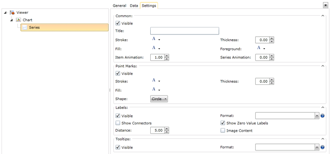
Common
Visible - Click this box if you want the common elements within the series to be visible.
Title - Enter a title for the common elements of the series.
Stroke - Click on the pulldown handle to select a color for the line included with common elements within the series. Hovering the mouse over the pulldown will trigger the blue "Default" text, allowing you to make this change a default property.
Thickness - Enter, or use the up and down arrows to set, the thickness of the line. Hovering the mouse over the text entry field will trigger the blue "Default" text, allowing you to make this change a default property.
Fill - Click on the pulldown handle to select a color for the fill included with common elements within the series. Hovering the mouse over the pulldown will trigger the blue "Default" text, allowing you to make this change a default property.
Foreground - Click on the pulldown handle to select a color for the foreground included with common elements within the series. Hovering the mouse over the pulldown will trigger the blue "Default" text, allowing you to make this change a default property.
Item Animation - Enter , or use the up and down arrows to set, the item animation rate for common items within the series.
Series Animation - Enter , or use the up and down arrows to set, the item animation rate for the series itself.
Point Marks
Visible - Click this box if you want point marks within the series to be visible.
Stroke - Click on the pulldown handle to select a color for the point marks within the series. Hovering the mouse over the pulldown will trigger the blue "Default" text, allowing you to make this change a default property.
Thickness - Enter, or use the up and down arrows to set, the thickness. Hovering the mouse over the text entry field will trigger the blue "Default" text, allowing you to make this change a default property.
Fill - Click on the pulldown handle to select a color for the fill. Hovering the mouse over the pulldown will trigger the blue "Default" text, allowing you to make this change a default property.
Shape - Use the pulldown menu to set the Point Mark shape (Circle, Diamond, Hexagon, Square, SquareRounded, StarEightRay, StarFiveRay, Triangle). Hovering the mouse over the pulldown will trigger the blue "Default" text, allowing you to make this change a default property.
Labels
Visible - Click this box if you want the labels within the series to be visible.
Format - You can decide upon how you wish the labels to be viewed: Standard Numeric Format Strings; Custom Numeric Format Strings; Standard Date and Time Format Strings; or Custom Date and Time Format Strings. Options include: 0.00; #,##; ##.0%; #.## 'degrees'; d; D; f; F; g; G; M; and Y.
Show Connectors - Click this box to show connectors between labels.
Distance - Enter, or use the up and down arrows to set, the distance for connection between labels. Hovering the mouse over the text entry field will trigger the blue "Default" text, allowing you to make this change a default property.
Show Zero Value Labels - Check this box if you wish to label zero values in the series.
Image Content - Check this box if you wish to include an associated image with any labels in the series.
Tooltips
Visible - Click this box if you want the tooltips within the series to be visible.
Format - You can decide upon how you wish the tooltips to be viewed: Standard Numeric Format Strings; Custom Numeric Format Strings; Standard Date and Time Format Strings; or Custom Date and Time Format Strings. Options include: 0.00; #,##; ##.0%; #.## 'degrees'; d; D; f; F; g; G; M; and Y.
See Also
FDDWorX Silverlight Web Part Configuration