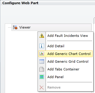
To Add a Chart:
Right-click on your selected Viewer in the left-sided pane of the FDDWorX Silverlight Web Part, then click on "Add Generic Chart Control", as shown below.
Add Chart

This adds a "Chart" branch to the project explorer as well as opens the chart properties in the right side of the FDDWorX Silverlight Web Part. These properties are split between the General and Appearance tabs.
Chart Properties
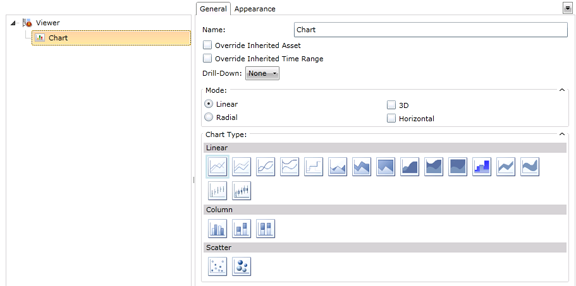
The following is a description of the settings that can be changed in the General Tab of the Chart properties.
Chart - General Tab Properties

Name - You can enter the name of the chart here.
Override Inherited Asset - Click this check box to override inherited assets from your designated data source. You will then have the option of overriding with a:
'Child of Specific Asset' Settings

Specific Asset Settings

Override Inherited Time Range - Click this check box to override inherited time/date ranges from your designated data source. You will then have the option of overriding with new time and date info.
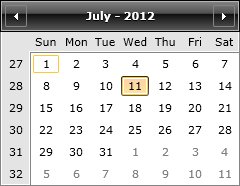
Monthly Calendar
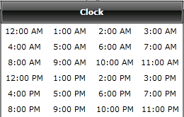
The button to the right of the time entry field brings up a clock window for time selection, as shown below.
Clock Window
Header Format Settings

Drill Down - Should you wish to be able to access an additional chart from a primary one (i.e., "drill down" to additional data on a separate chart), click on this pulldown menu. Options include "None" (to clear this selection), "Asset" or "Custom". Selecting "Custom" adds a "Drill-Down" branch to the Chart branch in the project explorer. You can then click on the Drill-Down branch to edit its own chart properties. You could then, in turn, create a Drill Down in that level and so on, to create multiple levels of chart data, if so desired.
One Drill-Down Level for a Selected Chart

Mode - Decide on whether your chart will be Linear or Radial. Based on which radio button you click, you'll have further options. For Linear Mode, you can make the chart either 3D (or leave as 2D) or Horizontal (or leave as Vertical). For Radial Mode, you can decide whether or not you want the chart in 3D. Your Mode selection will affect which Chart Type you can choose.
Chart Type - Depending on the Mode you selected, you can choose from multiple options for your chart type. Listed below are the Mode/Chart Type Options:
LINEAR MODE
Linear
![]() Line - Standard line series
Line - Standard line series
![]() Stacked Line - Stacked line series
Stacked Line - Stacked line series
![]() Spline - Standard spline series
Spline - Standard spline series
![]() Stacked Spline - Stacked spline series
Stacked Spline - Stacked spline series
![]() Step Line - Step line chart series
Step Line - Step line chart series
![]() Area - Line area series
Area - Line area series
![]() Stacked Area (x2) - Stacked area line series
Stacked Area (x2) - Stacked area line series
![]() Spline Area - Spline area series
Spline Area - Spline area series
![]() Stacked Spline Area - Stacked spline area series
Stacked Spline Area - Stacked spline area series
![]() 100% Stacked Spline Area - Stacked spline area series, filling 100% of the output range
100% Stacked Spline Area - Stacked spline area series, filling 100% of the output range
![]() Step Line Area - Step line area series
Step Line Area - Step line area series
![]() Range - Line range series
Range - Line range series
![]() Spline Range - Spline range series
Spline Range - Spline range series
![]() Stick - Stick chart series
Stick - Stick chart series
![]() Candle - Candle stick chart series
Candle - Candle stick chart series
Column
![]() Bar - Standard bar series
Bar - Standard bar series
![]() Stacked Bar - Stacked bar series
Stacked Bar - Stacked bar series
![]() 100% Stacked Bar - Stacked bar series, filling 100% of the output range
100% Stacked Bar - Stacked bar series, filling 100% of the output range
Scatter
![]() Scatter - Scatter (point) chart series
Scatter - Scatter (point) chart series
![]() Bubble - Bubble chart series
Bubble - Bubble chart series
LINEAR MODE - 3D
Linear
![]() Line 3D - 3D chart line series
Line 3D - 3D chart line series
![]() Stacked Line 3D - 3D chart stacked line series
Stacked Line 3D - 3D chart stacked line series
![]() Area 3D - 3D chart area series
Area 3D - 3D chart area series
![]() Stacked Area 3D - 3D chart stacked area series
Stacked Area 3D - 3D chart stacked area series
![]() 100% Stacked Area 3D - 3D chart 100% stacked area series
100% Stacked Area 3D - 3D chart 100% stacked area series
Column
![]() Bar 3D - 3D chart bar series
Bar 3D - 3D chart bar series
![]() Stacked Bar 3D - 3D chart stacked bar series
Stacked Bar 3D - 3D chart stacked bar series
![]() 100% Stacked Bar 3D - 3D chart 100% stacked bar series
100% Stacked Bar 3D - 3D chart 100% stacked bar series
LINEAR MODE - HORIZONTAL
Bar
![]() Horizontal Bar - Horizontal bar series
Horizontal Bar - Horizontal bar series
![]() Stacked Horizontal Bar - Stacked horizontal bar series
Stacked Horizontal Bar - Stacked horizontal bar series
![]() 100% Stacked Horizontal Bar - Stacked horizontal bar series, filling 100% of the output range
100% Stacked Horizontal Bar - Stacked horizontal bar series, filling 100% of the output range
RADIAL MODE
Radial
![]() Pie - Pie chart series
Pie - Pie chart series
![]() Doughnut - Doughnut chart series
Doughnut - Doughnut chart series
RADIAL MODE - 3D
Radial
![]() Pie 3D - 3D pie chart series
Pie 3D - 3D pie chart series
![]() Doughnut 3D - 3D doughnut chart series
Doughnut 3D - 3D doughnut chart series
The following is a description of the settings that can be changed in the Appearance Tab of the Chart properties.
Chart - Appearance Tab Properties
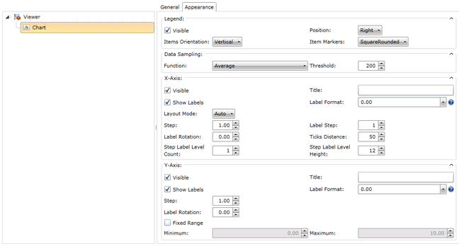
Title - Text and Format - Enter a name for the Chart that will appear in runtime. You can also set the color, font size, style and justification of your entered text here.
Subtitle - Text and Format - Enter a subtitle for the Chart that will appear in runtime. You can also set the color, font size, style and justification of your entered text here.
Border - Color and Thickness - Click on the pulldown handle to select a color for the border that will surround the chart. Enter (or use the up and down arrows) to set its thickness.
Background - Click on the pulldown handle to select a color for the background to be used behind the chart.
Legend
Visible - Click this box to include a Legend with your chart to provide additional information as to its elements.
Items Orientation - Use the pulldown menu to set whether the Legend items will be horizontal or vertical. Hovering the mouse over the pulldown will trigger the blue "Default" text, allowing you to make this change a default property.
Position - Use the pulldown to set where the Legend will be positioned (Left, Top, Right, or Bottom). Hovering the mouse over the pulldown will trigger the blue "Default" text, allowing you to make this change a default property.
Item Markers - Use the pulldown to set which item markers will be used within the Legend: Circle; Diamond; Hexagon; Square; SquareRounded; StarEightRay; StarFiveRay; or Triangle. Hovering the mouse over the pulldown will trigger the blue "Default" text, allowing you to make this change a default property.
Data Sampling
Function - Use the pulldown menu to set the data sampling function: Average; First, KeepExtremes; Last; Max; Min; or Sum.
Threshold - Enter, or use the up and down arrows to set, the data sampling threshold here.
X-Axis
Visible - Click this box to include an X-Axis with your chart.
Show Labels - Click this box to show labels for the X-Axis elements of the chart.
Title - You can enter a name for the X-Axis information here.
Label Format - You can decide upon how you wish the X-Axis labels to be viewed: Standard Numeric Format Strings; Custom Numeric Format Strings; Standard Date and Time Format Strings; or Custom Date and Time Format Strings. Options include: 0.00; #,##; ##.0%; #.## 'degrees'; d; D; f; F; g; G; M; and Y.
Layout Mode - Use the pulldown menu to select the layout mode for the chart's X-Axis info: Auto; Between; Inside; or Normal. Hovering the mouse over the pulldown will trigger the blue "Default" text, allowing you to make this change a default property.
Step - Enter, or use the up and down arrows to set, the Step for the X-Axis information here. Hovering the mouse over the text entry field will trigger the blue "Default" text, allowing you to make this change a default property.
Label Step - Enter, or use the up and down arrows to set, the Label Step here. Hovering the mouse over the text entry field will trigger the blue "Default" text, allowing you to make this change a default property.
Label Rotation - Enter, or use the up and down arrows to set, the Label Rotation here. Hovering the mouse over the text entry field will trigger the blue "Default" text, allowing you to make this change a default property.
Ticks Distance - Enter, or use the up and down arrows to set, the Ticks Distance here. Hovering the mouse over the text entry field will trigger the blue "Default" text, allowing you to make this change a default property.
Steps Label Level Count - Enter, or use the up and down arrows to set, the Steps Label Level Count here. Hovering the mouse over the text entry field will trigger the blue "Default" text, allowing you to make this change a default property.
Steps Label Level Height - Enter, or use the up and down arrows to set, the Steps Label Level Height here. Hovering the mouse over the text entry field will trigger the blue "Default" text, allowing you to make this change a default property.
Y-Axis
Visible - Click this box to include an Y-Axis with your chart.
Show Labels - Click this box to show labels for the Y-Axis elements of the chart.
Title - You can enter a name for the Y-Axis information here.
Label Format - You can decide upon how you wish the Y-Axis labels to be viewed: Standard Numeric Format Strings; Custom Numeric Format Strings; Standard Date and Time Format Strings; or Custom Date and Time Format Strings. Options include: 0.00; #,##; ##.0%; #.## 'degrees'; d; D; f; F; g; G; M; and Y.
Layout Mode - Use the pulldown menu to select the layout mode for the chart's Y-Axis info: Auto; Between; Inside; or Normal. Hovering the mouse over the pulldown will trigger the blue "Default" text, allowing you to make this change a default property.
Step - Enter, or use the up and down arrows to set, the Step for the Y-Axis information here. Hovering the mouse over the text entry field will trigger the blue "Default" text, allowing you to make this change a default property.
Label Rotation - Enter, or use the up and down arrows to set, the Label Rotation here. Hovering the mouse over the text entry field will trigger the blue "Default" text, allowing you to make this change a default property.
Fixed Range - Click here if you want the Y-Axis of your chart to have a fixed range. Selecting this option enables you to enter, or use the up and down buttons to set, a Minimum and Maximum value for the range.
See Also
FDDWorX Silverlight Web Part Configuration