|
|
The features on this page require an add-on to work with GENESIS64 Basic SCADA. |

|
|
The features on this page require an add-on to work with GENESIS64 Basic SCADA. |
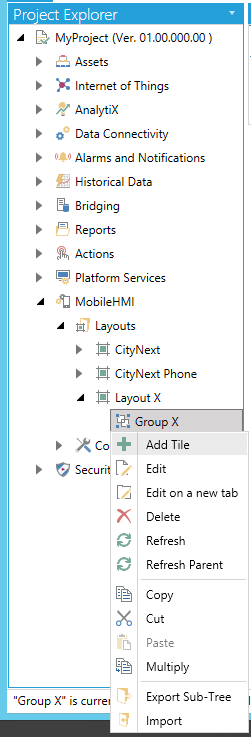
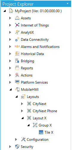
To Create a New Tile:
Expand the MC Mobile node in Project Explorer to reveal the Layouts branch. Right-click on your selected Group underneath your selected Layout within the Layouts branch within the MC Mobile provider (in the Project Explorer) in the Workbench and then on Add Tile, as shown below:
Adding a Tile from the Project Explorer in the Workbench
-OR-
You can also add a Tile by clicking on a Group underneath a Layout within the Layouts branch and then clicking on the Add Tile button (as shown below) in the Edit section of the Home ribbon at the top of the Workbench window.
Add Tile Button
This will open the Tile properties window, as shown below.
New Tile Properties
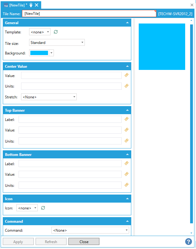
First, give your Tile a Name by filling in the Name text entry field.
The Tile Properties window contains six separate sections, including:
It is important to note that the Preview section of the window in the bottom right will change, in real time, according to how you update the settings within these sections.
General Section of the Tile Properties Window
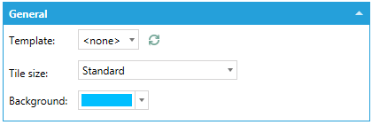
The General section of the Tile Properties window contains the following settings:
Template - The Template pulldown menu is populated from the Smart Tile Templates subbranch within the Configuration branch of the MC Mobile provider (in the Project Explorer) in the Workbench. Click the Refresh button ( ) to refresh the list within the pulldown menu.
Tile size - The Tile size menu provides the option to size your tile - similarly to how users can size Microsoft Windows Live Tiles. Options include Quarter, Standard, Wide and Double.
Background - The Background setting allows you to change the background color of the tile. The pulldown menu allows you to immediately select from Theme colors or Standard colors or you can click on the More Colors... option, which will open the separate Pick a Color window. You can select from CMYK, HLS, HSV, or RGB color entry options, as well as use either the # text entry field or click directly on the color block/sliders to the left of the window.
Center Value Section of the Tile Properties Window
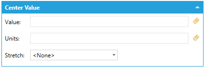
The Center Value section of the Tile Properties window contains the following settings:
Value - The Value setting allows you to enter the value to use for the center value within the tile. You can enter the info in the text entry field or by clicking the  button to open the Data Browser button and navigate to your selected value.
Units - The Units setting allows you to enter the units to use for the center value within the tile. You can enter the info in the text entry field or by clicking the button to open the Data Browser button and navigate to your selected value.
Stretch - Use the pulldown banner to select how the center value information will appear within tile. You can select from <None>, Fill, Uniform, or Uniform to fill.
Top Banner Section of the Tile Properties Window
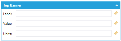
The Top Banner section of the Tile Properties window contains the following settings:
Label -The Label text entry field allows you to enter text that will appear in the top left of your tile, making it easier to distinguish from any additional tiles. You can also click on the button to open the Data Browser to set a label from a connected data source.
Value - The Value text entry field allows you to enter the location of a data source for information to be displayed within the tile. You can click on the button to open the Data Browser and navigate to your selected Value's data source. Note: If you have selected to utilize an existing Tile Template in the General Tab, the Value field may be blank but could still already be linked to a data source. A good way to see if this is the case is to notice the Preview window to the right and see if any Value has already been associated with the Top Banner of this tile.
Units - The Units text entry field allows you to set the unit(s) for which the Value has been set. You can also click on the button to open the Data Browser to set the units from a connected data source.
Bottom Banner Section of the Tile Properties Window
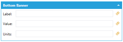
The Bottom Banner section of the Tile Properties window contains the following settings:
Label -The Label text entry field allows you to enter text that will appear in the bottom left of your tile, making it easier to distinguish from any additional tiles. You can also click on the button to open the Data Browser to set a label from a connected data source.
Value - The Value text entry field allows you to enter the location of a data source for information to be displayed within the tile. You can click on the button to open the Data Browser and navigate to your selected Value's data source. Note: If you have selected to utilize an existing Tile Template in the General Tab, the Value field may be blank but could still already be linked to a data source. A good way to see if this is the case is to notice the Preview window to the right and see if any Value has already been associated with the Top Banner of this tile.
Units - The Units text entry field allows you to set the unit(s) for which the Value has been set. You can also click on the button to open the Data Browser to set the units from a connected data source.
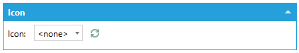
Icon Section of the Tile Properties Window
The Icon section of the Tile Properties window contains the following settings:
Icon - The Icon pulldown menu allows you to select a graphical representation for your tile. The menu comes pre-loaded upon initial installation of MC Mobile and includes the following icons: AlarmWorX, Assets, AssetWorX, Building, Cloud, Cost Efficiency, Costs, Datacenter, Document, Energy, Energy Efficiency, Energy Use, Factory, GraphWorX, GridWorX, Line Chart, Manager, Manufacturing, Map, Operator, Pie Chart, Pumpjack, Rain, Report, Security, Server, Service, Snow, Solar, Sun, TrendWorX, Truck, User, Users Group, Vertical Bar, Water, and Wind. You can also add new icons to this list by creating a Custom Icon via the Images sub-branch within the Configuration branch of the MC Mobile provider's Project Explorer. You may need to refresh the list for any new items to appear, by clicking the refresh [ ] button.
Command Section of the Tile Properties Window
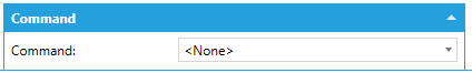
The Command section of the Tile Properties window contains the following settings:
Command - The Command pulldown menu allows you to attach a specific command to your tile.
Commands include: Acknowledge, Add Favorites, Apply Discard, Call Method, Custom Command, Export Data, Loan Alarm Configuration, Load DataGrid Configuration, Load Graphics Display, Load KPI Dashboard, Load Mobile Layout, Loan Trend Configuration, Load Url, Log Event, Login Dialog, Navigate, Open Url, Phone Call, Remove Favorite, Run Report, Run Transaction, Save Configuration, Send Alert Email, Send Alert Page, Send Email, Send Message, Set Global Aliases, Set Global Color Theme, Set Language, and Write Value.
Selecting a command from the pulldown menu will load additional associated settings.
For descriptions of Commands used with Equipment, click here.
For descriptions of Commands used with Equipment Classes, click here.
For descriptions of Commands used within GraphWorX64, click here.
Once you have finished making changes to the Tile Properties, click on the Apply & Close button in the bottom of the window.
The newly added tile will appear in the top left window within the Workbench, when the Group branch in which it is contained is expanded, as shown below.
New Tile Appearing with Group Branch Expanded in MC Mobile Provider in the Workbench
See Also: