Note: Grid panels described here should not be confused with the pre-made HMI (human-machine interface) panels and components available in the Symbols Library. For more information, refer to Symbol Library.
A panel is a container object that is similar to a layer except that a panel arranges or groups objects that you add to it and provides some automated features that you may want to exploit. Using the features available in panels gives you an added way of creating professional-looking displays and can save you the time when creating a display. You access panels from the GraphWorX64 2D Home ribbon, from the Shapes section.
|
|
Note: Grid panels described here should not be confused with the pre-made HMI (human-machine interface) panels and components available in the Symbols Library. For more information, refer to Symbol Library. |
Here are some other ways you might use panels:
Stack three state indicators on top of each other and make each visible only when a certain condition occurs.
Use grids or stacks to quickly place large numbers of process points onto a display in a distributed array.
Use the Canvas panel to create a collection of objects that can be manipulated as a group.
Add one panel to another one to, for example, create a grid within another panel. This provides a means for specifying a grid on one area of your display but not the entire display.
Panel properties. There are several types of panels you can add to a display; each panel type comes with its own properties. For example, you can set vertical or horizontal orientation for a Stack panel or set the properties of the grid in the Grid panel. It is not always the panel's properties that need to be set; sometimes you will need to set the properties of objects inside the panels. This distinction is made in the descriptions of each panel later in this topic. Also, when working with panels, switch into Advanced mode so that all properties are available to you.
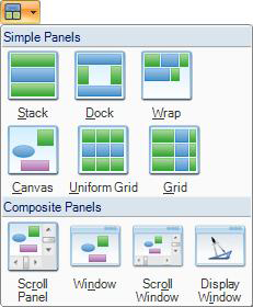
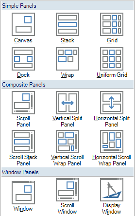
Panels tool. Access the Panels tool from the Shapes section of the GraphWorX64 Home ribbon. Add the panel you want, then select it in order to modify it. There are Simple panel types for arranging and grouping objects and Composite panel types that offer more sophisticated runtime features such as scrolling and a moveable, re-sizable window. Each type of panel is described in this topic under the following headings:
The following simple panels provide ways to organize and group objects in your display. For more sophisticated features, see the discussion of Composite panels.
|
|
The purpose of a Canvas panel is to easily group objects simply by adding them to the panel. This panel doesn't reposition the objects, so add objects to the panel exactly where you want them to appear. |
|
|
This type of panel stacks objects as you add them to the display. This panel doesn't require that you create the objects within the panel proper. That is, the panel repositions the object after you draw it. Objects stack from top to bottom in the sequence in which they are added; to change an object's location in the stack, click and drag the object to a new position, or move it up or down in the list in the project Explorer. |
|
|
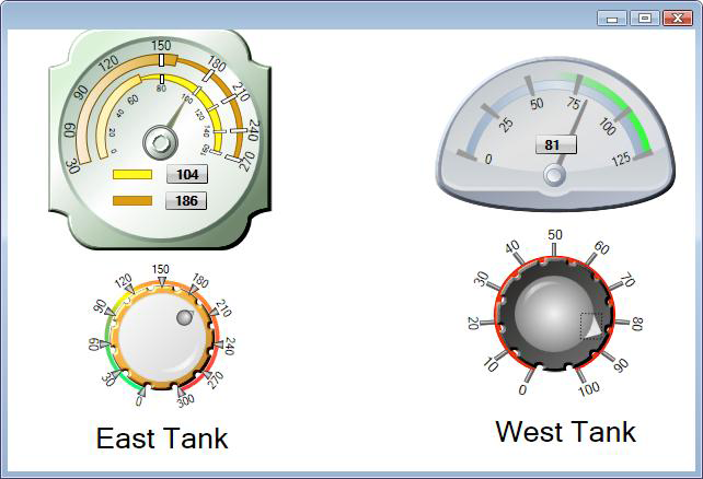
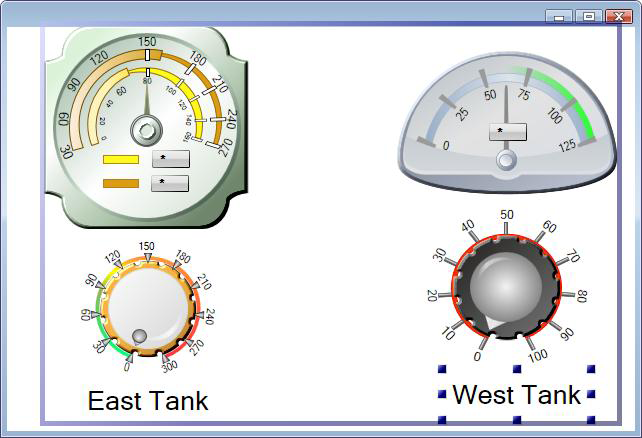
The Grid panel allows you to arrange objects into a 3x3 grid (Click here to see a sample). A given position can hold as many objects as you wish. By moving an object, you adjust that object's Row and Column properties (i.e. its position within the grid panel). By resizing an object, you adjust that object's RowSpan and ColumnSpan properties (i.e. its size relative to the grid panel). You can change the number of rows and columns within the grid panel -- as well as the order in which these rows and columns appear -- by right-clicking on the grid border. You can also specify the length type (Star Length Type, Pixel Length Type or Auto Length Type) for each row and column by right-clicking on the grid border. Properties: Use the object's Row and Column properties to specify the row (0, 1, or 2) and column (0, 1, or 2) in which the object is to be positioned. You can also specify the object's alignment within a position by using the object's HorizontalAlignment and VerticalAlignment properties. Use the object's RowSpan and ColumnSpan to set the total number of rows or columns that child content spans within the grid. These panels can also be edited manually by clicking and dragging the horizontal and vertical lines within the Grid panel. The Grid panel now features section dividers or combinations of lines and triangles that demarcate the borders between adjacent rows and columns within a given Grid pane. If the grid feature is enabled (via View > Grid/Ruler > Show Grid), the dividers will become and remain aligned to this "canvas grid" unless the user holds down the ALT key while performing the above operations. |
|
|
The Dock panel docks objects to the top, bottom, left, and right edges of a panel. When you add an object to a Dock panel, the object appears in the center of the panel. But as soon as you add a subsequent object, the first object is docked to the left edge (by default). |
|
|
A Wrap panel adds objects one at a time in the first vertical row or column, and when that row or column is filled it moves to the next row or column. To change an object's location in the wrap panel, click and drag the object to a new position, or move it up or down in the list in the project Explorer. |
|
|
A panel that manages objects inside a square grid. As you add objects, the panel maintains a square grid shape, expanding the grid without expanding the panel itself. With the first object, the grid is 1x1; with the second object, the grid becomes 2x2; when that grid is full, it expands to a 3x3 grid, and so on. For an example, refer to Uniform Grid Panel Example. To change an object's location in the uniform grid, click and drag the object to a new position, or move it up or down in the list in the project Explorer. |
To add a simple panel to a display:
Click the Panel tool icon then click the icon for the type of panel you desire.
On the display's work surface, click and drag to draw the panel size.
While the panel is selected (it is surrounded by a blue box), add objects to it; the panel adds them in the position defined by the panel type.
Click on the panel's Properties tab to change any of its properties.
 |
Using a Scroll panel to create your display is handy if you need to create a GraphWorX display but don't have the real estate for the entire display at runtime; the Scroll Viewer creates a subset of the display that runtime users can use for scrolling. This panel is composed of a Scroll Viewer object and a Canvas object |
 |
When part of a display needs to support a variable viewing area in Runtime Mode, the split panel provides an excellent method of organizing this type of content. The vertical split panel places two grids side by side and includes a vertical splitter. You can drag this splitter left and right in both Configuration Mode and Runtime Mode to adjust the relative sizes of the grids that this split panel contains. |
 |
When part of a display needs to support a variable viewing area in Runtime Mode, the split panel provides an excellent method of organizing this type of content. The horizontal split panel places two grids side by side and includes a horizontal splitter. You can drag this splitter up and down in both Configuration Mode and Runtime Mode to adjust the relative sizes of the grids that this split panel contains. |
 |
Using a Scroll Stack Panel within your display is handy if you need to create a stack panel but don't have the screen real estate for the entire panel at runtime; the Scroll Viewer creates a subset of the stack panel that runtime users can use for scrolling. This panel is composed of a Scroll Viewer object and a Stack Panel object. |
 |
Using a Vertical Scroll Wrap Panel within your display is handy if you need to create a wrap panel but don't have the screen real estate for the entire panel at runtime; the Scroll Viewer creates a subset of the wrap panel that runtime users can use for scrolling. This panel is composed of a Scroll Viewer object and a Wrap Panel object with a Horizontal orientation (that supports vertical scrolling).
|
 |
Using a Horizontal Scroll Wrap Panel within your display is handy if you need to create a wrap panel but don't have the screen real estate for the entire panel at runtime; the Scroll Viewer creates a subset of the wrap panel that runtime users can use for scrolling. This panel is composed of a Scroll Viewer object and a Wrap Panel object with a Vertical orientation (that supports horizontal scrolling). |
Composite panels provide advanced ways of organizing collections of objects; they are intended for use by more advanced users because they are more complex than simple panels. As the name implies, composites are panels that are actually made up of several different panel types combined together, which you can see in the Explorer.
Most editing takes place on the inner-most child panel (that is, the Canvas, the Group, the Wrap Panel, and so on), so you need to "drill into" this child panel (via double-clicking, or the Explorer) before attempting to add child objects.
Composite panels are:
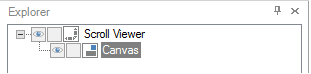
The Scroll Panel's Two Objects in the Explorer
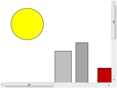
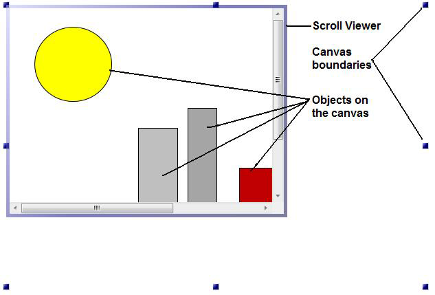
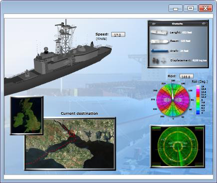
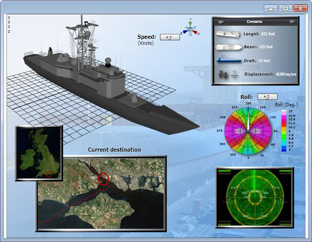
On the work surface, the Canvas panel has a Scroll Viewer that creates a scrollable region inside the display. Click here to see a sample Scroll Panel in Configuration mode or in Runtime mode.
To add a Scroll Panel to your work surface and create a display inside it, follow these steps closely:
On the GraphWorX64 Home ribbon, from the Shapes section click the Panel icon  , then the Scroll Panel icon .
On the work surface, drag the cursor to create a rectangle the size that you want the scrollable area to be. When you release the mouse button, the scrollable area displays as does the canvas, which has a default width and height of 800 and 600 pixels respectively. You can change the Width and Height properties for the Canvas and for the Scroll Viewer.
Note: For best results, always select the Canvas or Scroll Viewer by clicking on it in the Explorer; avoid trying to select them by clicking on them in the work surface.
To add objects to the display, first go to the Explorer and click the inner Canvas object. All objects must be added to the Canvas object.
Add the objects to the canvas and create the display.
After adding a split panel to a display, you can adjust its properties in the property grid. Some of the most useful properties include:
SplitterOrientation - Change the direction in which the splitter can move (Vertical orientation allows the splitter to move left and right; Horizontal orientation allows the splitter to move up and down). This setting effectively changes a vertical split panel to a horizontal split panel, or vice versa.
SplitterThickness - Adjust the size of the splitter. When set to Automatic (the default option), the splitter's interaction area increases when using the split panel on touch-enabled device to make it easier to adjust the panel's layout. The visible size the splitter remains the same regardless of device type, however, to preserve the layout of the grids on either side of the split panel's splitter.
PanelAutoScale - The default option (AutoScaleBothPanels) changes the size of both grids within the split panel by the same amount when the split panel itself is resized. By changing this setting to AutoScalePanel1, only the left-hand grid (or top grid) changes size when the split panel is resized; the right-hand grid (or bottom grid) remains fixed in size. Conversely, by setting the option to AutoScalePanel2, only the right-hand grid (or bottom grid) changes size while the left-hand grid (or top grid) remains fixed in size.
After adding a split panel to a display, you can adjust its properties in the property grid. Some of the most useful properties include:
SplitterOrientation - Change the direction in which the splitter can move (Vertical orientation allows the splitter to move left and right; Horizontal orientation allows the splitter to move up and down). This setting effectively changes a vertical split panel to a horizontal split panel, or vice versa.
SplitterThickness - Adjust the size of the splitter. When set to Automatic (the default option), the splitter's interaction area increases when using the split panel on touch-enabled device to make it easier to adjust the panel's layout. The visible size the splitter remains the same regardless of device type, however, to preserve the layout of the grids on either side of the split panel's splitter.
PanelAutoScale The default option (AutoScaleBothPanels) changes the size of both grids within the split panel by the same amount when the split panel itself is resized. By changing this setting to AutoScalePanel1, only the left-hand grid (or top grid) changes size when the split panel is resized; the right-hand grid (or bottom grid) remains fixed in size. Conversely, by setting the option to AutoScalePanel2, only the right-hand grid (or bottom grid) changes size while the left-hand grid (or top grid) remains fixed in size.
Using a Scroll Stack Panel within your display is handy if you need to create a stack panel but don't have the screen real estate for the entire panel at runtime; the Scroll Viewer creates a subset of the stack panel that runtime users can use for scrolling. This panel is composed of a Scroll Viewer object and a Stack Panel object.
Using a Vertical Scroll Wrap Panel within your display is handy if you need to create a wrap panel but don't have the screen real estate for the entire panel at runtime; the Scroll Viewer creates a subset of the wrap panel that runtime users can use for scrolling. This panel is composed of a Scroll Viewer object and a Wrap Panel object with a Horizontal orientation (that supports vertical scrolling).
Using a Horizontal Scroll Wrap Panel within your display is handy if you need to create a wrap panel but don't have the screen real estate for the entire panel at runtime; the Scroll Viewer creates a subset of the wrap panel that runtime users can use for scrolling. This panel is composed of a Scroll Viewer object and a Wrap Panel object with a Vertical orientation (that supports horizontal scrolling).
Windowed panels provide advanced ways of viewing collections of objects; they are intended for use by more advanced users because they are more complex than simple panels. As the name implies, window panels show contents inside of a window, allowing you to use familiar window-based commands (like Minimize, Maximize, and Close) to adjust the appearance of your display in Runtime Mode.
Most editing takes place on the inner-most child panel (that is, the Canvas or Group), so you need to "drill into" this child panel (via double-clicking, or the Explorer) before attempting to add child objects.
Window panels are:
The following table gives you an idea of the runtime features that are available with each panel. Use this to decide which type of panel to use.
|
Runtime Features: |
Scroll Panel |
Window Panel |
Scroll Window Panel |
Display Window Panel |
|
Scroll bars for scrolling |
Yes |
|
Yes |
|
|
Movable, resizable window |
|
Yes |
Yes |
Yes |
|
Incorporated .GDFX GraphWorX display file |
|
|
|
Yes |
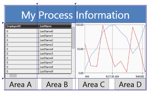
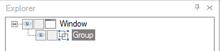
The Window panel has the appearance of a Window; runtime users can move and resize it. No scrolling is available with this panel; if you need runtime users to be able to scroll, use the Scroll Window panel described below, instead.
The Window panel is composed of a Window object and a Group object, which show up in the Explorer like this:
The Window Panel's Two Objects in the Explorer
Click here to see a sample Window panel in Configuration mode or in Runtime mode.
To add a Window panel to your work surface and create a display inside it, follow these steps closely:
On the GraphWorX64 Home ribbon, from the Shapes section click the Panel icon , then the Window panel icon  .
.
On the work surface, drag the cursor to create a rectangle that is the size of the window you are creating. You can change the Width and Height properties for the Window.
Note: For best results, always select the Window or Group by clicking on it in the Explorer; avoid trying to select them by clicking on them in the work surface.
To add objects to the display, first go to the Explorer and click the inner Group object. All objects must be added to the Group object.
Add the objects to the group to create the display.

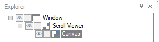
The Scroll Window panel has the appearance of a Window that runtime users can move, resize, and scroll in. Use this panel to create a Window panel whose content exceeds the window's size. The scroll bars allow users to see content outside the confines of the window.
The Scroll Window panel is composed of a Window object, a Scroll Viewer object, and a Canvas object, which show up in the Explorer like this:
The Scroll Window Panel's Three Objects in the Explorer
To add a Scroll Window panel to your work surface and create a display inside it, follow these steps closely:
On the GraphWorX64 Home ribbon, from the Shapes section click the Panel icon , then the Scroll Window panel icon .
On the work surface, drag the cursor to create a rectangle that is the size of the scrollable window you are creating. You can change the Width and Height properties for the Window and for the Canvas.
Note: For best results, always select the Window, Scroll Viewer, or Canvas by clicking on it in the Explorer; avoid trying to select them by clicking on them in the work surface.
To add objects to the display, first go to the Explorer and click the inner Canvas object. All objects must be added to the Canvas object.
Add the objects to the canvas to create the display.

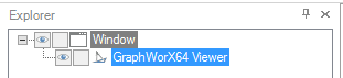
Use Display Window panel if you need to load a GraphWorX64 .GDFX display file into a window that runtime users can move and resize. This is the only panel that lets you incorporate an external GraphWorX file. Note that you cannot add any other type of object to this type of panel.
This panel is composed of a GraphWorX64 Viewer object within a Window object, which show up in the Explorer like this:
The Display Window Panel's Two Objects in the Explorer
Click here to see a sample Display Window panel in Configuration mode or see the window resized in Runtime mode.
To add a Display Window panel to your work surface and create a display inside it, follow these steps closely:
On the GraphWorX64 Home ribbon, from the Shapes section click the Panel icon , then the Display Window Panel icon .
On the work surface, drag the cursor to create a rectangle that is the size you want the Window to be. You can change the Width and Height properties for the Window object.
|
|
Note: For best results, always select the Window object or GraphWorX64 Viewer object by clicking on it in the Explorer; avoid trying to select them by clicking on them in the work surface. |
To add a GraphWorX64 display to the Window, first go to the Explorer and click the inner GraphWorX64 Viewer object.
On the Properties tab, scroll down to the Source property and click its ellipsis  button, then navigate to and select the GraphWorX64 display file you want to embed in the Window. Click Open. The display opens in the window.
|
|
Note: If you can't find the GraphWorX64 file you are looking for, consider the file name's extension. GraphWorX64 file extensions are explained in the Displays and Templates topic. |
See Also:

