|
|
The features on this page require a GENESIS64 Advanced license and are not available with GENESIS64 Basic SCADA . |
|
|
The features on this page require a GENESIS64 Advanced license and are not available with GENESIS64 Basic SCADA . |
Smart Energy AnalytiX is a Software as a Service (SaaS) product from ICONICS incorporating its Energy AnalytiX energy management, FDDWorX fault detection/diagnostics and KPIWorX self-service dashboarding tool technologies into a cloud portal-based subscription solution.
Smart Energy AnalytiX Executive Overview
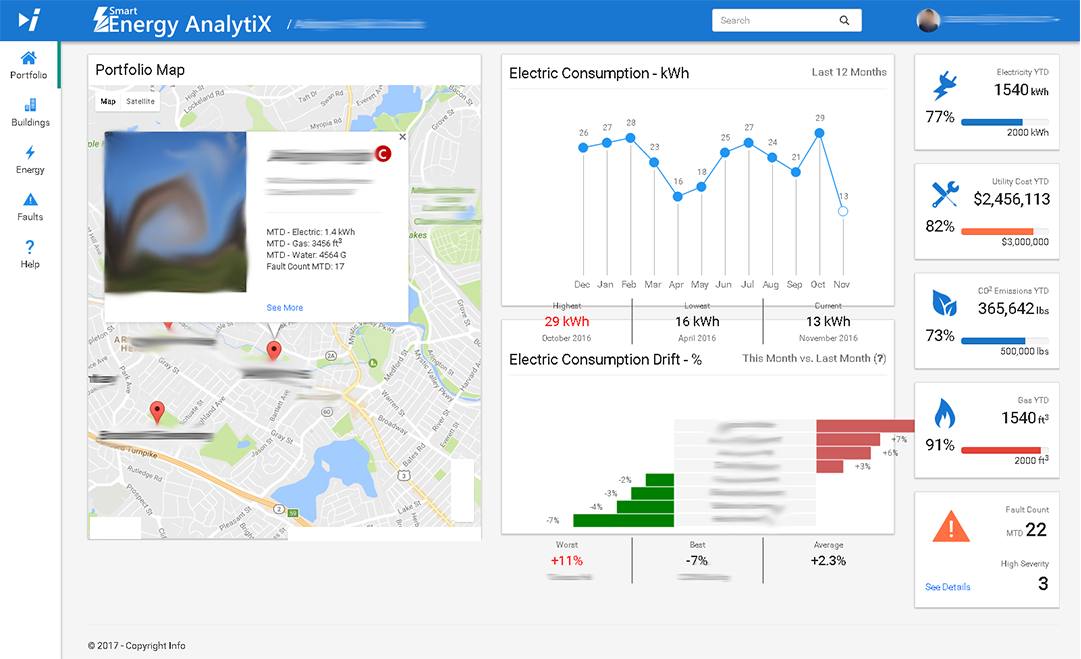
Smart Energy AnalytiX is useful within energy-smart building and facilities management applications. It targets customers' operation expenditure (OpEx) instead of capital expenses (CapEx), providing an inexpensive, subscription-based payment structure with lower deployment cost and time. Smart Energy AnalytiX is a fixed-feature solution that requires no customization and provides managed services for issue identification and resolution.
System Architecture
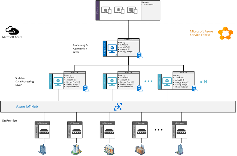
Configuration can be done using ICONICS analytics products, specifically:
Following configuration, users can access their Smart Energy AnalytiX portal through their selected cloud services provider, such as Microsoft Azure.
Access to the Smart Energy AnalytiX web page is granted through a basic login URL. After logging in, users will first be directed to an Overview page that contains pertinent KPIs and information based on user roles. For example, building owners and technicians could see different KPIs immediately after logging in.
Smart Energy AnalytiX Log In Screen
Once logged in, users will be able to see their content in a container-based layout, with left sidebar navigation and a fixed header. The container remains regardless of where users navigate within the portal. The left sidebar helps users to navigate to key areas of the portal such as Energy Analysis, Fault Analysis, Settings, etc. The top header displays important information such as alerts, a search bar, login/user info, product name, logo, etc.
Users can move around the portal primarily by using the left navigation sidebar for full page changes and the top tab bar for sub-page changes. Minimizing the number of pages and page refreshes helps to achieve a smoother, faster navigation experience.
Smart Energy AnalytiX Portfolio Page
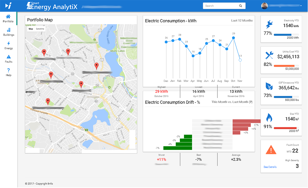
Some basic components at the Portfolio level can include a map with an organization's buildings marked, along with quick KPIs (for items such as consumption, fault count, etc.) an overall consumption counter and drift graphs.
For the map, a user can click on a marker to open an info box with specific details and links to drill into that building's individual info.
For consumption KPIs, users could select to see a portfolio-wide electric consumption graph (e.g., for the last 12 months), as well as quick KPIs on Max, Min and Avg.
A consumption drift can be included (e.g., showing comparison from last month to current month) for all buildings. A quick look can show which buildings are performing poorly in comparison to the previous month.
KPI tiles can show relevant values with progress bars that lead to a threshold. They can also show percentages that have already progressed.
A Buildings portal within Smart Energy AnalytiX can provide detailed information about a specific selected building. A Building Card on the left side of the page can show information such as the building name, address, grade, occupancy, etc. A Cost Graph can show full drilldown and multiple slicers/filters. A Faults Segmentation Graph visualizes fault segmentation with time slicers. KPI Tiles display additional relevant building data.
Sample Buildings Portal in Smart Energy AnalytiX
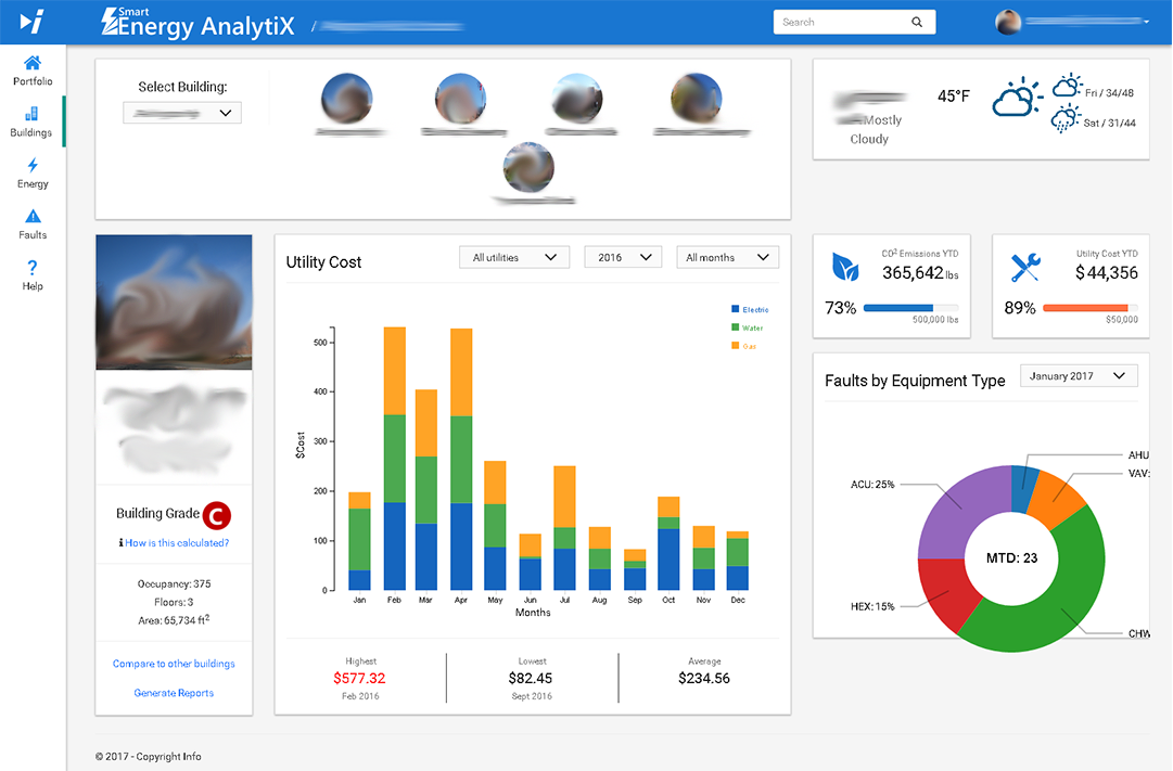
Cost Graphs help to visualize costs for the selected building. It can contain multiple filters to slice or filter the data based on a selected utility or by timeframe (e.g., year or month). The page requires no refresh as it can provide quick smooth graph updates. The Quick KPIs on the bottom of the graph reflect the Max/Min/Avg data as a user drills down or up. Tooltips containing cost information are displayed when a user hovers over each bar.
Faults Segmentation Graphs provide visualization of fault segmentation by equipment type. The data can be filtered or sliced by timeframe (e.g., monthly or yearly). This type of graph can immediately show which equipment type to pay attention to within a selected building. Labels and areas are able to transition smoothly upon data change.
KPI Cards can show current data values and can progress towards a threshold within a progress bar. The color of the bar can be set based on data value or directly by the user.
An Energy portal within Smart Energy AnalytiX can contain multiple tabs including:
Sample Energy Portal in Smart Energy AnalytiX
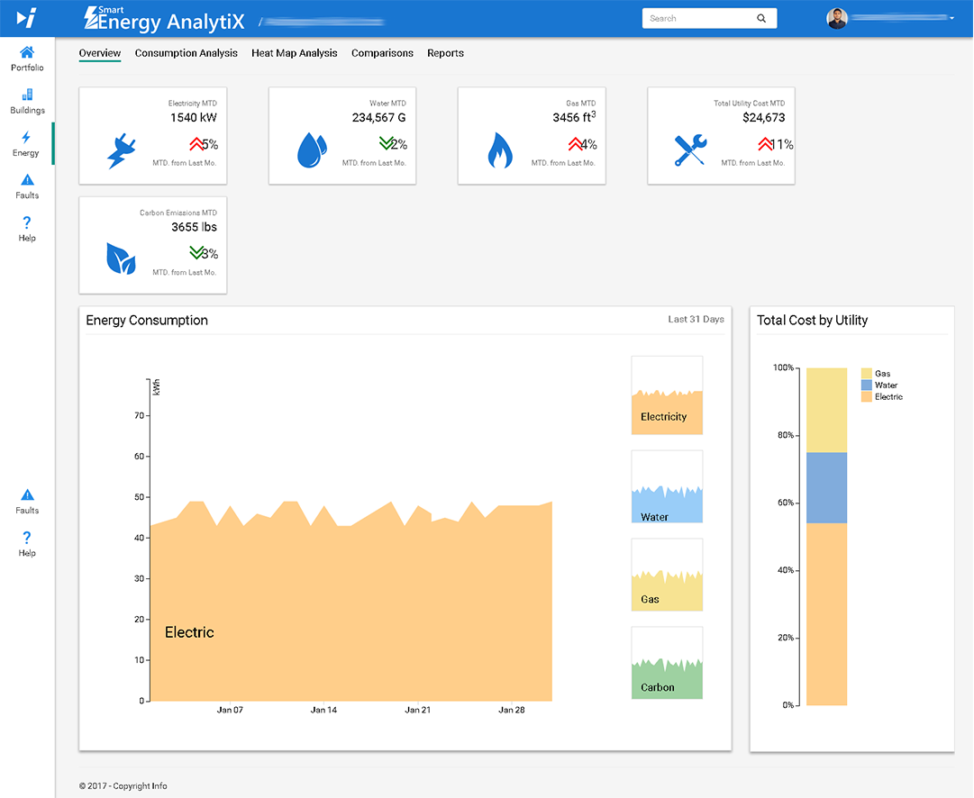
An Overview page in the Energy Portal can provide a quick view into overall energy consumption data. It also provides the ability to slice data via commonly used filter selections. Such filters can be related to building names, selected utilities (e.g., electric, gas, water), normalized data (e.g., raw summaries, normalize by square footage), and/or time intervals (e.g., today [by hour], this week [by day], this month [by week or day], this year [by month]). Filtering can be based on data content (with data displayed based on filter selection or based on building, utility or time interval). It can also be based on time series (e.g., data for a selected interval, data for a previous [related] interval [e.g., last year], average temperature for a selected interval or average temperature for a previous interval).
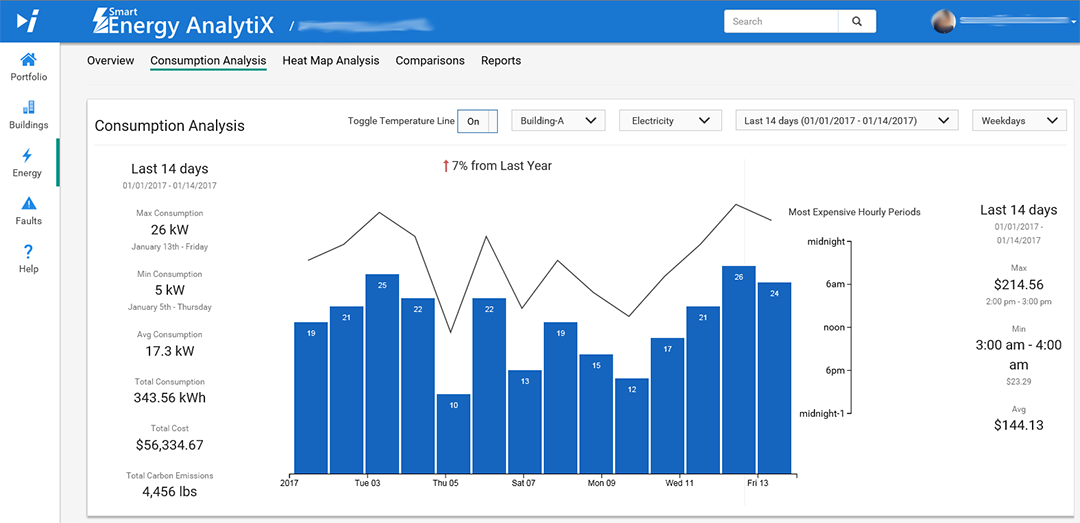
The Consumption Analysis tab can be used to analyze energy consumption details. Users can quickly identify areas or opportunities for improvement. Filtering within this tab can be based on building name, utility (e.g., electric, gas, water), day[s] (e.g., all days, weekdays, weekends), time intervals (today [by hour], this week [by day], this month [by week or day], this year [by month]), or analysis (heat map [hourly] analysis). Filtering can be based on data content (with data displayed based on filter selection or based on building, utility, time interval, or day[s] selection). It can also be based on time series (e.g., data for a selected interval or hourly-based heat map).
Sample Consumption Analysis Tab in Energy Portal in Smart Energy AnalytiX
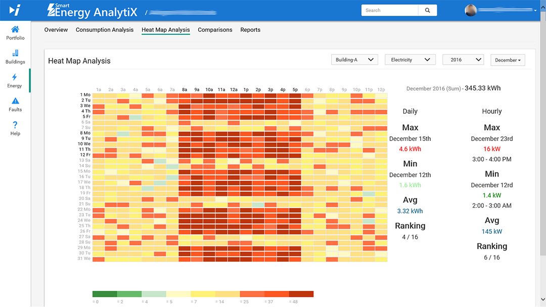
The Heat Map Analysis tab can be used to easily identify time periods of elevate energy consumption. Users can identify time periods to reduce energy consumption. Filtering within this tab can be based on timeframe, building(s), utility (e.g., electric, gas, water), or normalized variable. Filtering can be based on data content (e.g., a heat map of energy consumption by hour over a time frame can be displayed, or raw or normalized data as set by filter can be displayed).
Sample Heat Map Analysis Tab in Energy Portal in Smart Energy AnalytiX
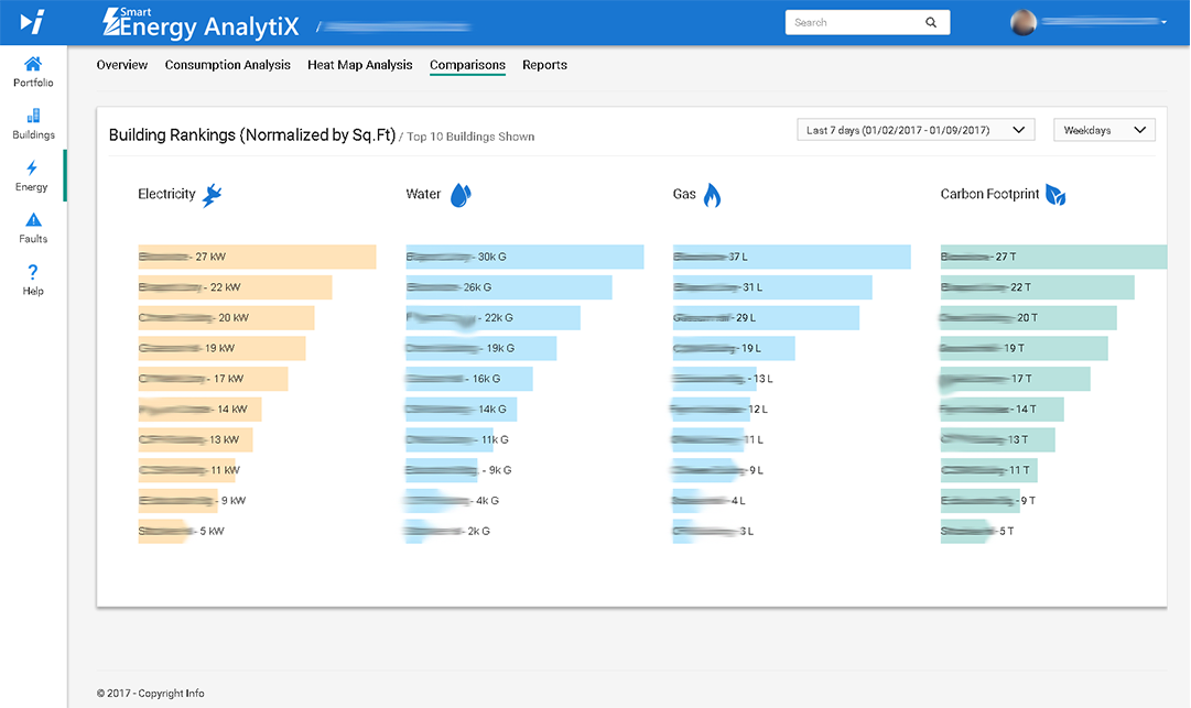
The Comparisons tab can be used to quickly compare and rank buildings in a portfolio. Users can utilize meaningful energy data comparisons based on normalized data to correctly rank energy efficiency. Filtering within this tab can be based on day[s] (e.g., all days, weekdays, weekends) or time intervals (e.g., today, this week, this month, this year). Filtering can be based on data content (with Top [N] building ranking data displayed based on filter selection or based on time interval or day[s] selection). It can also be based on time series (e.g., sorted consumption data, normalized by square footage, for each building).
Sample Comparisons Tab in Energy Portal in Smart Energy AnalytiX
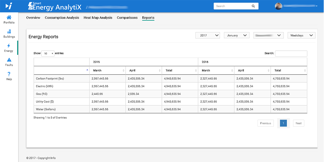
The Reports tab can be used for tabular reporting of energy data. Users will have the ability to export generated reports to .pdf, .csv, text files, etc. Filtering within this tab can be based on building(s), day(s) (e.g., all days, weekdays, weekends), years (e.g., last [#] years, multi-selection), or months (all [#] months [January, February, March, etc.] or multi-selection). Filtering can be based on data content (e.g., tabular data can be displayed based on filter selection, or time interval/day(s) selection, or multi-selection based on year and month. It can also be based on the ability to export to .pdf, .csv, etc.
Sample Reports Tab in Energy Portal in Smart Energy AnalytiX
A Faults portal within Smart Energy AnalytiX can contain multiple tabs including:
Sample Overview Tab in Faults Portal in Smart Energy AnalytiX
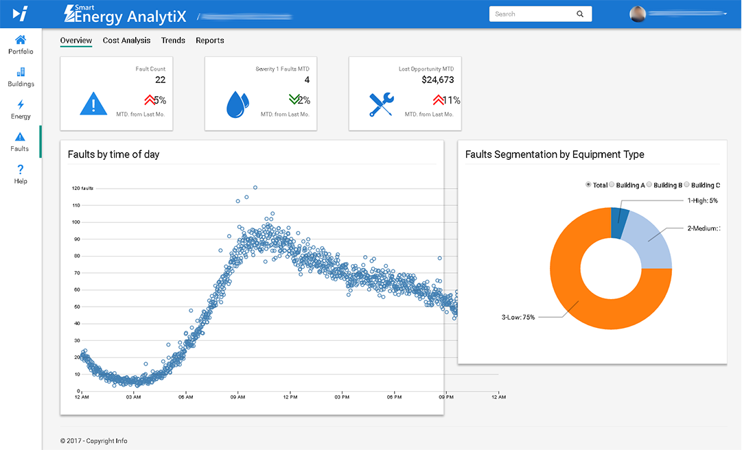
The Overview tab in the Faults portal in Smart Energy AnalytiX can KPI tabs covering data such as Fault Count (MTD from Last Month), Severity 1 Faults MTD (MTD from Last Month), or Lost Opportunity MTD (MTD from Last Month). It can also show larger charts such as Faults by time of day and Faults Segmentation by Equipment Type.
The Cost Analysis tab in the Faults portal in Smart Energy AnalytiX...
The Trends tab in the Faults portal in Smart Energy AnalytiX...
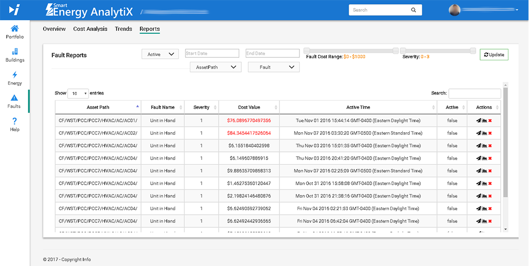
The Reports tab in the Faults portal in Smart Energy AnalytiX ...
Sample Reports Tab in Faults Portal in Smart Energy AnalytiX
See Also: