The Grid object has a large set of options that you can set. Some of these objects such as the data source and the assignment of columns are mandatory, as they set the nature of the data that you see in your alarm display. Other settings are optional, primarily the ones that affect how the data is displayed: setting for grouping data, applying a list of conditions, and displaying a set of status indicators. When you select a grid object in the configurator you see a dialog box with the grid's Source tab displayed.
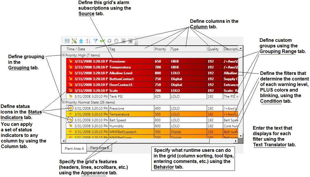
Each grid configuration has the tabs listed below, which create the runtime look and function of the grid. Click here to see a runtime grid and the tabs that contributed to its appearance. The following list provides a general sequence for using the tabs to configure a grid. The Advanced tab contains the grid's properties; many of these properties are set using the other tabs.
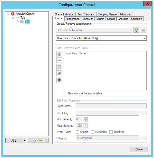
Source tab: Sources are described in Working with Alarms under the heading To configure an alarm source (an alarm subscription).
Appearance tab: Options found on the Appearance tab are described on the Appearance Tab topic.
Behavior tab: Options for allowing and suppressing runtime features, as well as certain display options such as tooltips and the number of data points in a grid are found on this tab. The important feature of alarm acknowledgement is controlled by a set of options found here as well. This tab is described in Behavior Tab below.
Column tab: The Column tab contains the data that your grid displays. You have control over certain properties such as title, width, and status indicators, as described in Column Tab, below.
Sorting Tab: The Sorting Tab
Details tab: The Details Tab
Grouping tab: Groups organize your alarms by values contained in the column that you group on. Multilevel groups can be specified. Grouping allows you to view your alarms in a display that provides an analysis function. For more information, refer to Grouping Tab, below.
Condition tab: Conditions define ranges of alarm levels for alarms at which the visual cues for warning runtime users change. Conditions and their uses are described in Condition Tab, below.
Status Indicator tab: Status indicators are icons that appear to the left of each alarm (on each row). They give a quick visual indicator of the trends in your alarms that you are seeing. See Status Indicator Tab, below, for more details.
Text Translator tab: Define text for each alarm condition. Refer to Text Translator Tab Options in AlarmWorX.
Grouping Range tab: Ranges allow you to create customized groups of alarms that can be used at runtime for grouping alarms. For more detail on ranges, refer to Grouping Alarms in Grids and Charts.
Advanced tab: Advanced options provide finer and more granular control over display properties. This tab is described in the Advanced Display Options topic.
You can click on the blue information button  in each tab for additional tips.
Click Here for information on how to set properties within the Source tab.
Click Here for information on how to set properties within the Appearance tab.
The Behavior tab for a grid is primarily useful for controlling what an operations an operator can perform on an alarm display at runtime. If the display developer want to lock down the display so that sorting, grouping, re sizing, and other operations are disabled, then the check box settings you see in the Behavior tab below disable this behavior at runtime. Use the table below to set the behaviors you desire for a grid. You can set these properties for any grid on a tab, or for all grids in a display using the two buttons at the bottom of the dialog box.
The Behavior Tab
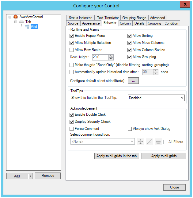
Behavior Tab Properties
|
Property |
Settings |
Description |
||
|
Runtime and Alarms Section |
||||
|
Enable Popup Menu |
Enabled/Disabled |
If selected, runtime users can right-click the grid to pop up a menu. The popup menu (or context) contains command that can acknowledge an alarm. Disabling this property suppresses the right-click display of a context menu. |
||
|
Allow Sorting |
Enabled/Disabled |
If selected, runtime users can sort alarms on the basis of individual columns. Sorts are accomplished by clicking on a column header as a toggle switch: once to ascend, a second time to descend. |
||
|
Allow Multiple Selection |
Enabled/Disabled |
If selected, runtime users can select two or more rows using the CTRL or SHIFT key. Users hold down the CTRL or SHIFT key while clicking the different rows they want to select. |
||
|
Allow Move Columns |
Enabled/Disabled |
If selected, runtime users can move individual columns by clicking and dragging the header right or left to another location. |
||
|
Allow Row Resize |
Enabled/Disabled |
If selected, runtime users can change the depth of rows by clicking and dragging on a row's edge. |
||
|
Allow Column Resize |
Enabled/Disabled |
If selected, runtime users can change the width of columns by clicking and dragging on a column's edge. |
||
|
Row Height |
Number of pixels |
The height of the grid's rows, in pixels. The default is 20. Setting this number too low can hide text from view in the rows. Setting it too high can take up extra space in the grid. You might need to raise the height, for example, if the icons you are using as status indicators do not fully display in the grid. |
||
|
Allow Grouping |
Enabled/Disabled |
If selected, runtime users can group data in the table by clicking and dragging a column header into the Group Header section. You can also create grouping using the Grouping tab described in this topic. Disabling the grouping feature also disables the groups you specify on the Grouping tab. |
||
|
Make the grid "Read Only" (disable filtering, sorting, grouping) |
Enabled/Disabled |
If selected, the grid become "Read Only", no longer allowing filtering, sorting or grouping actions. |
||
|
Automatically update Historical Data After nn Secs |
Enabled/Disabled, Number |
If the grid's source is alarm history, you can put a check mark in this check box to automatically refresh the data at runtime at a specified interval. Specify the frequency in seconds. Runtime users can always refresh the data manually using the Refresh button in the grid. |
||
|
Configure default client side filter(s) |
Activate Popup Window |
Click the ellipsis [...] button to open the 'Select a filter from the list' window. Click the
|
||
|
Tooltips Section |
||||
|
Show this field in the Tooltip |
Pulldown Menu |
Select any field so show its value as each alarm's tooltip. Fields are the columns you see in the grid. If you don't want tool tips to appear for the grid, select Disabled (which is the default). |
||
|
Commands on Events Section |
||||
|
Enable Commands on Events |
Enable/Disable |
The AlarmWorX64 Viewer is one of many controls that now supports executing commands on events. These events vary per control, but for the AlarmWorX64 Viewer they include: • Double Click • Middle Click • Right Click • Row Click (grid, list, or flip) • Row Selected (grid, list, or flip) • Sample Click (chart only) • Sample Double Click (chart only)
To configure the command to be executed when this event occurs, select your grid, list, or flip and go to the Behavior tab, or select your chart and go to the Axis tab. Find the Commands on Events section, check Enable Commands on Events, then select the Configure button.
This support for commands on events replaces the support added in version 10.95.4 to execute commands when selecting a row using the SelectionCommandColumnKey advanced property. |
||
|
Acknowledgement Section |
||||
|
Enable Double Click |
Enable/Disable |
Allows the operator to double click on an alarm at runtime to enter an acknowledgement into the Acknowledgement dialog box. |
||
|
Force Comment |
Enable/Disable |
Requires operator to enter comment when acknowledging the alarm if a specific condition exists. Once this box is checked, it will activate the 'Select comment condition' section, where you can set a condition so that the comment is forced to be entered only when the condition is met. For more information, refer to Configuring Filters for Alarm Grids and Charts. |
||
|
Always show Ack Dialog |
Enable/Disable |
Clicking this checkbox enables showing an Acknowledgment Dialog. |
||
|
Buttons |
||||
|
Apply to all grids in the tab |
Button |
Copies the selections on the Behavior tab to the Behavior tabs for all other grids in the tab. |
||
|
Apply to all grids |
Button |
Copies the selections on the Behavior tab to the Behavior tabs for all other grids in the viewer, regardless of the tabs on which they appear. |
||
When you select a data source for a grid (on the Source tab), you automatically populate the grid with all of the attributes that are defined for that data source. By default only the first six attributes appear as columns in the grid; using the check box to the left of each attribute on the tab (as shown in the figure below), you can select those that are to appear in the grid. As a general rule, you should include only those columns whose values provide meaningful information to the runtime users who will be viewing the grid.
The Column Tab for a Grid Object
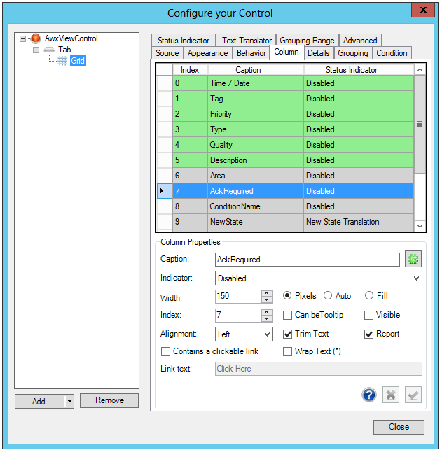
You can edit each column's heading (or Caption). If you are defining the grid for use in a multi-lingual setting, you can click the Caption's Browse Global Aliases [ ] button to open the Data Browser where you can use language aliases you have defined for individual column headings. (Language aliasing is described in the Language Support tab.)
Any column in the grid can have its own set of Indicators, which are icons that reflect changing values or conditions for an attribute. You can use the pulldown menu to select a predefined set of status indicators, or define a new set for use specifically with a particular column. For more information, refer to the discussion of the Status Indicator tab, later in this topic.
Alternatively, in the Status Indicator tab, you can use a text translation dictionary that inserts words instead of values into a particular column. For example, the Quality attribute typically displays numeric values that have little meaning for a runtime user; however, you can specify the Quality Translation dictionary that ICONICS has defined for you; insert it as the Quality attribute's Status Indicator so that descriptive words appear instead of numeric values. For more information, refer to Text Translator Tab Options in AlarmWorX. Note that you cannot use both text translation and status indicators for an alarm's attribute.
For Format, use the (0) placeholder for the original value when you want to format string values. Otherwise, you can use double or date time format. For additional info, see Custom Date Time Formats (https://msdn.microsoft.com/library/8kb3ddd4%28v=vs.110%29.aspx) or Custom Numeric Formats (https://msdn.microsoft.com/en-us/library/0c899ak8(v-vs.110).aspx).
You can also set the column's Width (in Pixels, Auto or Fill). If, on the Behavior tab, you specified that runtime users can resize columns, then the width you specify here is the default. Runtime users can change it.
You can set an Index number for the selected column by entering it in the text entry field or using the up and down buttons.
You can edit each column's text Alignment (Center, Left, Right or Justify) via the pulldown menu, as well as if you wish to Wrap Text for multi-line character display or Trim Text.
You can enable selected columns to show in AlarmWorX64 reports by making sure the Report checkbox is checked..
Note that if an attribute has a URL, you can enable it as a link for runtime users. Click on the "Contains a clickable link" checkbox to allow runtime users to click on the column and open an Internet browser for the URL. Once activated, you can enter specific Link text into the bottom text entry field.
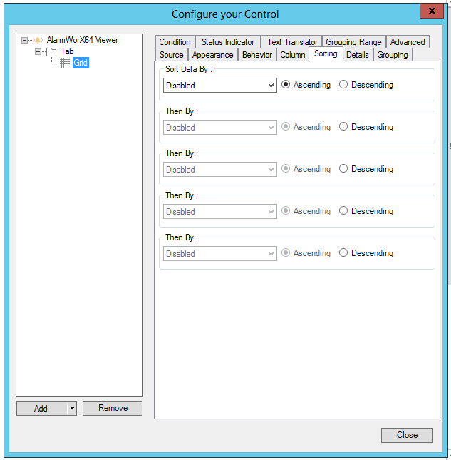
On the Sorting tab (shown below).
Grid Sorting Tab
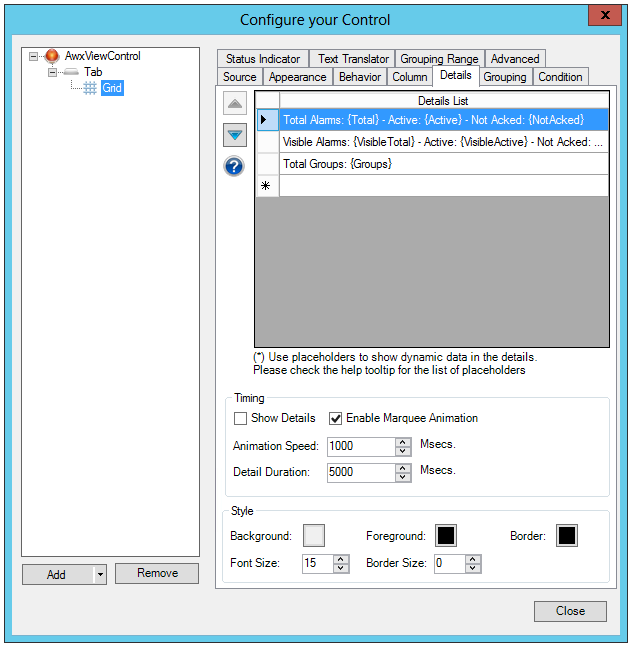
It is possible to specify a list of details which are visualized in the details panel below the grid. Each detail will be shown for a customizable amount of time (Detail Duration). It is possible to use an animation. Details are updated periodically when they are shown. It's possible to use placeholders or data tags in order to show dynamic data in the details.
This is the list of available placeholders:
Alarms count: {Total}
Active Alarms: {Active}
Active Not Acked Alarms: {ActiveNotAcked}
Active Acked Alarms {ActiveAcked}
Normal (Not Active, Not Acked) Alarms: {NotAcked}
Visible Alarms Count: {VisibleTotal}
Visible Active Alarms: {VisibleActive}
Visible Normal (Not Active, Not Acked) Alarms: {VisibleNotAcked}
Groups count: {Groups}
Active Filters: {Filters}
Time Range (for historical alarms): {Start} and {End}
Grid Details Tab
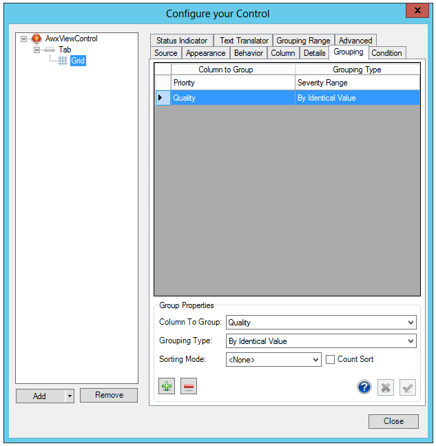
On the Grouping tab (shown below), you specify ways that alarms can be grouped or sorted in the grid. Alarms can be sorted based only on the fields and criteria you select.
Thanks to these Grouping capabilities, the grid can be simplified and organized so that, in the end, it is more easily readable by the operators. To group, it's necessary to select a Column to Group (used to group the rows) and a Grouping Type.
It's possible to group by identical values (for instance, all the rows that have the same value in the selected column will belong to the same group).
It's also possible to group objects by a user-defined Range. See the Grouping Range tab for more information about Ranges.
|
|
Note: Fields are grouped based on their values. You specify the ranges of values to be included in a group by using the separate Grouping Range tab. For example, for the Priority field, you might add all alarms with a priority 1 to one range, all alarms with priorities 2 through 5 to a second range, and alarms for all other priorities to a third range. Then you can use the group of ranges for prioritizing alarms in a grid. Ranges that you define on that tab can be reused from grid to grid in the viewer. |
It's also possible to combine multiple groups (i.e. group by Severity and by Date/Time). Users just need to add or remove rows from the grid on the right.
|
|
Note: Usually, groups on the same level are sorted by name. When the Grouping Range is applied, groups are sorted using their position within the Grouping Range. When the "Count Sort" checkbox is checked, groups are sorted by the number of items they contain. |
Two Fields in a Sequence Groups Alarms by Priority, then Quality
To define ways in which alarms can be grouped:
In the Column to Group cell, select the column you want to group or sort by. Note that all available attributes appear in the drop-down list, even those attributes that are hidden from the grid, so make sure you select the correct attribute. If you want to sort on an attribute that is hidden, do so with a purpose in mind.
In the Grouping Type cell, specify the group of ranges to be used for sorting the column. You can select a range that is provided by ICONICS (By Identical Value or Severity Range) or you can select a range that you defined using the Grouping Range tab, which is described in the topic Grouping Alarms in Grids and Charts.
The Sorting Mode pulldown allows you to sort by 'Ascending' or 'Descending' values (or 'None' for no sorting mode).
Click on the Count Sort checkbox to sort groups by the number of items they contain.
Repeat these steps for each field you want use for sorting alarms.
Use the Condition tab (shown below) to configure the visual cues that display for all alarms in the grid. To do this, you must specify a list of conditions under which an alarm appears normal and all levels under which the alarm escalates to warning and critical stages. Two predefined sets of conditions are already defined for you: Real Time Conditions and Historical Conditions. Both of these sets of conditions are read-only, and cannot be modified, but you can apply them to prototypes to see how they work.
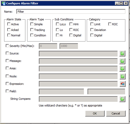
A condition is made up of a filter and a visual style. In runtime, if the filter is true for a row, then the related visual style is applied to the row. You can create as many conditions as you have filters and visual styles. When creating a new condition, you specify the values, the condition level's name, and how each condition appears in the grid's alarms at runtime.
A Grid Condition Tab Displaying Predefined Real Time Conditions
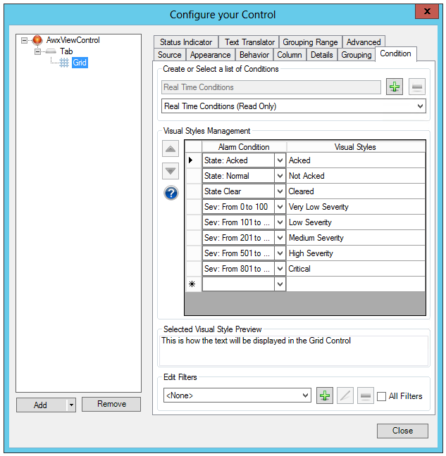
The second pulldown box allows you to set the type of conditions (Real Time Conditions [Read Only] or Historical Conditions [Read Only]). Clicking the  button allows you to add the Conditions according to your selection (Real Time or Historical).
Next, in the Visual Styles Management section of the Condition tab, if you double-click within any cell in the column and then click the ellipsis [...] button that appears, you will open the Configure the style dialog box, shown in the figure below. You can specify the way in which a alarm, when triggered based on the conditions you have specified, appears in the grid. The dialog box below shows the style used for the selected alarm condition.
Notice that you not only have control over text qualities and color, but you can also have alarms blink or set the properties so that your alarm beeps at various speeds (Slow, Normal or Fast) to signal the operator that an alarm condition exists. Look at the example above.
You can set a Blink Speed within these properties. Generally speaking, the more urgent an alarm is, the faster it blinks from the colors of its Normal State to the colors of its Blinking State. The rate of blinking can be Slow, Normal or Fast. To prevent the alarm from blinking when the conditions of the filter are met, you would select Disabled as the Blink option.
Users can also set an audio 'beep' within these same properties. The Beep Speed can be set similarly to the Blink Speed.
Users can now configure the AlarmWorX64 Viewer to make different sounds based on different conditions. Previously, all alarms had to use the same sound.
To configure custom sounds, configure your alarm viewer, select your grid, go to the Condition tab, edit the Visual Style for your condition, fill in the new Custom Beep File field, and specify a Beep Speed. The custom beep file can be a relative path (relative to the display file location) or a web URI.
Note that only one sound will play at a time. If more than one alarm with a configured sound is present, the alarm viewer will determine which sound plays by the order of conditions in the list. The topmost matching condition with a sound will be the one that plays.
Also note that alarms that do not match the current filter will not trigger sounds.
Users still have the option of overriding the default beep sound using the BeepFileLocation property of the alarm viewer. Conditions that have a beep speed, but no custom beep file will still play the custom BeepFileLocation sound.
The custom beep file field is not currently supported for the HTML5-based alarm viewer. It is supported in desktop (WPF) and Universal Windows Platform (UWP).
The 'Configure the Style' Dialog Box Where You Define the Conditions of the Visual Style

The Edit Filters section will allow you to edit the currently selected filter value. In this dialog box, you can modify filters, create new filter conditions, or delete existing filters. Filters are described in more detail in the topic Configuring Filters for Alarm Grids and Charts.
A grid also has a feature called Status Icons, which you set on the Status Indicator tab. Status icons are icon sets that appear in the left hand column. They give an operator a visual indicator of the trend in alarming. The icons swap in and out as an alarm's state changes. Shown in the dialog box below, status indicators can be any set of icons you choose: arrows, flags, faces, symbols, or a set you create. Icons should reflect the severity of the alarm conditions. For example, the icon for a severe condition should provide a signal to runtime operators that attention is needed. Icons are assigned to each condition of an alarm, letting you signal to runtime operators the worsening or improvement of an alarm's condition using visual cues. Status icons are a good way of providing a quick way for operators to gauge the conditions that they see on their display.
Status Icons on the Status Indicator Tab
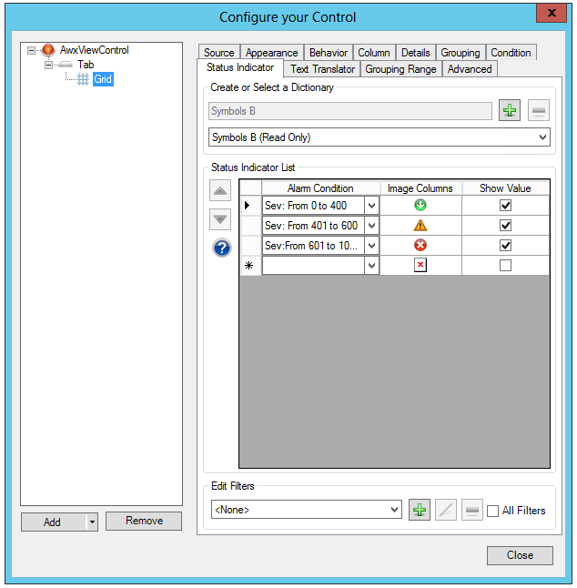
There are predefined sets of status indicators that you can use for your alarms. You can also create your own sets. Each set is called a dictionary. In the Status Indicator tab, you assign an icon to each filter (filters are defined in the Conditions tab, so make sure you filters are defined first). You also set each filter's Show Value check box which, when selected, in runtime shows the original value of the cell together with the icon.
You can define a different icons for each condition or filter. Click the pulldown menu in your selected Alarm Condition column cell to select the condition. You can use any alarm attribute to specify the condition, but it is likely that you will want to use the filters that you used in the Conditions tab. Next, click on the nearby Image Columns cell in the same row and you will be notified that you have the option to embed or reference the image. If you wish to embed the image, you can then proceed to locate your desired image file.
Go to the Column tab to apply the status indicator to any column.
There is also an Edit Filters section of the Status Indicator tab, where you can add (), edit ( ) or remove (
 ) filters.
Click HERE for how to set properties within the Text Translator tab.
Click HERE for how to set properties within the Grouping Range tab.
Click HERE for how to set properties within the Advanced tab.