Most simple symbols, like gauges, have varying but self-explanatory properties in Widget Settings. There is usually a property for the DataSource (which can be a tag name or a constant) along with other properties such as units, a subtitle, and high and low limits.
To create your own symbols for KPIWorX, see Adding Custom Symbols.
The alarm grid and alarm list components are both designed to display alarms and events, but in different ways.
The alarm grid shows the alarms in a table format, similar to the AlarmWorX64 Viewer control available in GraphWorX64. The alarm grid can do advanced filtering and sorting on the fly in presentation mode, can select an acknowledge multiple rows at a time, and export the list of alarms to CSV, TXT, HTML, or Excel format. These features require the context menu, usually accessed via mouse right-click or a long press.
The alarm list shows them in a condensed list. In general, the alarm list is easier to work with on mobile or touch devices due to the larger hit area. Alarms in the alarm list can be easily selected with a tap to see more information or acknowledge the alarm. The alarm list also has an optional quick search bar at the top, to help navigate a long list of alarms.
Both alarm components can show either real-time or historical alarms.
The DataSource for the alarm grid and list is the alarm subscription. It must be an OPC UA or Classic OPC AE data source, which can usually be found in the Tag Browser under Alarms and Notifications. You can either subscribe to an entire server (such as AlarmWorX64) or an area or tag underneath that server.
In the Widget Settings you can set the font family, size, and weight for the alarm grid and list. In addition, for the alarm list you can set how much padding is around each alarm cell, the background and font size for the detail view (what you see when you select an alarm), and the thickness and color of the border around the selected alarm.
To set the look of the rows in either the alarm grid or list, go to Widget Settings, select Alarm Styles, then select either RealTimeConditionList or HistoricalConditionList based on the type of alarms (real-time or historical) you would like to style.
In the Styles section, select the state of alarm you would like to style. You can select the foreground and background colors for alarms in this state, and optionally override the font size.
Note: The Key and Name fields for styles (both in the General section and on each individual style) are used internally. Do not edit these fields.
The map component allows you to place a set of symbols on a map at given coordinates. As data sources, the map takes a set of latitude and longitude coordinates, along with a measure. The measure is used as the data source for each symbol.
You can choose a Symbol from the General symbol category to display on the map. You can also choose a Size for your symbol, if you'd like to see it larger or smaller on the map.
To display a custom symbol, follow the instructions in Adding Custom Symbols, and be sure to save your symbol into the General category located in WebSites\AnyGlass\Projects\KPIWorX.
Map widgets that display data coming from AnalytiX-BI can benefit from on-the-fly filtering and limit the results to the top N items. See On-the-Fly Filtering and Aggregation with AnalytiX-BI.
By default, the map widget gets its map tiles from Bing. To change this, go to Widget Settings, to the Layers section, then select your layer (which by default will be named Bing). Change the MappingSystem property. You can choose from these mapping systems:
Bing
Esri
WMS
Each mapping system has its own additional properties that can be configured. For example, Esri maps can specify a tile type and a custom connection string.
Map widgets can have multiple layers. The most common use case for multiple layers is when you are getting layers from Esri maps.
To add an additional layer, select the add (+) button in the Layers section. You can then select the layer and edit its properties, such as the map source (see the Choosing a map source section).
To remove or reorder layers, select the edit  button in the Layers section. In edit mode, select a layer, then use the up or down arrows to move the layers in the list, or use the remove (-) button to remove the layer. Select the edit button again to exit edit mode and modify layer properties.
The map widget supports geofencing. The map can display the geofences and worker paths.
To show geofences, edit the map widget settings and enable Show geofences.
To configure worker paths, set the Symbol of the map widget to path. Map the Latitude, Longitude, and TimestampPathBinding properties to appropriate columns of your worker dataset and map the Measure column to the name or ID of your worker dataset.
See Geofence for how to create geofences.
The microchart is a simple view of a trend over time, designed to provide you with a glance of a trend's recent behavior. It does not have axes, labels, or a legend. The end (right side) of the microchart always represents the current time.
Note: For a more advanced trend viewer with more options, use a trend widget instead.
Note: The microchart and trend components do not have completely compatible properties. Swapping a widget between a trend and a microchart may cause it to lose some settings. To avoid having to reconfigure your trends you should decide at the beginning whether you'd prefer a full trend or a microchart.
Microcharts can contain multiple data series. To add a new series, drag a historical tag onto the microchart widget, or hit the add (+) button in the Series section of the Widget Settings.
Microcharts are best suited for displaying historical data, found in the Tag Browser under Historical Data. They can also trend real-time values, such as those from under Data Connectivity > OPC Data Access. Real-time values will always begin with no history when opening a dashboard or adding the series for the first time. Refreshing the page or loading a new dashboard will result in the clearing of the displayed history for real-time values.
Note: If you would like the history of real-time tags to persist, log the tag with a logger or historian, such as Hyper Historian, and add it to the microchart as a historical tag.
To remove or reorder a series, select the edit button in the Series section. In edit mode, select a series, then use the up or down arrows to move the series in the list, or use the remove (-) button to remove the series. Select the edit button again to exit edit mode and modify the series' properties.
The microchart itself has only two properties:
RefreshRate - The rate (in seconds) at which the microchart will refresh its data source. This also serves as the update rate for real-time tags.
Interval - The interval of time (in seconds) displayed by the microchart.
Each series has its own properties that define how it looks and behaves.
The general section define's the series' DataSource, parameters, and type.
The parameters for a real-time tag will usually be blank, but for a historical tag they define the aggregate used and other historical properties. For information on how to create a historical parameter string, see Create a Historical Parameters String.
The type defines how the trend is drawn, as a line, series of bars, etc. See Plot Types for more details.
The appearance section defines the colors and other settings for how the trend is drawn.
The samples section determines if and how the samples are drawn for line or similar chart types. To hide the samples altogether, set the type to none.
The first, last, maximum, or minimum samples can be distinguished by setting their color or size differently than the main samples. Expand the appropriate section, toggle the sample type to be visible, then set the color or size as needed.
For example, if you wanted to make it easy to spot the highest point on the trend you could expand the max sample section, toggle it to be visible, then increase the size and change the fill color to red.
Note: Deselecting visible for a specific type of sample (such as max sample) will not hide that sample altogether. It will simply make that sample use the configured style for all samples. It will be indistinguishable from regular samples.
Note: For bar and similar chart types, the style of these special samples will be applied to the bar that represents that sample.
Note: The first and last samples refer to where they are drawn on the microchart. The first sample is the one furthest to the left, and the last sample is the one furthest to the right.
The table component presents data in a tabular format. To map data you can either drag series into the dimension field under data in Widget Settings, or simply drag a dataset from the Tag Browser into a table component, or even an empty widget. (The default component for a dataset is a table.)
For example, you could create a table widget by opening the Tag Browser, browsing for Data Connectivity > Databases > SQL Server > Northwind > Data Sources and dragging Products into an empty cell.
To change the order of the columns in the table, use the  button in the dimension field to drag the data sources into a new position. You can use the X button in the dimension field to remove columns, and you can add new columns by dragging new fields from the Tag Browser.
If the source of the data is AnalytiX-BI, you can limit the results to the top N items. See On-the-Fly Filtering and Aggregation with AnalytiX-BI.
Also in Widget Settings, you can set the page size (the number of records per page) and configure the color and font size for the table header and cells.
To change the title of a column or its data format, go to Widget Settings, select the column in the Columns section, then set the caption and format fields.
The tree component can be connected to a selected networked hierarchy. By default when a database item that is typically connected with date/time columns is dragged and dropped into the tree control, it will automatically show the calendar. However, those same cells can now be changed to show a tree hierarchy instead. When used with drill-down data in an adjoining cell in a KPIWorX dashboard, you can then control the drill-down of the entire dashboard via the new tree control.
The tree widget can be connected to a column that contains a hierarchy. The two hierarchies currently supported are datetime columns and asset columns.
A datetime column visualized in the tree widget will show a tree with the year as the top level, followed by month, day of month, hour, etc.
The tree widget can control the drill-down of other charts. For example, a user can expand the year 2020 in a datetime widget, select the month of November, and other chart widgets on the dashboard will automatically drill down into November of 2020.
When the tree widget is configured to be one row high it becomes a bread crumb bar.
Example of Tree Control (Highlighted in Red) with Drilldown Data
The trend component displays a trend of real-time or historical values over time. It is designed to show more detail than a microchart, and should work similar to the TrendWorX64 Viewer control available in GraphWorX64.
Note: The microchart and trend components do not have completely compatible properties. Swapping a widget between a trend and a microchart may cause it to lose some settings. To avoid having to reconfigure your trends you should decide at the beginning whether you'd prefer a full trend or a microchart.
Trends are best suited for displaying historical data, found in the Tag Browser under Historical Data. They can also trend real-time values, such as those from under Data Connectivity > OPC Data Access. Real-time values will always begin with no history when opening a dashboard or adding the series for the first time. Refreshing the page or loading a new dashboard will result in the clearing of the displayed history for real-time values.
Note: If you would like the history of real-time tags to persist, log the tag with a logger or historian, such as Hyper Historian, and add it to the trend as a historical tag.
To remove or reorder a series, select the edit button in the Series section. In edit mode, select a series, then use the up or down arrows to move the series in the list, or use the remove (-) button to remove the series. Select the edit button again to exit edit mode and modify the series' properties.
In Widget Settings you can alter the StyleColor of the chart, toggle whether it starts frozen, or set the period (which is the length of time represented by the chart). You can also add more series or pens and configure the axes, legend, and summary, as described below.
Trend component can contain multiple series, and each series can contain multiple pens.
In the trend component, a series is a collection of pens. The only property of the series itself is its plot type, such as line, area, or bar. See Plot Types for more details.
Most users will use only a single series, but if you wish to use different plot types in the same trend you will need more than one series. To add additional series, use the add (+) button in the Series section of Widget Settings. To remove series or change their order, select the edit button in the Series section. In edit mode, select a series, then use the up or down arrows to move the series in the list, or use the remove (-) button to remove the series. Select the edit button again to exit edit mode.
Adding a new series will result in a series with a single pen in that series labeled unknown tag. You can either modify that pen to map it to a data source or remove it and add your own pen.
You can add a pen to a series by going into the Widget Settings for the trend, selecting a series and using the add (+) button in the Pens section, or dragging a tag from the Tag Browser. Tags dragged directly onto a trend widget will be added to the last series in the list, if there is more than one series.
To remove pens or change their order, select the edit button in the Pens section. In edit mode, select a pen, then use the up or down arrows to move the pen in the list, or use the remove (-) button to remove the pen. Select the edit button again to exit edit mode.
Note: There is no way to move a pen from one series to another. You must remove the pen from one series and add a fresh pen to the other series.
In the properties for a pen you can set the units and description (which are displayed in the legend, if visible), toggle whether annotations are visible (for more info about annotations, see <link>), and set its DataSource.
Note: The description is also used to name the pen in the Pens list under a series.
The parameters for a real-time tag will usually be blank, but for a historical tag they define the aggregate used and other historical properties. For information on how to create a historical parameter string, see Create a Historical Parameters String.
In the Pen Marker section, you can configure the marker that represents the "pen", which will be shown on the right-most side of the screen. This "pen" connects to the last known value for this series, as if it were an actual pen drawing the trend line on paper.
For real time pens, UseRealTimeInterpolation will tell the trend widget to generate intermediate samples for real-time data when no updates are received within the sampling interval period.
You can toggle the visibility of a pen from Widget Settings under Series section > your series > your pen > Appearance section > visibility. You can also uncheck the box for that pen from the legend when in presentation mode.
Invisible pens will remain present in the legend, and the user can check the box for that pen in presentation mode to make the pen visible again.
Users may want to be able to distinguish bad from good quality data in their trends. To alter the styles for different qualities of data, go to Widget Settings, under the Series section select your series, then select your pen.
In the Appearance section, the BadQualityPlotMode and UncertainQualityPlotMode properties determine how bad or uncertain quality should be plotted. The trend widget can either plot it normally, span over it (treat it as if the bad or uncertain samples did not exist, and the value simply did not change at that time), or leave a gap (do not draw a line or bar for those samples).
To set the style for good quality data, select Good Sample Style in the Appearance section. Here you can set the color, line thickness, opacity, and marker shape and size (if markers are used). Similarly in the Appearance section you can select Bad Sample Style to configure the same attributes for bad or uncertain samples (if those quality types are plotted at all, per the appropriate PlotMode setting.)
To change the range or period of the trend, go to Widget Settings, and change the period. You can also bring up the context menu (right-click or long press), select Periods & Rates to bring up the Edit Trend Period and Rates dialog, then change the Trend Period.
Also from the Edit Trend Period and Rates dialog, you can change these settings:
Summary Period - range of the summary view - see Working with freeze mode)
Sampling Interval - update rate for real-time pens, or the aggregate sample interval for historical pens
Animation Speed - the rate at which the trend is redrawn
History Read Rate - the rate at which the trend requests new samples for historical tags
To change the style and other properties of an axis, expand either the vertical axes or horizontal axes section in Widget Settings, then select your axis. You can add or modify the title (or label) for the axis, set the style of the grid lines, and give maximum and minimum values.
You can also hide or show the axes in presentation mode by bringing up the context menu (right-click or long press) and selecting Hide Axis or Show Axis.
You can swap the horizontal and vertical axes presentation mode by bringing up the context menu (right-click or long press) and selecting Swap Axes.
To hide or show the legend, go to Widget Settings, expand the legend section, and toggle the show property. You can also do this from presentation mode by bringing up the context menu (right-click or long press) and selecting Hide Legend or Show Legend.
In Widget Settings, you can change what side the legend appears on by changing the dock setting.
You can change the size of the legend by altering the size property in Widget Settings, or go into presentation mode and drag the border between the legend and the graph.
To change what columns are visible, choose a set from the columns property list in Widget Settings.
In presentation mode, you can change the sorting of the pens in the legend by selecting a header. You can toggle each header to be sorted ascending, descending, or not sorted. You can also toggle the visibility of a pen by checking or unchecking its entry in the legend.
To enter freeze mode, either go to Widget Settings, to the Data section, and toggle frozen, or bring up the context menu (right-click or long press) and select Freeze.
When frozen, the trend will not update with fresh data samples, and the user is allowed to scroll or zoom around the trend to look more carefully at past data.
Note: To force a frozen trend to update, bring up the context menu and select Refresh. Refresh will force a historical refresh even when the trend is not frozen. This may be useful if you have a very long update rate.
If configured, the summary view appears when the trend is frozen. Summary view is a wider view of the trend, designed to let the user more easily scroll through the history and find a point of interest. To toggle whether the summary view appears, go to Widget Settings, to the Summary section, and toggle show.
Also in the Summary section, you can set the dock position of the summary view, and its size.
To scroll in summary view, select and drag the selected area in gray. This gray zone represents the area depicted in the man graph. You can also widen and shorten the view window by dragging the edges of the gray area.
Note: The overall range of the summary view will also change when the view area is widened or shortened.
Note: While summary view can be viewed in edit mode, you must be in presentation mode to scroll or change the view area.
To change the range or period of the summary view, bring up the context menu and select Periods & Rates. In the Edit Trend Periods and Rates dialog, change the Summary Period.
You can also jump to a specific time in a frozen trend by bringing up the context menu and selecting Set Time.
In freeze mode, you will see a cursor appear. When the cursor is dragged, a tooltip will appear to show the specific values of the pens at that position. To hide the cursor, bring up the context menu and select Hide Cursors.
To zoom in on a particular area of the trend, go into presentation mode, then bring up the context menu (right-click or long press) and select Start Zoom Mode. Once you are in zoom mode, select and drag to highlight an area of the trend. When you are done dragging, the viewer will zoom to that trend.
To return to the default zoom level, bring up the context menu and select Stop Zoom Mode.
Note: Zooming works when the trend is both frozen and unfrozen.
Note: While you can enter or exit zoom mode from edit mode, you will not be able to drag to select a zoom area. It is recommended to only start zoom mode when you're already in presentation mode.
If your data includes operator comments, you can view them bringing up the context menu (right-click or long press) and selecting Show Operator Comments. You can hide them again by selecting Hide Operator Comments from the context menu.
Note: You cannot add operator comments to a historical pen from the KPIWorX trend widget. For more information on how to add operator comments, see Legend Options for Trend Charts.
To get a CSV export of the displayed data in the trend widget, bring up the context menu (right-click or long press) and select Export. The text Data exported will appear in the upper left corner of the trend, with a download arrow, as shown below.
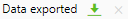
Select the download arrow to download a copy of the CSV file. Select the X to dismiss the message.
There are three components that can apply filters to other widgets on the page, when data is coming from AnalytiX-BI. See On-the-Fly Filtering and Aggregation with AnalytiX-BI for more details about filtering.
The filter widgets can only be interacted with in presentation mode.
The filter control presents a list of items that the user can choose from. Drag an AnalytiX-BI data source onto the widget or the dimension property in the Widget Properties.
To force only one item to be selectable at a time, set the selection mode to be SingleSelection.
To allow multiple items to be selected, use either MultipleSelection or ExtendedSelection as the selection mode.
With MultipleSelection, selecting a new item adds it to the list of selected items. To deselect an item, select it a second time.
ExtendedSelection works similarly to many desktop multi-selection lists. It acts like SingleSelection except when the Ctrl or Shift modifier keys are pressed down. With no modifier keys pressed, selecting a new item will clear any existing selection. Holding down Ctrl and selecting an item will add it to the list of currently selected items (or remove it, if it was currently selected). Holding down Shift and selecting an item will select all items between this selection and the last selection.
When should you use MultipleSelection versus ExtendedSelection for multi-select lists? If any of your users will be touchscreen devices, you almost certainly will want to use MultipleSelection, because touchscreen users will not have easy access to the Ctrl or Shift keys needed for ExtendedSelection. If you expect your users will need to select multiple items in a row you may want to use ExtendedSelection to allow them to use the Shift modifier, but be aware that touchscreen users may not be able to multi-select using this widget.
You can use the context menu (right-click or long press) on the filter control to Select All items, Invert Filter (swap the selected and deselected items) or Clear Filter (deselect all items).
The calendar control can operate in two separate modes, range mode and preset mode. Both modes allow the user to filter the current dashboard based on a date range.
Preset mode presents a list of preset date ranges such as Last 7 Days or Week to Day (the current week up to today). In presentation mode, the user can choose from this list to apply that filter.
In range mode, a calendar is shown. The user can choose either from or to at the bottom, then choose a date to modify that end point of the range. The currently selected endpoint (from or to) will have a colored bar on top of it so the user can identify which endpoint they are modifying.
In Widget Settings, the user can choose which mode to use by changing the mode property. PresetsAndRange will show tabs so the user can choose which mode they would prefer to use when in presentation mode. When using PresetsAndRange, choosing Custom Range from the Presets tab will switch the user to the Range tab. Choosing any other preset and switching to the Range tab will show the user the current range, but not allow them to change it. (Go back to Presets and choose Custom Range to change it.)
The DateTimeFormat property determines the date format shown in the from and to sections of range mode.
Only values of type date or datetime can be chosen for the calendar control.
The user can use the context menu (right-click or long press) of the calendar control to Clear filter.
The range selector is for choosing a range within a set of numerical values. Once a numerical data source is mapped it will populate a line with the maximum and minimum values found. In presentation mode, the user can drag the start and end points along the range of values to define a range within the max and min.
The user can use the context menu (right-click or long press) of the range selector control to Clear filter.
This widget has no properties aside from the data source (called, dimension).
You can add the System section to your Component Library by going to Settings > Symbols and selecting System. These components can be used to replace features that are normally part of the KPIWorX page header, and can allow access to them in case the header has been hidden.
The three system widgets are Login (allows the user to log in, and displays the logged-in user name), Mode (toggle between presentation and edit mode) and Navigation (open the navigation panel). These widgets only have one property, which is their foreground color.