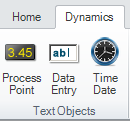
Process Points, Data Entry, and Time Date objects are three variants of a dynamic object type called Text Objects. You can create any of these three objects from the Text Objects section of the GraphWorX64 Dynamics ribbon.
Process Points and Data Entry objects have nearly the same features - they are Text Label shapes that have a Process Point dynamic assigned to them. However, there is one property on their Dynamics tab that makes them distinct, and it is the DataEntry property:
A Process Point is (by default) a READ-only object that is meant to display static or dynamic data. Its DataEntry property is, by default, set to False.
A Data Entry object is a WRITE-able object that is intended to accept input from runtime users. Its DataEntry property is, by default, set to True.
On a GraphWorX design surface, these two objects have one visual difference: a Data Entry object has an outline, while a Process Point does not. This default characteristic is on the objects' BorderThickness property on the Properties tab.
|
|
Note: The third Text Label object is the Time Date object, which is a Text Label shape with a TimeDate dynamic assigned to it. It has some special property assignments that make the display of date and time data more convenient. Otherwise Time Date objects aren't much different than Process Points or Data Entry objects. For more information, refer to Time and Date Text Labels. |
A Process Point is typically used to show variable data in GraphWorX64 displays. It is meant primarily for display or output. Among the common uses of Process Points are:
To display the current state or value of a data source based on an OPC tag.
To display a state.
To display a text string based on a static assignment, the result of a text calculation, or the current assignment of an alias .
To provide the output of an expression or calculation.
By comparison, a Data Entry object is meant to allow user interaction. Among the uses of Data Entry objects are:
To allow a state or value to be chosen and applied to a variable or tag.
To change a global alias, local alias, or language alias assignment.
To select one of a group or collection of states to alter display behavior in some way.
To create a Process Point or Data Entry object:
Click the Process Point or Data Entry button shown in the figure of the Text Objects section of the GraphWorX64 Dynamics ribbon.
Click the design surface to create a default-sized object, or click and drag the size of the object you want to create on the design surface.
Use the Process Point's Dynamics tab to set the data source and change the dynamic's properties as needed. Note that the properties that appear on the tab may be limited by the application mode you are using; refer to Configuration Modes for more information.
Use the object's Properties tab to change the object properties as needed.
The default values that you see for a Process Point or Data Entry object's Properties tab and the objects' Process Point Dynamics tab are set on the Preferences tab; for more information, refer to Preferences.
In most instances, the properties exposed in the Standard Configuration mode is sufficient for nearly all displays you might create. The fundamental properties that you need to work with are the data source assignments, whether the Data Entry is allowed (True) or not (False), and whether these labels are selected or displayed as a set or collection of states. In this section, you will find some examples of static and variable assignment for data sources. In the section that follows the concept of State selection and display is described.
The Properties pane for a Process Point or Data Entry object are nearly identical, and both let you control the way the object is formatted and appears on the screen. As you see in the figure below the Properties pane contains Common settings for the object name and a description, line and fill settings, the text displayed at runtime (Content Text property), measurements, and font characteristics. Advanced Configuration mode adds settings for tab order position, locked, visible, focusable, enabled, and other properties.
Process Point Properties Pane in Standard Configuration Mode

The Property pane settings are important, of course, but the main settings you need to define for PPT and DE objects that make them functional are found on the Dynamics tab. An example of the Process Point Dynamics pane in Standard Configuration mode is shown in the figure below.
A Process Point Dynamics Pane in Standard Configuration Mode

Of course, in Advanced Configuration mode many more properties are displayed. But for the vast majority of PPTs you only need to set the values in this mode. This is one area where knowing too much can also get you into trouble. In Advanced mode there is a setting that defines the way data is handled from the source: the ShowDataTypeAs, which has a default type of Object (Native Type). If you know that the OPC tag is set as an 8-bit value (for example) you might be tempted to go and change the ShowDataTypeAs to something else, perhaps 8 bit Integer. However, in 99% of the cases leaving the default value as Object (Native Type) works correctly and should not be changed.
|
|
Warning: Do not change the ShowDataTypeAs property in the Dynamics pane for a PPT or DE from Object (Native Type) unless you are certain that this assignment will work correctly. |
To illustrate how Process Points and Data Entry objects work with variables and tags let's consider a few examples. In the figure below from top to bottom a Data Entry object, Process Point, and a Circular knob was added to the design surface.
To create a label using a Process Point:
Leave the PPT DataSource properties on the Dynamics pane blank.
Set the Text property of the Contents section of the Properties pane to I am a PPT Label
The PPT object displays the text I am a PPT Label both in Configuration and Runtime modes.
To set a Process Point to a data tag, alias, or other variable value:
Click the Ellipsis button  in the DataSource property of the Dynamics pane and select the tag, alias, simulation, or expression that you desire from the Data Browser as shown below. The Data Browser formats the variable correctly for you.
Or enter the variable into the DataSource property directly.
A Simulation Chosen from the Data Browser

To get a sense for how a variable is handled, in the figure below the three different objects have had their data source set to the value localsim::var1. The circular knob's triangular indicator has a rotation dynamic assigned to it, and that rotation dynamic's data source was assigned to localsim::var1 as well. The local simulator for var1 is declaring a variable that can be written to or read from. The figure below is shown at runtime, and what you observe is that if you click and drag the knob around the values in both the PPT and DE change accordingly. A value of 22 on the knob shows up as 22.00 (that is the number format that is the default) in the PPT and DE objects. You can click in the Data Entry object, but not in the Process Point object. When you click in the DE and change the value to 53 the PPT and the indicator on the circular knob both change to reflect the var1 value of 53.
An Example of Using a Variable with a PPT and DE Label

Localsim is a local simulator that can store a single value, but you could just as easily changed the tag to reflect an OPC data source that varies over time (or could vary over time). To assign an OPC data tag go to the DataSource property of the three different objects and assign them an OPC tag you would go into the Data Browser and locate the tag which will have a format similar to the following:
@\\ServerName\OPC_Server.Simulator.1\SimulatePLC.Ramp3.Value
If you assign a tag that has variable values, then what you find at runtime is that the Process Point, Data Entry label and Circular knob displays the value of the tag as it changes over time. You also find that the Data Entry label displays the value of the tag but has grey text and cannot get the focus of action (be edited). This assignment changes the Data Entry label to a READ-only state. Many OPC tags show a single value or state, and in that instance the assignment of the three objects above to a tag similar to the one:
@sim64:Double.Static("Static1").Value
ends up returning you to a similar condition to the one you saw earlier for the variable assignment localsim::var1; except with the above assignment you are now storing the variable value into an OPC tag value, albeit one that is a static value.
In many instances you want to be able to assign Process Points, Data Entry labels, and other dynamic indicators of values in a GraphWorX64 display to one of a set of different values. If there was only two values: on and off, 1 or 0, True or False, then that would be a Boolean assignment. You can assign a Toggle dynamic to create that kind of switch. Toggles are indeed more general in GraphWorX64 as you can assign two arbitrary states and even set one to be active or not. When a toggle is in an inactive state the default value of the control is used.
GENESIS64 uses the concept of a state and an associated collection of values to define a multi-state toggle. If your collection has the following values: 0, 15, 40, 50, 75, and 100 then every time you clicked the switch you would move through the order sequentially, returning to the first state after you left the last state. For example the sequence would be 50, 75, 100, 0, 15, and so on. You can use states and collections with PPTs and DEs, and the construct is even more powerful because you can use the DE to select a state from the collection and then have either the value of the state show in the PPT, or a string that is assigned as a function of a range setting. You might have 0 translated to off, 15 to Low, 50 to Half, 75 to High, and 100 to Full. Let's take a look at how this is implemented.
To use a state assignment with a Data Entry label:
Create a Data Entry label and a Process Point and set both of these objects' DataSource property to our old friend localsim::var1; which is a declared variable.
Since the Data Entry label is editable, it will have a property for DataEntry set to True.
Click once on the StateField property to turn it to True; then click on the Ellipsis button in the Collection property to define your set of values or states.
When you open the Collection property the Edit Process Point States dialog box appears as shown in the figure below.
Click the Add button and begin to add your desired states. In the figure the states 0, 15, 40, 50, 75, and 100 were added and those values were assigned in both the StateValue and StateText properties.
Although values were used, you could just as well set the StateValue to OPC tags, aliases, or another variable value. The StateText is the label given to the state. You can also set behavior so that the text changes color if the state is enabled.
Edit Process Point States Dialog Box

Go to the Process Point Dynamics and set the StateField to True, then click on the Collection button and enter the following values for the states' StateValue and StateText values: 0, Closed; 15, Low Low; 40, Low; 50, Half; 75, High; and 100, Open. The DataEntry property for a PPT is set to False and should be left in that conditions.
The figure below shows you the Data Entry label's Property pane in Standard Configuration mode.
Data Entry Dynamics Pane in Standard Configuration mode

Drag a circular knob from the Symbol library, select its indicator knob; then set the DataSource to localsim::var1, and its LowLimit to 0 and the HighLimit to 100.
Go into runtime, the figure below shows the act of selecting a state in the Data Entry label and the text displayed in the Process Point above.
A State Assignment at Runtime

As you make selections in the DataEntry label the new text is displayed in the Process Point and the Knob rotates to the correct position. To illustrate the similarity between DE and PE, if you go to the DataEntry property for the Process Point dynamic and change the DataEntry property to True, you can now set the value from within the Process Point and you get the StateField and Collection values showing as their StateText text strings.
A Data Entry Within a Process Point Assigned to a State Value

Let's now consider the Circular Knob's action and its impact on both the DE and PPT labels. The knob comes out of the Symbol library as an analog dial, and has its DataSource change to localsim::var1 and range set between 0 and 100. The figure below shows the Dynamic pane of the knob's Rotation action as it is modified to work as above. At runtime you can move the knob position anywhere on the dial and change the value of the localsim::var1. Since this is now a StateField and uses a collection the only positions that show up in the DE or PPT labels are the 0 point and the 100 point, because those are the two positions in which it is possible to exactly place the knob to get two decimal place accuracy of the var1 value.
Analog Knob Settings

What we want for a StateField assignment is to have the knob constrained to the values that are part of the collection. There are two ways to do this:
As a Discrete Switch. To make a dial that is really a switch you would remove the Rotation dynamic. Then create different images of the knob in the positions you want to illustrate (0, 15, 40, 50, 75, and 100). Center all of the copies and then define a Toggle action that displays the appropriate image in the sequence each time you click it.
As a Click Knob. This approach works by constraining the knob to integer values so that you can place the knob in the position you want by simply dragging it there. The discussion below illustrates a click knob.
To create a click knob:
Select the knob Rotation Dynamic and change the AnimationMode to Analog, if necessary.
The DataSource should be assigned to localsim::var1.
Set the Dial property to True; this allows the knob to be rotated.
The LowLimit assignment is 0; and the HighLimit assignment is 100.
Switch to Advanced Configuration mode by selecting that mode from the Application Mode drop down menu in the Misc tab group of the View ribbon.
Set the DetentType to Delta Value, the DetentValue to 5, and the DetentOrigin to 0.
Setting Detents or Steps for a Click Dial

Go into runtime and click and drag the knob to the different positions. The only positions available are in increments of 5, and whenever you reach one of the defined members of the collection the value for that member appears in both the PPT and DE labels.
The detents could have been defined as a Number of Detents, and then that number set to 20 and you would observe the same behavior. At values that are not part of the collection nothing is displayed in the PPT or DE labels. Had you assigned the number of 100 to the Number of Detents the knob would click to each integer value (0, 1, 2, ..., 99, 100) on the dial. A runtime setting is illustrated below.
Click Knob at Runtime

See also: