If you want to manipulate a set of objects as a single object you can group them together. Whereas each individual object has its own bounding box, a grouped set of objects display a single bounding box. In the Explorer, the group is shown as one object. A group can contain one or more objects and groups inside it.
Ungrouped Objects (Left) vs. Grouped Objects (Middle) and Their Appearance in the Explorer (Right)
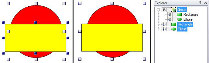
In the figure above, the Rectangle is in front of the circle and is selected; the red circle behind the yellow rectangle on the left is selected, but is not the primary object. When you select a group object on the design surface or the group object in the Explorer tree, that object is selected as a single object and is manipulated as a single object. You can move the group as a single object, reassign its top-to-bottom order by dragging the group object up or down in the Explorer, and so forth.
Many operations on a group are applied to the entire group, including: the order in the front-to-back hierarchy, move, rotate, re-size and reshape, style and colors, and more. You can set the properties of the group in the Properties tab; group properties are described below in Group Properties. What you change there will affect the group as a whole.
You can also manipulate individual objects within the group. To change the relationship and properties of objects in a group, you can select one or more components of the group. Because selecting one object for modification can be tricky, the steps for doing this are provided below, in Select an Object that Is in a Group. If you use objects' ShareKeyword property to be able to maintain uniformity among identical objects in your GraphWorX64 displays, you can use the Update Shared Objects feature to update components in groups; for more information, refer to Updating Shared Objects in Groups or Symbols.
To select an object that is part of a group:
Click the group object in the Explorer pane to make the group object active; the name will be highlighted in blue.
Click the group's + to expand the tree and display its components.
Click a member of the group to select that member. The selected member of the group becomes the selected object and is highlighted in blue. The group's name is now highlighted in gray, indicating that the group object is currently active, but not selected.
Now hold down the Shift key, and click on the selected member that is highlighted in blue. (Note that this is a two-step process. Click the object, then hold down the Shift key and click the object again. )
You can move, resize, or reshape the selected object within the group independently of other objects at this point, as shown in the figure below.
Select an Object Within a Group to Modify It
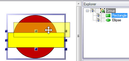
To modify a different object in the group, click on the object. You will be able to modify it as shown in the illustration above.
To select an additional object in the group, hold down the Ctrl key and click on another member of the group. At this point you have both objects of the group selected, both are highlighted in blue in the Explorer and the group object is highlighted in gray. With multiple objects selected, all of the objects are moved, resized, or reshaped uniformly.
When you are done, click outside the group. Note that if you click outside the group accidentally, you must reenter modification mode by restarting at step 3, above.
Group properties are described below. For more information, refer to Object Properties. Default values are set for group properties in the Preferences tab, in the New Group Default Settings.
|
Property |
Settings |
Description |
|
Common - Behavior section |
||
|
IsEnabled |
True or False |
True enables the group in the user interface at runtime. |
|
Focusable |
True or False |
True indicates that the group can receive keyboard input from runtime users. |
|
IsHitTestVisible |
True or False |
True indicates that the group can receive mouse input from runtime users. |
|
Cursor |
|
Identifies the pointer that users will see then holding the mouse over this group in runtime. |
|
IsTabStop |
True or False |
True indicates that runtime users can tab to the group when pressing the Tab key. |
|
TabIndex |
|
Identifies the group's relative tab order in the display if IsTabStop is True. |
|
Common - Style Section |
|
|
|
Opacity |
0 to 100 |
Determines the group's opacity in the display. |
|
ClipToBounds |
True or False |
|
|
Effect |
|
Determines the effect to be applied to the object. For more information, refer to Adding a Glow, Shadow, Blur, or Opacity Effect. |
|
Measurements section |
|
|
|
Angle |
0 to 360 |
Determines the degree to which the object is tilted or angled. |
|
DescendantBounds |
+ |
This is a header for the following four properties, which determine the group's position and dimensions in the display. Alternatively, you can drag the group on the display. Using the property gives you more control if precision is required for positioning and sizing the group. Expand this property by clicking its + sign. |
|
X |
Number of pixels |
The group's position on the X axis; the left edge of the group aligns this number of pixels from the left edge of the display. |
|
Y |
Number of pixels |
The group's position on the Y axis; the top edge of the group aligns this number of pixels from the top edge of the display. |
|
Width |
Number of pixels |
The group's width in pixels. |
|
Height |
Number of pixels |
The group's height in pixels. |
|
Visual Quality section |
|
|
|
SnapsToDevicePixels |
True or False |
|
|
EdgeMode |
Default or Aliased |
|
See also: