The Data Explorer is a control that allows the user to navigate all data sources with zero configuration. Using the data browser tree view, users can navigate between all data sources and view live values for real-time data, historical data, data sets, alarms, schedules, assets and BACnet.
Alternatively, the Data Explorer can be launched directly as a standalone application from the Start Screen or Start Menu (All apps > ICONICS Tools > Data Explorer) as well as the Runtime ribbon.
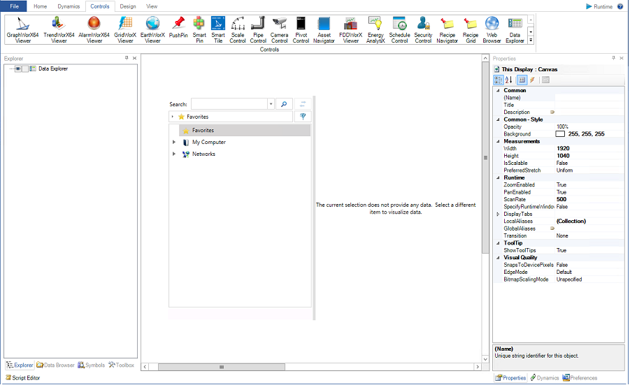
To insert a Data Explorer into a display, begin by selecting the Controls tab. This will expose all of the available controls, including the Data Explorer.
GraphWorX Controls Ribbon

Selecting the Data Explorer option will transform the cursor into a cross. Use the cross to draw the desired size of the Data Explorer on the canvas. This will insert a Data Explorer onto the canvas.
Data Explorer in a Display

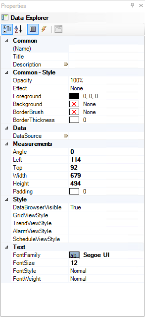
The Data Explorer has a number of properties that can assist the user in customizing their control.
Data Explorer Properties

The following Properties can be set for the GraphWorX64 Viewer:
Common
Name - Unique string identifier for this viewer.
Title - Title for this viewer. Unlike the Name property, the Title does not have to be unique.
Description - Description for this viewer. The Description typically appears as a tooltip for the viewer.
Common - Style
Opacity - Overall opacity percent of this viewer. Range: 0% (fully transparent) - 100% (fully opaque).
Effect - Visual effects (3D-edge, shadow, glow, blue) applied to this viewer.
Foreground - Foreground color, gradient, or pattern of this viewer.
Background - Background color, gradient, or pattern of this viewer.
BorderBrush - Color, gradient, or pattern of the border surrounding this viewer.
BorderThickness - Width of the border surrounding this viewer.
Data
DataSource - Select the ellipse to browse for the data source.
Measurements
Angle - The current angle of rotation for this viewer.
Left - Horizontal position of top-left corner of the viewer.
Top - Vertical position of top-left corner of the viewer.
Width - Width of the viewer.
Height - Height of the viewer.
Padding - The amount of space surrounding the content of this viewer.
Style (unique to the Data Explorer)
DataBrowserVisible - Set whether or not the Data Browser panel in this Data Explorer is visible.
GridViewStyle - Specify a file defines the style used for Grid Views. If empty, a default style will be used. Select the ellipse to set a template file.
TrendViewStyle - Specify a file defines the style used for Trend Views. If empty, a default style will be used. Select the ellipse to set a template file.
AlarmViewStyle - Specify a file defines the style used for Alarm Views. If empty, a default style will be used. Select the ellipse to set a template file.
ScheduleViewStyle - Specify a file defines the style used for Schedule Views. If empty, a default style will be used. Select the ellipse to set a template file.
Text
FontFamily - Specify the name of the font used to render the text.
FontSize - Specify the size of the font used to render the text.
FontStyle - Specify the style of the font used to render the text (italics).
FontWeight - Specify the weight of the font used to render the text.
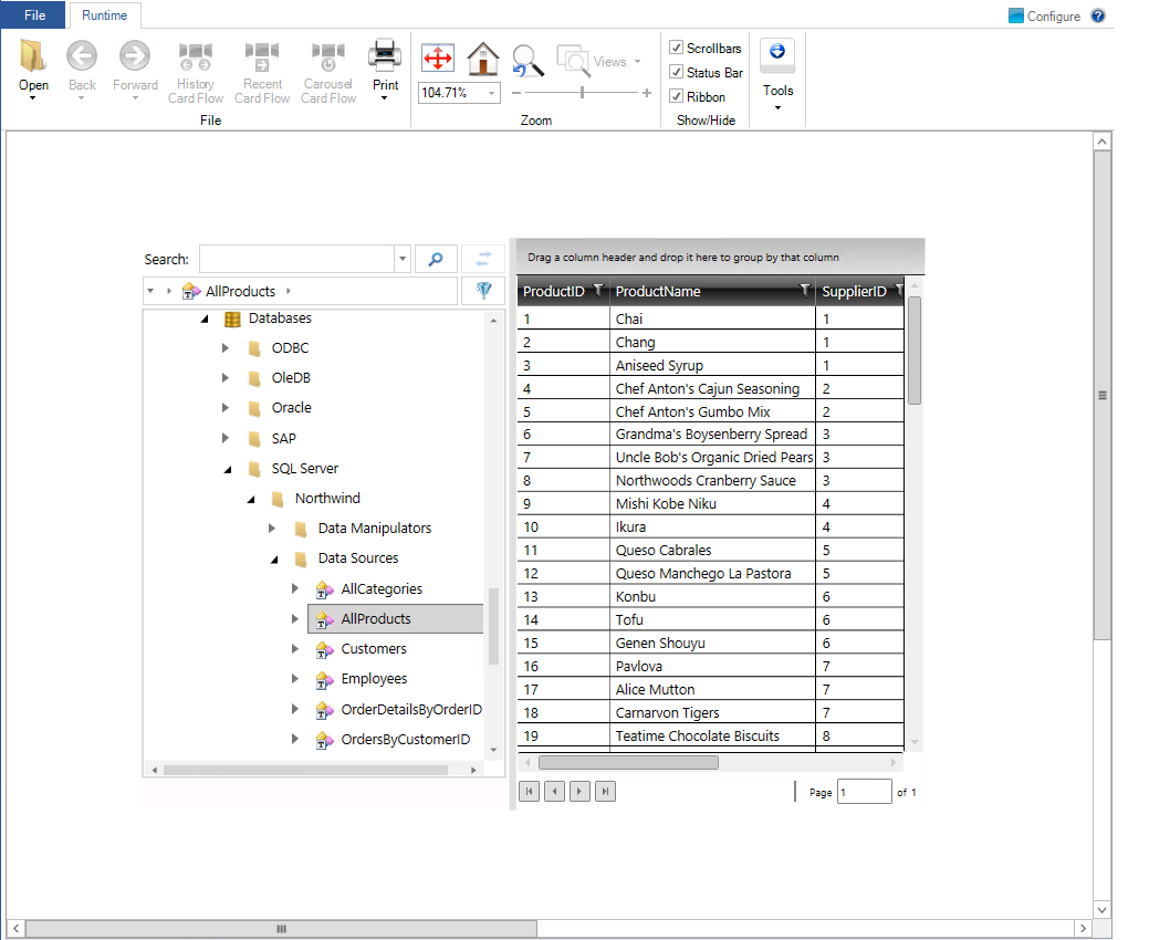
Once set in Runtime mode, the user can leverage the built-in browser to find and automatically locate and render data and data sources. For example, locating and selecting a trend will automatically render a trend viewer while selecting a schedule will automatically render a schedule control.
Grid Viewer in the Data Explorer in Runtime

In runtime, users can take full advantage of all control and viewer features available to the specified display. Utilizing the properties, advanced users can further customize the Data Explorer for various other functions without using the default data browser.
Advanced Use of the Data Browser
See Also:
Controls Ribbon in GraphWorX 2D