

The Asset Navigator Control in GraphWorX64 ties to the AssetWorX provider in the Workbench, which allows users to create a tree-based representation of an organization's assets in order to visualize data, perform commands and analysis and more.
It can be used in conjunction with additional controls (including AlarmWorX64 Viewer, Energy AnalytiX Viewer, FDDWorX Viewer, GridWorX Viewer, GraphWorX64 Viewer, TrendWorX Viewer, etc.) within the same GraphWorX64 display to allow users to perform asset-based commands automatically.
To Add an Asset Navigator Control in GraphWorX64
In GraphWorX64, click on the Controls ribbon and select the Asset Navigator Control.
Draw a box that will hold the connected asset tree.
Tip: A vertical box will make things easier later on as compared to a more horizontal one.
The Asset Navigator control will show a default tree, but not from the default database within the AssetWorX provider in the Workbench. You'll notice the distinction in that the top level of the tree is labeled as "Root" with a sub-item as "Company" and a further sub-item as "Factory". You will need to connect to an active AssetWorX database in order to utilize any configured data in any additional control you wish to add to this same GraphWorX64 display.
For more about connecting to an AssetWorX database, see below in Enabling Commands Through the Asset Navigator Control in GraphWorX64.
Adding an Asset Navigator Control in GraphWorX64
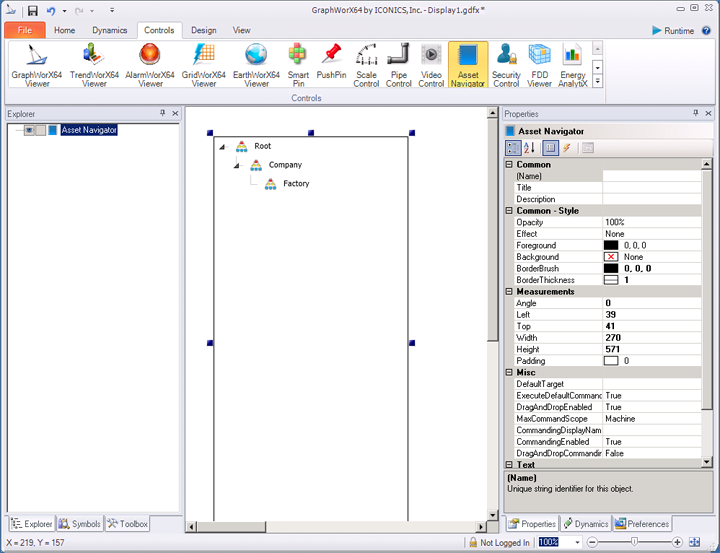
Asset Navigator Ribbon

Navigator
Configure -Opens the Configuration window.
Context Menus -Enable to show context menu when right-clicking.
Search Bar -Enable to show search bar.
Root Asset -Enable to show default root asset.
Tooltips -Enable to show tooltips on assets and commands.
Grid
Header -Enable to show header in the grid.
Columns -Select predefined columns (Default, Description, Alarms, Alarm Microcharts, Custom).
Gridlines -Select displayed gridlines (None, Vertical, Horizontal, Both).
Selected Asset
Read -Read selected asset from a datasource.
Write -Write the path of selected asset to a datasource.
Style
Rules -Select predefined styling rules (Default, Active Unacked Alarms Count, Active Unacked Alarms Severity, All Unacked Alarms Severity, Custom).
Alternate Styling -Enables alternate background and foreground on every other row.
Style -Expand this section to select a theme from Light Themes, Dark Themes, Gray Themes, or Basic Themes (including Light Style [Default], Dark Style, or Custom Style).
The Asset Navigator properties can be configured either through the Configuration window, shown below, or via the Properties section of the Workbench on the right side of the GraphWorX64 window.
Asset Navigator Configuration Window - GENERAL Tab
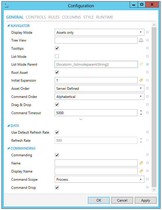
NAVIGATOR
Display Mode -Choose whether to display only assets, only favorites or both.
Tree View -Specify tree view name to show custom tree view. If empty, control shows the default asset tree.
Tooltips -True to show tooltips of nodes under cursor.
List Mode -Turn on special mode where the navigator displays only single level of assets as a list. Use ListModeParentDataSource to specify the parent of displayed assets.
List Mode Parent -Data source that controls the parent asset in List Mode.
Root Asset - True to show root asset.
Initial Expansion - Number of levels expanded during initialization or when a user logs in.
Asset Order - Asset order type. Overrides server defined settings for entire tree.
Command Order -Command order type for commands in context menus.
Drag & Drop - True to enable dragging assets to other controls.
Command Timeout -Timeout period in milliseconds for resolving command parameters. After this period, command will be cancelled.
Root Asset Path -Root asset path. Ignored if not accessible due to insufficient access rights.
Browsable Favorites -True to allow browsing of set favorite assets.
DATA
Used Default Refresh Rate - Use default refresh rate or refresh rate inherited from parent container.
Refresh Rate - Data refresh rate of data sources defined for properties, in milliseconds. Do not modify if you intend to use local variables for sharing data with other controls, e.g. selected asset or current time range.
COMMANDING
Commanding - Determines whether commands are enabled for this display. Use the CommandingName setting to specify a registration name.
Name - Name used for registering the control for commanding.
Display Name - User friendly control name.
Command Scope - Indicates whether commands sent and received by this display affect the current process only (Process) or all processes that are currently opened (Machine). For inter-process commanding, use the Machine option.
Command Drop - True to enable receiving commands by drag and drop.
Asset Navigator Configuration Window - CONTROLS Tab
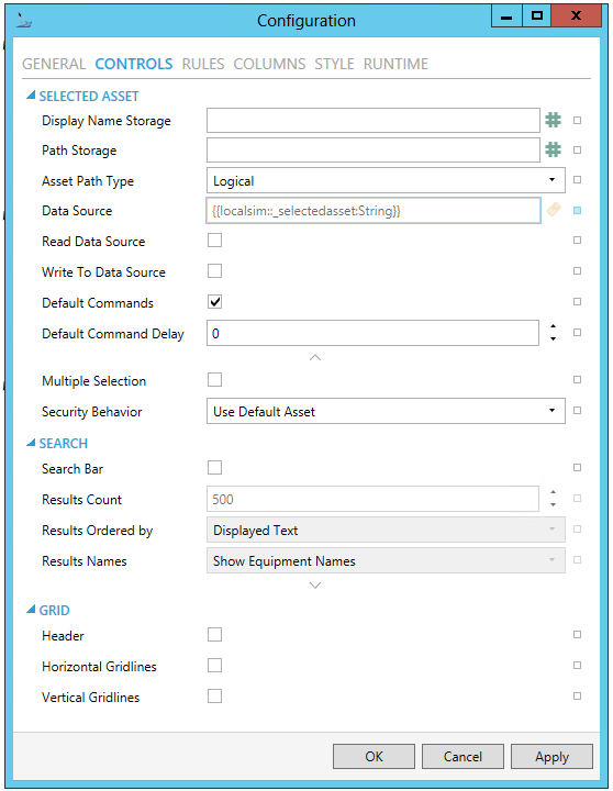
SELECTED ASSET
Display Name Storage - Specify global alias to store localized display name of selected asset. For example, "#Alias=;" or "#Alias=/+2;" without the double quotes.
Path Storage -Specify global alias to store path of selected asset. For example, "#Alias=;" or "#Alias=/+2;" without the double quotes.
Asset Path Type - Select type of path that gets stored. Logical uses path as seen in Asset Navigator. Physical uses path as defined on server and can be empty for virtual assets. Combined uses physical where possible and logical for the rest. The differences are significant when using tree views.
Data Source - Data source that can used to store (write) or set (read) selected asset path. Stored asset path type is specified by another property.
Read Data Source -Enable to retrieve an asset name from a data source and select it in the control whenever the data source changes.
Write to Data Source - Enable to write the name of selected asset to a data source whenever the selection in the control changes.
Default Commands - Turn off to disable execution of default commands on asset selection.
Default Command Delay - Time interval in milliseconds between selection change and default commands execution.
Multiple Selection - Enables multi-selection in the tree. Multiple assets can be selected using Ctrl and Shift keys. Default commands are disabled with multi-selection.
Security Behavior -Defines the behavior of selected assets after another user logs in or when security changes. UseDefaultAsset selects default asset as defined in Security server and dispatches default commands. RestoreLastAsset attempts to restore last selected asset (without dispatching default commands).
SEARCH
Search Bar - True to show search controls in runtime.
Results Count - The number of search results retrieved from the server.
Results Ordered by - Choose the ordering of search results. Complete displayed text, Displayed asset name, Server asset name, or Full asset browse path.
Results Names - Set ShowDisplayNames to show display names in search results. ShowEquipmentNames displays equipment names.
Hide Asset Path - Hides the parent path of the asset in search results, resulting in showing only asset names.
GRID
Header -True to show header of the grid.
Horizontal Gridlines -True to show horizontal grid lines, otherwise false.
Vertical Gridlines - True to show vertical grid lines, otherwise false.
Asset Navigator Configuration Window - RULES Tab
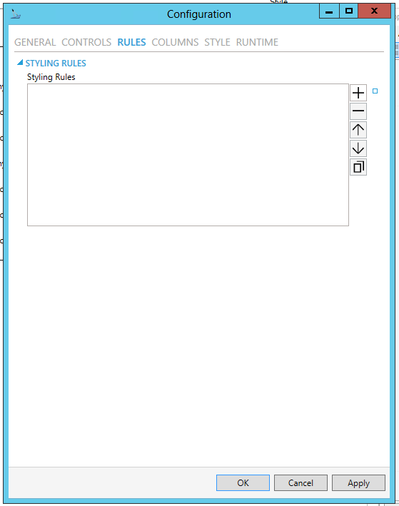
Styling Rules - Configure rules for dynamic styling. Click on the plus button [+] to add a Styling Rule. You can also remove a Styling Rule via the minus button [-], move it up or down within a list of styling rules (via the up/down arrows) or duplicate it via the  button.
Name - Name of the Styling Rule. Configuration-only property to easily distinguish the rule in the collection. Enter a name in the text entry field.
Condition - Configure the expression that serves as a condition for this rule. Use @@self as alias for current asset to access its properties. Enter the Condition in the text entry field or click on the  button to open the Expression Editor. The Condition field is required.
Background - Background color, gradient or pattern of this object. You can enter a color code (if known) in the text entry field or click on the  button to open the Brush Picker window and set the properties for your background.
Foreground - Foreground color, gradient or pattern of this object. You can enter a color code (if known) in the text entry field or click on the  button to open the Brush Picker window and set the properties for your foreground.
Asset Navigator Configuration Window - COLUMNS Tab
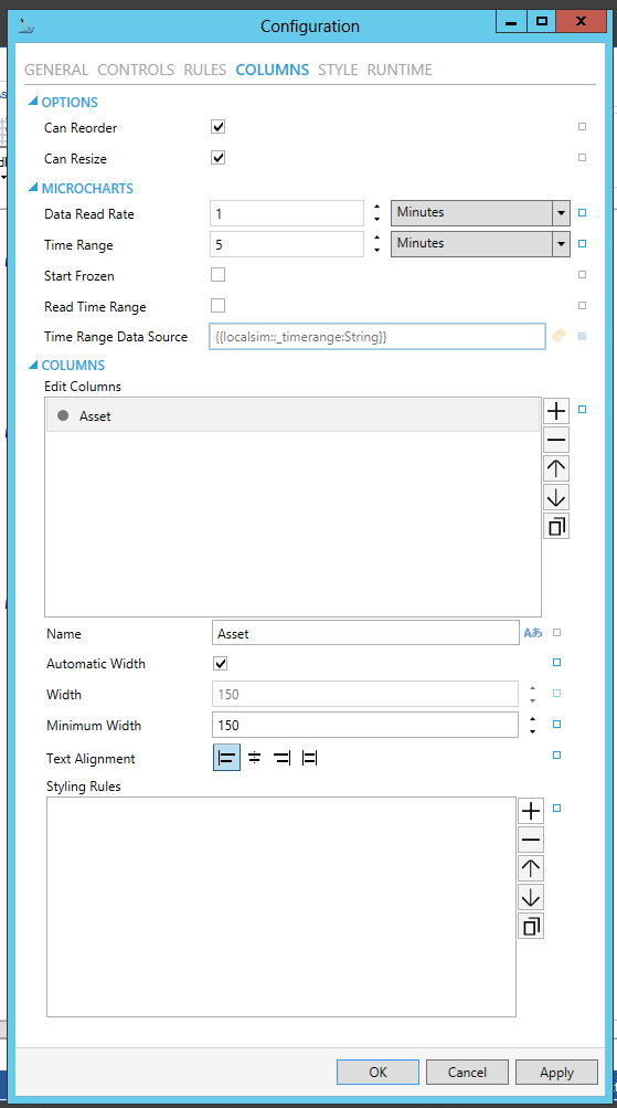
OPTIONS
Can Reorder - True to allow manual column reordering in runtime.
Can Resize - True to allow manual column resizing in runtime.
MICROCHARTS - [Click HERE for more info on Microcharts within the Asset Navigator.]
Data Read Rate -Set the data read rate of inner controls using time range (e.g. microcharts).
Time Range -Configure the time range of inner controls using time axis.
Start Frozen -Set the time axis of inner controls to start as frozen.
Read Time Range -Read the Time Range from specified data source.
Time Range Data Source -The data source that will be used to read the Time Range values.
COLUMNS
Edit Columns - Edit visible columns. Click on the plus button [+] to add an Unnamed column, which you can then edit via the properties listed below. You can also remove a selected column via the minus button [-], move it up or down within a list of columns (via the up/down arrows) or duplicate it via the  button.
Field - Select a field from the list of configured fields to be displayed. Use the pulldown menu to select from listed Fields. The Column Field has be set to one of the Fields configured in this control.
Content Type - The Content Type will automatically be determined by the selection of the Field.
Name - Set displayed name of this column. Enter a name in the text entry field or click on the  button to browse language aliases.
Automatic Width - True to automatically expand the width of this column based on its content.
Width - Sets the width of the column. When activated, enter a width in the text entry field or use the up/down arrows.
Minimum Width - Sets the minimal allowed width of the column. Enter a minimum width in the text entry field or use the up/down arrows.
Text Alignment - Set the alignment (left, right, center) of the text in this column.
Styling Rules - Configure rules for dynamic styling. Click on the plus button [+] to add a Styling Rule. You can also remove a Styling Rule via the minus button [-], move it up or down within a list of styling rules (via the up/down arrows) or duplicate it via the  button.
Name - Name of the Styling Rule. Configuration-only property to easily distinguish the rule in the collection. Enter a name in the text entry field.
Condition - Configure the expression that serves as a condition for this rule. Use @@self as alias for current asset to access its properties. Enter the Condition in the text entry field or click on the  button to open the Expression Editor. The Condition field is required.
Background - Background color, gradient or pattern of this object. You can enter a color code (if known) in the text entry field or click on the  button to open the Brush Picker window and set the properties for your background.
Foreground - Foreground color, gradient or pattern of this object. You can enter a color code (if known) in the text entry field or click on the  button to open the Brush Picker window and set the properties for your foreground.
Icon - Name of the icon as defined on AssetWorX server.
Asset Navigator Configuration Window - STYLE Tab
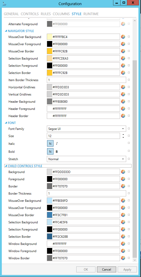
STYLE
Background - Background color, gradient or pattern of this object. You can enter a color code (if known) in the text entry field or click on the  button to open the Brush Picker window and set the properties for your background
Foreground - Foreground color, gradient or pattern of this object. You can enter a color code (if known) in the text entry field or click on the  button to open the Brush Picker window and set the properties for your foreround.
Border - Color, gradient, or pattern of the border surrounding this object. You can enter a color code (if known) in the text entry field or click on the  button to open the Brush Picker window and set the properties for your border.
Border thickness - Width of the border surrounding this object. Enter a thickness in the text entry field.
 button to open the Brush Picker window and set the properties for your alternate background.
 button to open the Brush Picker window and set the properties for your alternate foreground.
NAVIGATOR STYLE
MouseOver Background - Background brush of item under mouse cursor. You can enter a color code (if known) in the text entry field or click on the  button to open the Brush Picker window and set the properties for your mouseover background.
MouseOver Foreground - Foreground brush of item under mouse cursor. You can enter a color code (if known) in the text entry field or click on the  button to open the Brush Picker window and set the properties for your mouseover foreground.
MouseOver Border - Border brush of item under mouse cursor. You can enter a color code (if known) in the text entry field or click on the  button to open the Brush Picker window and set the properties for your mouseover border.
Selection Background - Background brush of selected item. You can enter a color code (if known) in the text entry field or click on the  button to open the Brush Picker window and set the properties for your selection background.
Selection Foreground - Foreground brush of selected item. You can enter a color code (if known) in the text entry field or click on the  button to open the Brush Picker window and set the properties for your selection foreground.
Selection Border - Border brush of selected item. You can enter a color code (if known) in the text entry field or click on the  button to open the Brush Picker window and set the properties for your selection border.
Item Border Thickness - Border thickness of items. Enter a thickness in the text entry field.
Horizontal Gridlines -Brush of horizontal grid lines. You can enter a color code (if known) in the text entry field or click on the  button to open the Brush Picker window and set the properties for your horizontal gridlines.
Vertical Gridlines -Brush of vertical grid lines. You can enter a color code (if known) in the text entry field or click on the  button to open the Brush Picker window and set the properties for your vertical gridlines.
Header Background - Background brush of grid header. You can enter a color code (if known) in the text entry field or click on the  button to open the Brush Picker window and set the properties for your header background.
Header Foreground - Foreground brush of grid header. You can enter a color code (if known) in the text entry field or click on the  button to open the Brush Picker window and set the properties for your header foreground.
Header Border - Border brush of grid header. You can enter a color code (if known) in the text entry field or click on the  button to open the Brush Picker window and set the properties for your header border.
FONT
Font Family - Specifies the name of the font used to render text. Use the pulldown menu to select from installed fonts.
Size - Specifies the size of the font used to render text. Enter a font size in the text entry field or use the up/down buttons.
Italic - Specifies the style of the font used to render text (italic). Select "N" for Normal or "I" for Italic.
Bold - Specifies the thickness of the font used to render text (bold) Select "N" for Normal or "B" for Bold.
Stretch - Specifies whether a font appears with a typical width (Normal) narrower than usual (Condensed), or wider than usual (Expanded). Use the pulldown menu to make your selection.
CHILD CONTROLS STYLE
Background - Background brush of child controls. You can enter a color code (if known) in the text entry field or click on the  button to open the Brush Picker window and set the properties for your background.
Foreground - Foreground brush of child controls. You can enter a color code (if known) in the text entry field or click on the  button to open the Brush Picker window and set the properties for your foreground.
Border - Border brush of child controls. You can enter a color code (if known) in the text entry field or click on the  button to open the Brush Picker window and set the properties for your border.
Border Thickness - Border thickness of child controls. Enter a thickness in the text entry field.
MouseOver Background - Background brush of child controls under mouse cursor. You can enter a color code (if known) in the text entry field or click on the  button to open the Brush Picker window and set the properties for your mouseover background.
MouseOver Foreground - Foreground brush of child controls under mouse cursor. You can enter a color code (if known) in the text entry field or click on the  button to open the Brush Picker window and set the properties for your mouseover foreground.
MouseOver Border - Border brush of child controls under mouse cursor. You can enter a color code (if known) in the text entry field or click on the  button to open the Brush Picker window and set the properties for your mouseover border.
Selection Background - Background brush of selected child controls. You can enter a color code (if known) in the text entry field or click on the  button to open the Brush Picker window and set the properties for your selection background.
Selection Foreground - Foreground brush of selected child controls. You can enter a color code (if known) in the text entry field or click on the  button to open the Brush Picker window and set the properties for your selection foreground.
Selection Border - Border brush of selected child controls. You can enter a color code (if known) in the text entry field or click on the  button to open the Brush Picker window and set the properties for your selection border.
Window Background - Background brush of child control windows. You can enter a color code (if known) in the text entry field or click on the  button to open the Brush Picker window and set the properties for your background of child control windows.
Window Foreground - Foreground brush of child control windows. You can enter a color code (if known) in the text entry field or click on the  button to open the Brush Picker window and set the properties for your foreground of child control windows.
Window Border - Border brush of child control windows. You can enter a color code (if known) in the text entry field or click on the  button to open the Brush Picker window and set the properties for your border of child control windows.
Asset Navigator Configuration Window - RUNTIME Tab
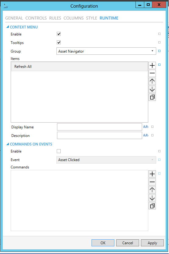
Context Menu - True to enable context menu on right click.
Tooltips - Enables tooltips on hover in context menu items.
Context Menu Group - Select context menu group for editing. Use the pulldown menu to select from Asset Navigator, Asset Node, Search Results Node, Favorite Asset, or Favorite Folder.
Context Menu Items - Allows users to add items to a collection based on the selected Context Menu Group. Click on the plus sign [+] to add an item to the list. Click on the minus sign [-] to remove a listed item. Click on the up arrow to move a selected item higher in the list. Click on the down arrow to move a selected item lower in the list. Click on the  button to duplicate a selected entry in the list.
Asset Navigator
Refresh All - Action to refresh the whole navigator control
Display Name - Set the name displayed in configuration collection. Enter a display name in the text entry field or click on the  button to open the Data Browser and navigate to your selected Display Name.
Description - Set the description displayed in tooltip in configuration collection. Enter the description in the text entry field or click on the  button to open the Data Browser and navigate to your selected description.
Separator - Horizontal separator to separate groups of context menu items.
Custom Command - Custom command that can be configured to run any command with custom parameters.
Command - Use the pulldown menu to select the Command you wish to include as a Context Menu Item. Click HERE for more info on Commands in GraphWorX64.
Copy from - This selection gives you the option of copying all applicable items from your selected Context Menu Group.
Asset Node
Server Commands - List of asset commands as defined in Asset Catalog.
Refresh - Action to refresh the children of specific node.
Refresh All - Action to refresh the whole navigator control
Add to Favorites - Adds this Asset to Favorites using specified options.
Separator - Horizontal separator to separate groups of context menu items.
Custom Command - Custom command that can be configured to run any command with custom parameters.
Command - Use the pulldown menu to select the Command you wish to include as a Context Menu Item. Click HERE for more info on Commands in GraphWorX64.
Copy from - This selection gives you the option of copying all applicable items from your selected Context Menu Group.
Search Results Node
Server Commands - List of asset commands as defined in Asset Catalog.
Add to Favorites - Adds this Asset to Favorites using specified options.
Separator - Horizontal separator to separate groups of context menu items.
Custom Command - Custom command that can be configured to run any command with custom parameters.
Command - Use the pulldown menu to select the Command you wish to include as a Context Menu Item. Click HERE for more info on Commands in GraphWorX64.
Copy from - This selection gives you the option of copying all applicable items from your selected Context Menu Group.
Favorite Asset
Server Commands - List of asset commands as defined in Asset Catalog.
Refresh - Action to refresh the children of specific node.
Delete -Deletes this favorite item.
Rename -Renames this favorite item.
Copy -Copy this item.
Cut -Cut this item.
Refresh All - Action to refresh the whole navigator control
Separator - Horizontal separator to separate groups of context menu items.
Custom Command - Custom command that can be configured to run any command with custom parameters.
Command - Use the pulldown menu to select the Command you wish to include as a Context Menu Item. Click HERE for more info on Commands in GraphWorX64.
Copy from - This selection gives you the option of copying all applicable items from your selected Context Menu Group.
Favorite Folder
New Folder - Creates a new favorites folder under this node.
Delete -Deletes this favorite item.
Rename -Renames this favorite item.
Copy -Copy this item.
Cut -Cut this item.
Paste - Paste copied or cut item under this item.
Paste to Favorites -Puts asset selected by 'Add to Favorites' action under this node as a new Favorite item.
Refresh - Action to refresh the children of specific node.
Refresh All - Action to refresh the whole navigator control
Separator - Horizontal separator to separate groups of context menu items.
Custom Command - Custom command that can be configured to run any command with custom parameters.
Command - Use the pulldown menu to select the Command you wish to include as a Context Menu Item. Click HERE for more info on Commands in GraphWorX64.
Copy from - This selection gives you the option of copying all applicable items from your selected Context Menu Group.
EVENTS
Enable - True to enable configuring actions and commands for control events.
Event - Select a control event and configure actions to fire when the event occurs. Use the pulldown menu to select from Asset Clicked, Asset Selected, Ready, or Started.
Actions - List of actions to perform when selected control event occurs. Click on the plus sign [+] to add an item to the list. Click on the minus sign [-] to remove a listed item. Click on the up arrow to move a selected item higher in the list. Click on the down arrow to move a selected item lower in the list. Click on the  button to duplicate a selected entry in the list. For any Custom Command selected in the list, you can then select a specific Command and then complete the associated properties for that command. Click HERE for more info on Commands in GraphWorX64.
Common
(Name) - Unique string identifier for this object.
Title - Title for this object. Unlike the Name property, the Title does not have to be unique.
Description - Description for this object. The Description typically appears as a tooltip for the object.
Common-Style
Opacity - Overall opacity of this object (0% = fully transparent. 100% = fully opaque).
Effect - Visual effects (3D-edge, shadow, glow, blue) applied to this object.
Foreground - Foreground color, gradient, or pattern of this object.
Background - Background color, gradient, or pattern of this object.
Border - Color, gradient, or pattern of the border surrounding this object.
BorderWidth - Width of the border surrounding this object.
ItemBorderThickness - Border thickness of items.
SelectionBorderBrush - Border brush of selected item.
SelectionForeground - Foreground brush of selected item.
SelectionBackground - Background brush of selected item.
MouseOverBorderBrush - Border brush of item under mouse cursor.
MouseOverForeground - Foreground brush of item under mouse cursor.
MouseOverBackground - Background brush of item under mouse cursor.
VerticalGridLineBrush - Brush of vertical grid lines.
HorizontalGridLineBrush - Brush of horizontal grid lines.
HeaderBackground - Background brush of grid header.
HeaderForeground - Foreground brush of grid header.
HeaderBorderBrush - Border bush of grid header.
ControlBorderBrush - Border brush of child controls.
ControlBorderThickness - Border thickness of child controls.
ControlBackground - Background brush of child controls.
ControlForeground - Foreground brush of child controls.
ControlSelectionBorderBrush - Border brush of selected child controls.
ControlSelectionBackground - Background brush of selected child controls.
ControlSelectionForeground - Foreground color of selected child controls.
ControlMouseOverBorderBrush - Border brush of child controls under mouse cursor.
ControlMouseOverBackground - Background brush of child controls under mouse cursor.
ControlMouseOverForeground - Foreground brush of child controls under mouse cursor.
ControlWindowsBorderBrush - Border brush of child control windows.
ControlWindowBackground - Background brush of child control windows.
ControlWindowForeground - Foreground brush of child control windows.
Measurements
Angle - The current angle of rotation for this object.
Left - Horizontal position of top-left corner of the object.
Top - Vertical position of the top-left corner of the object.
Width - Width of the object.
Height - Height of the object.
Padding - The amount of space surrounding the content of this object.
Misc
DragAndDropEnabled - True to enable dragging assets to other controls.
InitialExpansion -Number of levels expanded during initialization or when a user logs in.
CommandDispatchingTimeout - Timeout period in milliseconds for resolving command parameters. After this period, command will be cancelled.
DefaultCommandsExecutionDelay - Time interval in milliseconds between selection change and default commands execution.
TreeViewName - Specify tree view name to show custom tree view. If empty, control shows the default asset tree.
AssetOrderType - Asset order type. Overrides server defined settings for entire tree.
SelectedAssetPathStorage - Specify global alias to store path of selected asset. For example, "#Alias=;" or "#Alias=/+2/" without the double quotes.
SelectedAssetPathType - Select type of path that gets stored. Logical uses path as seen in Asset Navigator. Physical uses path as defined on server and can be empty for virtual assets. Combined uses physical where possible and logical for the rest. The differences are significant when using tree views.
SelectedAssetDisplayNameStorage - Specify global alias to store localized display name of selected asset. For example, "#Alias=;" or "#Alias=/+2;" without the double quotes.
SelectedAssetDataSource - Data source that can be used to store (write) or set (read) selected asset path. Stored asset path type is specified by another property.
SelectedAssetReadDataSource - Enable to retrieve an asset name from a data source and select it in the control whenever the data source changes.
SelectedAssetWriteDataSource - Enable to write the name of selected asset to a data source whenever the selection in the control changes.
EnableSearch - True to show search controls in runtime.
ListMode - Turn on special mode where the navigator displays only single level of assets as a list. Use ListModeParentDataSource to specify the parent of displayed assets.
ListModeParentDataSource - Data source that controls the parent asset in List Mode.
ShowHeader - True to show header of the grid.
ShowHorizontalGridLines - True to show horizontal grid lines, otherwise false.
ShowVerticalGridLines - True to show vertical grid lines, otherwise false.
AllowColumnResize - True to allow manual column resizing in runtime.
AllowColumnReorder - True to allow manual column reordering in runtime.
ExecuteDefaultCommands - Turn off to disable execution of default commands on asset selection.
DisplayNameInSearchResults - Set true to show display names in search results instead of equipment names.
DisplayMode - Choose whether to display only assets, only favorites or both.
EnableContextMenu - True to enable context menu on right click.
ShowRootNode - True to show root node.
ShowTooltips - True to show tooltips of nodes under cursor.
RootNode - Path to node that should serve as a root node for the displayed tree.
Misc-Commanding
CommandingEnabled - Determines whether commands are enabled for this display. Use the CommandingName setting to specifiy a registration name.
DragAndDropCommandingEnabled - Set to True to enable receiving commands by drag and drop method.
CommandingName - Name used for registering the control for commanding.
CommandingDisplayName - User friendly control name.
MaxCommandScope - Indicates whether commands sent and received by this display affect the current process only (Process) or all processes that are currently opened (Machine). For inter-process commanding, use the Machine option.
Text
FontFamily - Specifies the name of the font used to render text.
FontSize - Specifies the size of the font used to render text.
FontStyle - Specifies the style of the font used to render text (italic).
FontWeight - Specifies the thickness of the font used to render text (bold).
3. After setting the Object Properties, the Asset Navigator control can be saved when the containing GraphWorX64 display itself is saved.
The latest version of GENESIS64/GraphWorX64 allows you to run commands from a tree navigation control into other controls in the display. This is done by utilizing the asset catalog structure set up through the AssetWorX provider within the Workbench.
See Also: