Creating an SPC Plot in TrendWorX64 Viewer
|

|
Note: The following information is applicable only to users who have installed a Quality AnalytiX package from the AnalytiX suite. For more information about installing Quality AnalytiX, see the Installing Quality AnalytiX topic.
|
After installing Quality AnalytiX, you can create an SPC plot in TrendWorX64 Viewer by opening the TrendWorX64 Viewer Configurator and selecting the SPC plot type (the plot in the SPC section of the Plot tab) when adding a new plot.
The SPC plot shows how the sample values for an SPC tag vary over time with respect to the defined control limits (UCL, CL, and LCL). These limits appear with the sample values on a TrendWorX64 Viewer chart when this plot is selected. Using this plot type, you can easily view the time(s) during which samples have exceeded the defined control limits and have triggered an alarm state. You can also see at a glance the samples that contain operator annotations.
Unlike other plots, the SPC plot contains a middle tab in the TrendWorX64 Viewer Configurator labeled Settings. The options available on this tab appear in the image below:
Settings Tab for Configuring SPC Plots in TrendWorX64 Viewer
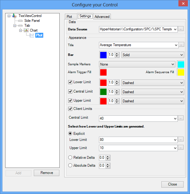
To configure the settings associated with an SPC plot in TrendWorX64 Viewer:
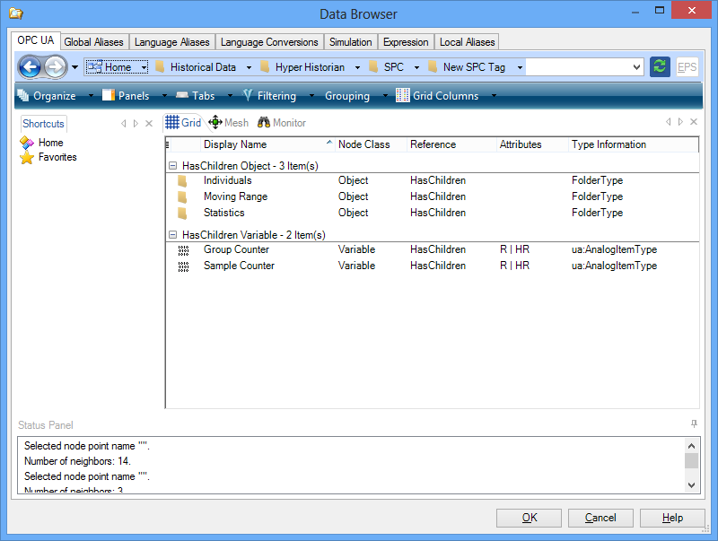
- In the Data section of the tab, select the ellipsis button [...] to the right of the textbox next to Data Source to open the Data Browser. Here, you can navigate to the SPC tag or associated value that you wish to display in TrendWorX64 Viewer. For more information about associated values that accompany tags, see the SPC Tag Associated Values topic section.
- In the Appearance section of the tab, enter a Title for the plot in the provided textbox. You can also select the ellipsis button [...] to the right of the textbox to open the Data Browser and select a tag to use as the title instead.
- For the Bar field, you can select several display options for the line that connects the sample data points on the plot:
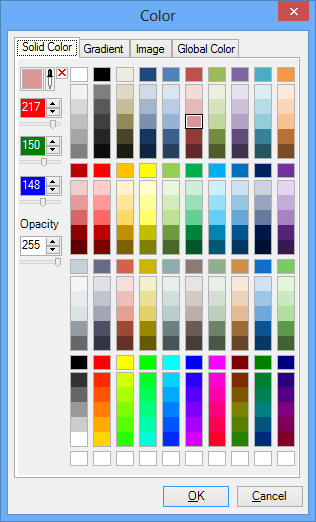
- Click the square with a color in it to open the Color selector. Here, you can choose a common color or enter numbers into the textboxes on the left-hand side of the selector to create a custom color and opacity. You can also use a gradient, image, or global color (set with a global alias) as the color for the line connecting the sample data points on the plot.
- Enter a number in the textbox to the right of the color square to set the thickness of the line connecting sample points, in points. Larger values in this textbox result in thicker lines. You can also choose a number by selecting the up and down arrows to the right of the textbox.
- In the drop-down menu on the right-hand side of the Bar field, select the line style that you would like to use for connecting the sample data points on the plot. You can choose from a solid line (Solid), a line with long dashes (Dashed), a line with short dots (Dotted), or a line that alternates between dots and dashes (Dotted-Dashed).
- Use the provided drop-down list to select the type of Sample Markers, or shapes corresponding to individual sample data points, that you would like to display on the SPC Plot. You can hide these markers altogether (None), or you can have filled-in circles (Circle), squares (Square), or triangles (Triangle) representing the different data points. You can then select a color for these sample markers by following the same process you used for part (a) of step 3.
- Select the Alarm Trigger Fill color that you would like the SPC plot to display when a data point has triggered an alarm by following the same process you used for part (a) of step 3.
- Select the Alarm Sequence Fill color that you would like the SPC plot to display when a sequence of data points leads up to an alarm trigger point by following the same process you used for part (a) of step 3.
- Enable the check box next to Lower Limit to display a line representing the lower control limit (LCL) associated with the data sample at a given time on the plot. If this setting is enabled, you can configure the display options for the line using a process similar to the one for the Bar option in step 3.
- Enable the check box next to Central Limit to display a line representing the center line (CL) associated with the data sample at a given time on the plot. If this setting is enabled, you can configure the display options for the line using a process similar to the one for the Bar option in step 3.
- Enable the check box next to Upper Limit to display a line representing the lower control limit (UCL) associated with the data sample at a given time on the plot. If this setting is enabled, you can configure the display options for the line using a process similar to the one for the Bar option in step 3.
- Enable the check box next to Client Limits to override the control limits you have configured for the SPC tag that this plot displays with client-side limits. If this check box is enabled, complete steps 11-15 below. Otherwise, continue to step 16.
- Enter a new Central Limit for the SPC tag appearing in this plot using the provided textbox, or select the ellipsis button [...] to the right of the textbox to open the Data Browser and select a tag value to use as the central limit instead.
- Below the Central Limit textbox, enable one of the following radio buttons to select a method for showing the lower control limit (LCL) and upper control limit (UCL): Explicit, Relative Delta, or Absolute Delta.
- If you enabled the Explicit radio button, use the provided textbox to enter a constant Lower Limit, or select the ellipsis button [...] to open the Data Browser and select a tag value to use as the lower limit instead. Repeat this process for the Upper Limit.
- If you enabled the Relative Delta radio button, enter a number in the provided textbox to set the percentage above and below the center line (CL) where the lower control limit (LCL) and upper control limit (UCL) should appear. You can also choose a percentage by selecting the up and down arrow buttons to the right of the textbox.
For example, if the Central Limit is 20 and the Relative Delta is set to 25.0, the UCL will appear as 20 + (20 * 25.0%) = 25, and the LCL will appear as 20 - (20 * 25.0%) = 15.
- If you enabled the Absolute Delta radio button, enter a number in the provided textbox to set the amount above and below the center line (CL) where the lower control limit (LCL) and the upper control limit (UCL) should appear. You can also choose a number by selecting the up and down arrow buttons to the right of the textbox.
For example, if the Central Limit is 20 and the Absolute Delta is set to 10.0, the UCL will appear as 20 + 10 = 30, and the LCL will appear as 20 - 10 = 10.
- Click the Close button when you are satisfied with the changes you have made to the SPC plot.
For more information on adding and configuring a plot within TrendWorX64 Viewer, see the Plot Options for Trend Charts and Advanced Display Options topics.
See also:
Plot Options for Trend Charts
Advanced Display Options
SPC Plot Annotation