![]()
![]()
The Excel Add-In for ReportWorX64 and ReportWorX Express allows for mapping and editing data sources to be done directly in Excel, giving users a good idea of how their data mapping will look with the rest of their sheet.
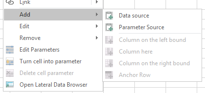
To map data sources, select the cell or cell range you'd like to map, then go to the ReportWorX64 menu and choose Add > Data Source from the Edit Data Source section. A Data Browser will open. Choose the data source tag to map, then select OK. The cells in your sheet will now appear as mapped. The Edit and Remove options in the ReportWorX64 menu can edit or remove data sources.
Data sources can also be added via the context menu. Bring up the context menu of a cell to see the ReportWorX64 options available. These options include the same Add, Edit, and Remove menus found in the ReportWorX64 ribbon, along with the ability to work with parameters and open the data browser.
Adding a Data Source in Excel
Users can add brand new data sources or make edits to existing data sources using the Configure Data Sources button in the ReportWorX64 menu. This button will open a slimmed-down version of Workbench.
The Open Lateral Data Browser button or context menu item can be used to open a data browser alongside the Excel sheet. Similar to how the Layout and Parameter Configurator used to work, data sources can be dragged from this data browser directly into the worksheet. (Note, an "invalid target" crossed circle icon may be shown when dragging data sources. The drag and drop should work, regardless.)
There is an additional way to work with charts in ReportWorX64 and ReportWorX64 Express. Charts can be created from a particular data source with the aid of a helpful wizard.
Charts created from a data source automatically map to the correct cells in the data source. The user no longer has to remember what cells to select in the blank data source. Charts created from a data source are not visible until data is downloaded, allowing the user to place them over the source data, if desired, without obscuring the configuration of the data source.
This feature can also be used to create a series of charts with the number or charts depending on the data. This allows reports to dynamically add or remove charts as needed when the data changes.
These charts will automatically update when the Timer Download feature is used.
To Add a Chart from a Data Source:
Place your cursor in a cell mapped to a data source.
Open the Data source chart configuration dialog by selecting one of the following:
ReportWorX64 ribbon > Edit > Chart Settings
OR
Context menu > Edit > Chart Settings
In the Chart settings section, select data source columns for the X column and Y column.
In the Choose chart type section, select Specify chart type, then choose a chart type, such as 2D Line.
In Chart position section, select the chart's location with one of the following methods:
Select the desired Worksheet. Fill in the X position and Y position with the location of the chart's upper left corner in pixels.
OR
Select the Select position button, then select a cell where you would like to align the chart's upper left corner. This can be on another sheet, if desired.
Set the width and height of the chart. (A suggestion is to increase the width to 500 and height to 300 to start with.)
Make other changes, if desired, then select OK. Note, no chart will be immediately visible. This is normal.
On the ReportWorX64 ribbon, select Download data. When the data has finished downloading your chart will appear.
Select the Clear Data button. The chart will disappear.
Changes can be made to the chart settings by selecting a cell in the data source, then returning to the Data source chart configuration dialog using the same steps as above.
If desired, save this workbook and upload it to the ReportWorX64 Server as a report template. When the report is generated, the charts will be created, just as they are when using the Download data option inside Excel.
Note, make your data source is configured and mapped correctly before adding a chart using the Data source chart configuration. Users cannot update a data sources columns, headers, or source tags while a chart exists. To remove a chart and allow updating of the data source, select the data source, go to either the ReportWorX64 ribbon or the context menu, then select Remove > Chart Settings.
To leverage Excel's extensive chart formatting options, users can create a chart to use as a template. In the Choose chart type section, select Use existing chart as template and then select the chart to use as a template. All existing formatting will be copied from the template chart. The template chart cannot be deleted, but it can be hidden if desired by placing it on a particular sheet and hiding that sheet.
By default, any existing series data in the template chart will be copied into the new charts. To prevent this, enable the Clear Series option.
Optionally, multiple data series can be added to a chart. These series must exist in the same data source, with all of their X and Y data in the same columns, and a third column must exist with the desired name of each series. An example of this is a data source mapped to multiple historical data tags using the Extended data source type.
Here is an example of adding multiple historical pens was multiple series in a chart:
Place your cursor in a cell.
Go to the ReportWorX64 ribbon or the context menu and select Add > Data source.
Select multiple historical tags, then select OK.
Place your cursor in a mapped cell, then edit the data source by going to the ReportWorX64 ribbon or the context menu and selecting Edit > Data source.
Set Column Style to Extended.
Select Save and close.
Place your cursor in a mapped cell, then bring up the chart settings by going to the ReportWorX64 ribbon or the context menu and selecting Edit > Chart Settings.
For X column, choose Timestamp.
For Y column, choose Value.
Enable Use series column.
For Series column, choose PointName.
For chart type, choose 2D Scatter Line.
Select the chart position and size.
Select OK.
Download the data. Observe that each pen has its own line in the final chart.
When using a series column, instead of putting all series into one chart, each series can have its own chart. Configure the chart as described above but enable Also generate a variable number of charts grouped by the value of the series column and choose a direction. When downloading the data, you will see additional charts under the first one, one chart per unique series value (if using the above example, one chart per pen).
Adding charts the traditional way (using Excel's native insert chart feature and connecting it to blank data source cells) is still supported. Users can choose which chart feature suits their reports best, and even use a combination of chart types in their reports.
See Also:
About Reports in the Workbench
Displaying/Mapping Parameters in Excel Sheet
Automatic Update of Real-Time Data Sources