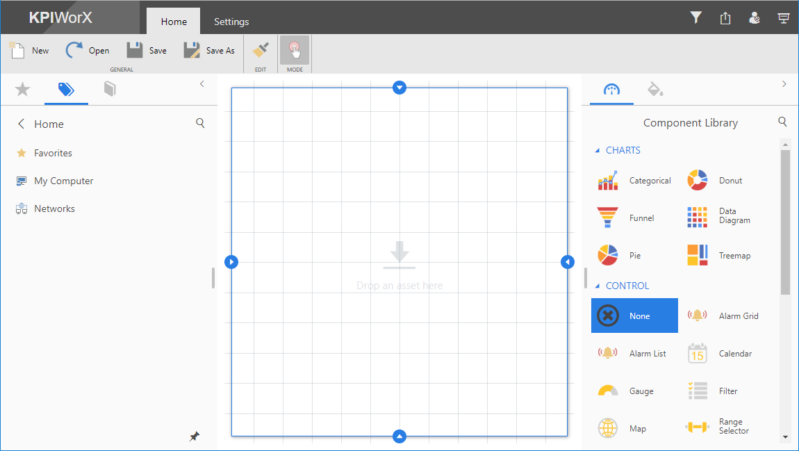
By default, the KPIWorX main page will look something like the figure below:
There are two modes to use when dividing the canvas into cells or panels: grid or split mode. Switch between them by going to the Settings tab and choosing the Layout dropdown. The two layout options determine how you can divide your canvas into separate cells and add new cells.
Note: Changing between split or grid mode will clear your existing canvas. You should decide what mode you want to use before you add any symbols to your dashboard.
Choose grid mode if you would like to create a more uniform look to your dashboard, such as by having identically sized components. Choose split mode if you would like to have a more free-form space to work with and easier resizing of cells.
After you have entered grid mode or when starting a new dashboard, your canvas will be one single cell.
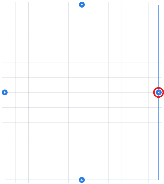
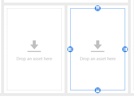
Drag one of the resize icons  around the edge of the cell inward to make the cell smaller.
Resize a cell:
Result:
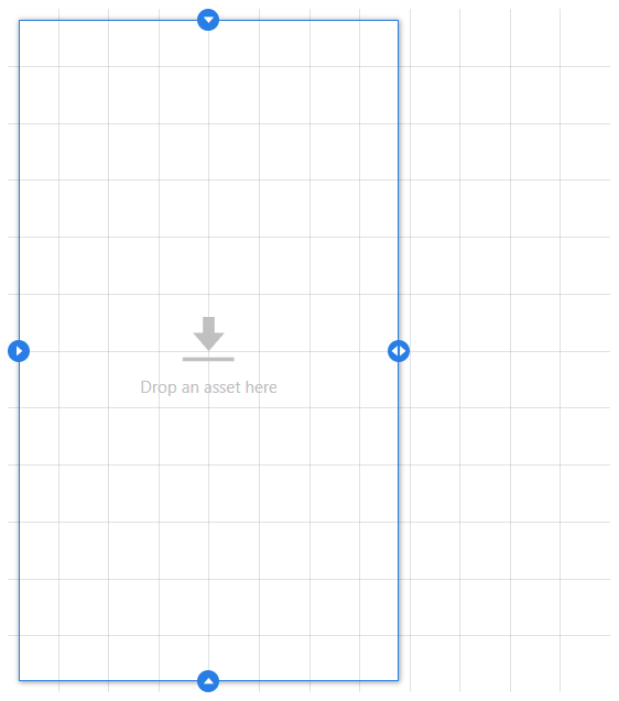
The space on the other side of the selected cell is now available. It is technically not a cell yet, but can be split into cells by selecting it and using the same resize buttons, or you can drag a component into the space to create a new cell.
When dragging resize icons, the borders will snap to the visible grid. You can change the number of grid rows or columns on the Settings tab.
Increasing the number of rows or columns will add more space outside the existing cells. You cannot reduce the number of rows or columns if there are cells occupying that space. You must either shrink or remove the cells before you can reduce the grid size. (See below for how to remove cells.)
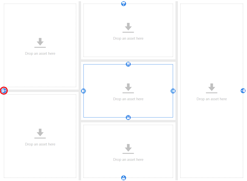
Select a cell. The selected cell will have a blue border. (If you have not added any cells yet, your entire canvas will be one cell.)
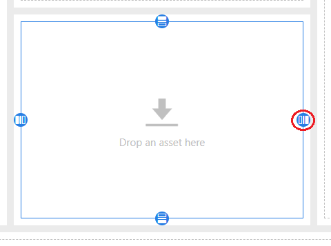
Click the split cell button  to split the existing cell horizontally or vertically. The new cell will be created on the same side as the selected split cell button, and will be selected after the split.
Click the Split Cell Button
Result
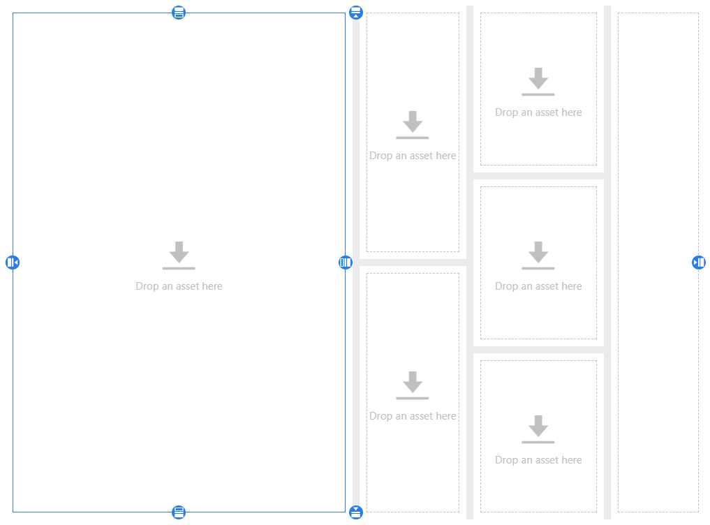
Click the split canvas button  to add a new cell on that side of the canvas. The rest of the canvas will be resized to make room for the new cell.
Click the Split Canvas Button
Result
You can grab any of the borders between cells and move them to resize those cells.
To remove a cell, select the more options  button on the cell, then and select Remove. In split mode, the space the cell occupied will be taken up by one of the surrounding cells. In grid mode, the cell will become unallocated space.
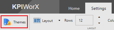
Starting in 10.95.3, KPIWorX includes a Themes button in the Settings menu.
Themes Button
Themes allow the user to customize the colors of various KPIWorX elements, including:
Header colors
Navigation colors
Browser/Property grid colors
Canvas color
Widget colors
KPIWorX comes with a number of pre-built themes and allows the user to customize and save their own themes and apply them across multiple dashboards.
Go to the Settings tab and select Theme Manager.
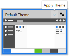
The Theme Manager allows you to set various colors for the different parts of your display. You can choose from several pre-built themes, or create your own. To choose a theme, select it and choose Apply Theme.
Apply Theme Button
When you have chosen a theme you like, select the OK button to return to KPIWorX.
Note: Hitting OK will automatically apply the selected theme. If desired, you can simply select a theme and hit OK, skipping the Apply Theme button.
To create a new theme, you must start with one of the existing themes. From the Theme Manager, select an existing theme and select the Create Copy of Theme.
Create Copy of Theme Button
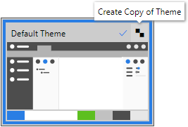
Note: You can copy any theme, default or custom.
A new theme will appear in the Custom Themes section, and will be selected for editing on the right. Select the theme name at the top of the editing panel to rename the theme, and choose new colors for the various sections.
Note: You can use the search box in the upper right corner to filter the list of elements to be colored.
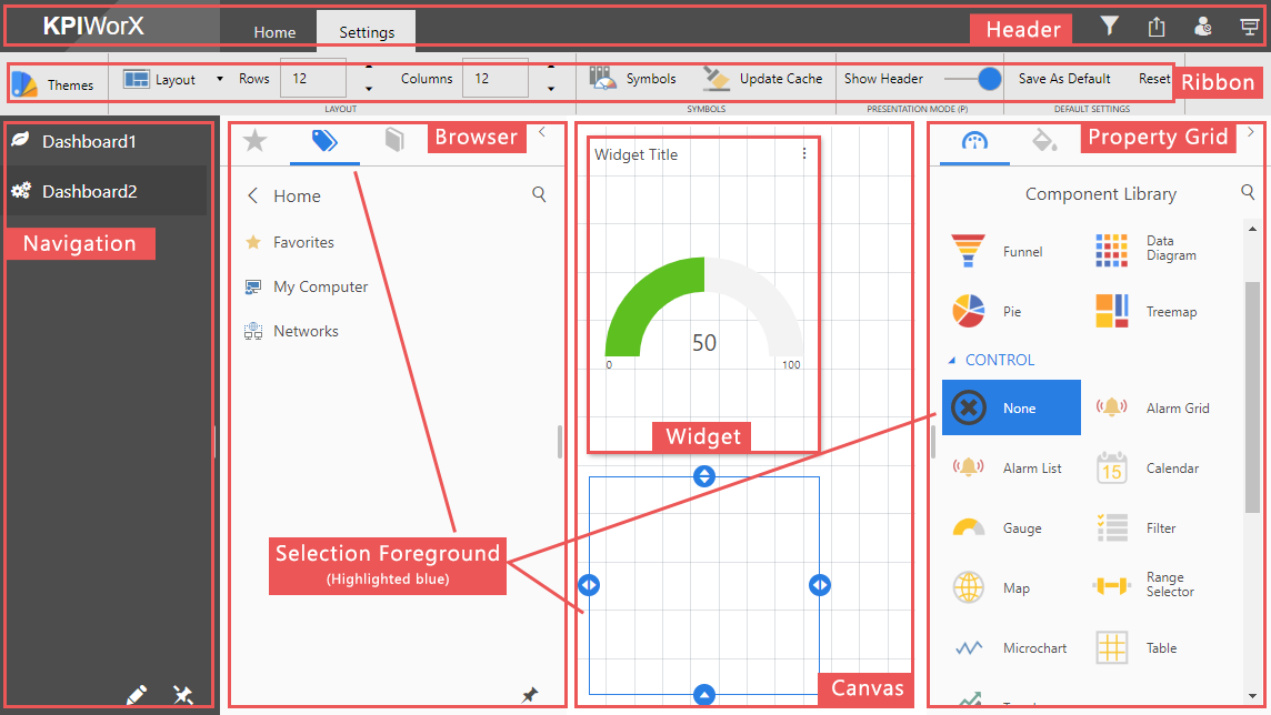
The different sections of a KPIWorX screen are labeled below.
Sections of KPIWorX Screen
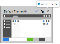
To remove (delete) a custom theme, select the theme, then select the Remove Theme button.
Remove Theme button
Note: If you have accidentally removed a theme you wish to keep, hit Cancel, then reopen the Theme Manager. Removing a theme is permanent once you have selected OK.
Note: Default themes cannot be removed.
Settings > Save as Default and Reset
When you work within KPIWorX, you typically use styles (for instance for a background or for a grid layout with grid 20x20, etc. All of these ribbon settings can be store as default to make it easier when creating the next new dashboard.