|
|
Available with GENESIS64 Basic SCADA. |

|
|
Available with GENESIS64 Basic SCADA. |
The Condition Tab allows you to create or select a list of conditions as well as manage their visual styles
A GridWorX Chart's Condition Tab
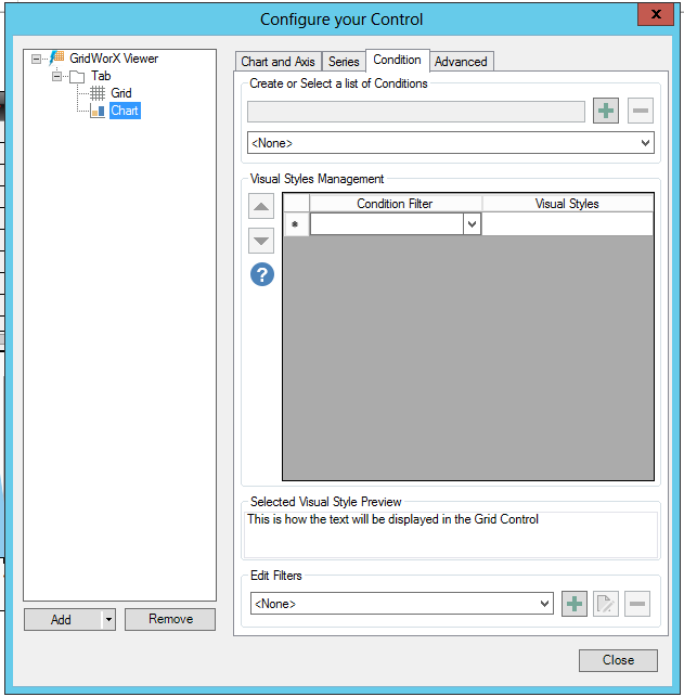
Create or Select a list of Conditions
Enter a name for a new condition in the top text entry field then click on the + button to add it to a created list.
Once you have created some conditions, they will appear in the pulldown menu beneath the text entry field. If you wish to remove any from the pulldown list, select it then click on the - button.
Visual Styles Management
Visual Styles are applied to the rows of the GridWorX Viewer Control to provide visual feedback to users depending on Alarm Conditions. Use the grid on the side to add or remove Visual Styles. You can edit existing Visual Styles by click on the cells of the grid. When a Visual Style is selected, you can see a preview of the style in the "Selected Visual Style Preview" section under the grid. You can set different properties (ie. Background, Font Color, Blinking Speed) for each Visual Style. The Visual Style is applied to the grid if the related Alarm Condition is valid. Note that Alarm Conditions are applied in the order specified by the grid. If two are valid, only the Alarm Condition with the higher priority is applied.
Condition Filter - Use the pulldown menu to select the condition filter
Visual Styles - Double-click within a cell in this column. You will then be able to click the [...] ellipsis button, which will open the Configure the style window, shown below.
Configure the style window
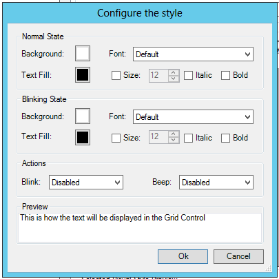
Normal State
Background - Click this box to set a background (Solid Color, Gradient or Global Color).
Font - Use the pulldown menu to select a Font.
Text Fill - Click this box to set a text fill (Solid Color, Gradient, Image or Global Color).
Size - Click this box if you wish to set the font size.
Italic - Click to italicize the text.
Bold - Click to make the text bold.
Blinking State
Background - Click this box to set a background (Solid Color, Gradient or Global Color).
Font - Use the pulldown menu to select a Font.
Text Fill - Click this box to set a text fill (Solid Color, Gradient, Image or Global Color).
Size - Click this box if you wish to set the font size.
Italic - Click to italicize the text.
Bold - Click to make the text bold.
Actions
Blink - Use the pulldown menu to select a blink action (Disabled, Slow, Normal or Fast).
Beep - Use the pulldown menu to select a beep action (Disabled, Slow, Normal or Fast).
Selected Visual Style Preview
The preview section will show, as properties are set, how the text will be displayed in the Grid Control.
See Also:
Chart and Axis Tab
Series Tab
Advanced Tab
GridWorX Configuration Ribbon
Adding a GridWorX64 Viewer