|
|
The features on this page require an add-on to work with GENESIS64 Basic SCADA. |

![]()
|
|
The features on this page require an add-on to work with GENESIS64 Basic SCADA. |
![]()
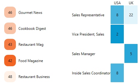
The Data diagram is a control for your BI/SCADA application that visualizes arbitrary data in a form of a colored table. The data source can be a data set defined in GridWorX server or AnalytiX-BI server. It is available for all products and all platforms, including WebHMI, MobileHMI and KPIWorX.
Before you set up a data diagram, you want to make sure that you have an existing data source defined in either AnalytiX-BI server or GridWorX server. In this example, we will use a sample data source from GridWorX server database.
Open GraphWorX64.
Go to the Controls tab.
Add a Data Diagram to your display.
A new ribbon (see the image below) for configuring the data diagram should be available. If not, select the data diagram.
Data Diagram Configuration Ribbon
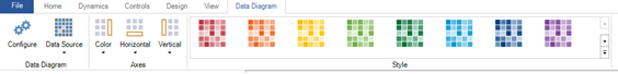
Select Data Source.
Select My Computer > Data Connectivity > Databases > SQL Server > Northwind > Data Sources > Trends.
Select OK.
Select the more arrow under Data Source.
Configuring Bindings
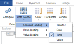
Select Columns Binding > Time.
Select Rows Binding > Date.
Select Value Binding > Value.
If desired, use the Color, Horizontal, and Vertical buttons to change the placement or visibility of the axes.
If desired, select a new color in the Style section.
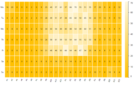
Go into runtime to see the data.
Data Diagram in Runtime
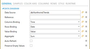
To open the advanced configuration, go to configure mode, then select the Configure button in the ribbon or double-click on the data diagram.
On the General page, you can define an aggregate to use when calculating sample values. If the server supports runtime updates, enable Auto-Refresh to process them. You can choose to keep the row or column binding empty; in which case the data diagram will show a single row or column of samples.
Data Configuration
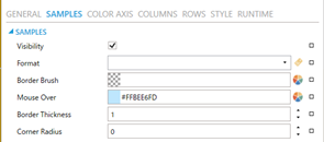
On the Samples page, you can define a custom number format for sample values. Hiding sample labels in data diagram can significantly improve performance and is highly recommended when the actual sample value is not as important as the sample color. It is recommended to set the Border Thickness to zero if you are requesting a large number of samples.
Samples Configuration
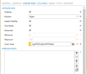
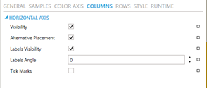
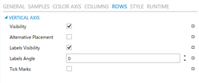
The Color Axis, Columns, and Rows pages configure the three axes. You can choose to hide labels and/or tick marks and set visibility and position. For the Color Axis, you can also define its minimum and maximum values, either as a static number or as a dynamic data source.
Color Axis Configuration
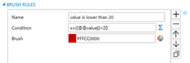
The color of each sample is calculated from the color scale configured in the Color Axis page. Alternatively, you can define custom rules to determine the sample colors. You can even combine both methods. Custom rules have precedence over the color scale.
For example, add the rules shown in Figure 7 to our data diagram. To add rules, either select the plus button, or select the small rectangle to the far right and choose a sample set of rules to start with.
Custom Rules
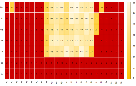
Now, in runtime all samples with a value less than 20 will turn red (see Figure 8).
Custom Rules Applied
If your axis labels on the horizontal axes overlap, you can use the Labels Angle property to define rotation angle in degrees.
Columns and Rows Configuration
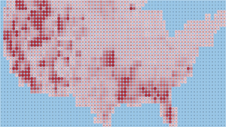
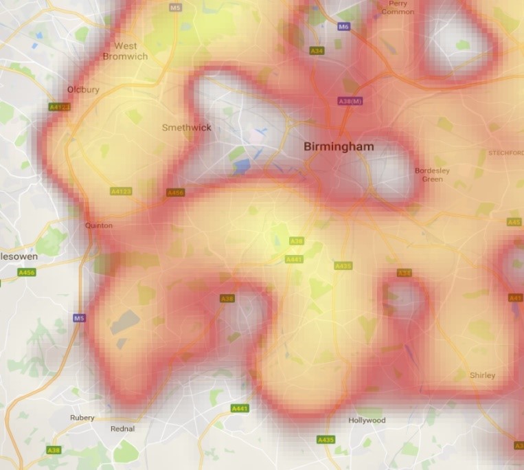
Though the main purpose of the data diagram is to visualize categorized and aggregated samples (similar to a contingency table or crosstab), you can customize it for a number of different creative uses. See the following images for examples.
Map of the USA with Distribution of a Measured Value
Data Diagram Used as Overlay on Top of a Static Map
Data Diagram Used as Dynamic Legend or Statistical Tool
See Also: