AnalytiX-BI is a powerful companion to KPIWorX. Using data models set up in AnalytiX-BI, you can do advanced runtime filtering and aggregation.
See the AnalytiX-BI documentation for how to set up a data model.
By default, AnalytiX-BI comes with a sample data model connected to the Northwind database. We will use that sample data model in the examples below. Each example will build on the previous example as we walk you through creating a dashboard using AnalytiX-BI data.
You can map widgets to an AnalytiX-BI data model the same way you can map any other data set, however AnalytiX-BI can provide on-the-fly aggregation of data.
When you map certain attributes from AnalytiX-BI data models onto widgets, KPIWorX will automatically aggregate the data. You can choose a specific aggregate by expanding the attribute in the Tag Browser and dragging the aggregate, or you can go into the Widget Settings panel and change the aggregate in there.
The following example will walk you through creating a pie chart to show the number of orders (count aggregate) shipped to different countries.
From the Component Library, drag a Pie chart onto your canvas.
Select your new pie widget, open Container Settings and set the title to Orders Shipped.
Open the Widget Settings panel and enable Labels. Keep the Widget Settings panel open to better see what is happening in later steps.
In the Tag Browser, browse to My Computer > AnalytiX > BI Server > Data Models > Northwind.
Expand the Orders table. You will see a list of attributes for this table.
Drag the ShipCountry attribute onto the pie chart. You should see ShipCountry appear in the Category field.
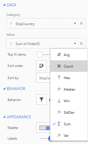
Drag the OrderID attribute onto the pie chart. Instead of simply seeing OrderID in the Value field, you should see Sum of OrderID. KPIWorX automatically selected an aggregate for this data.
OrderID is a unique identifier of each order, so to find the number of orders we need to count this field. Select the dropdown arrow in the Value field for Sum of OrderID, and choose Count.
Choosing the Count Aggregate
You should now have a pie chart showing the count of orders shipped to each country.
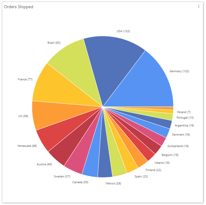
Data coming from AnalytiX-BI can also be sorted on the fly as well. Let's make our Orders Shipped pie chart a little more readable by sorting it based on the number of orders.
In Widget Settings, change Sort by to Count of OrderID
For Sort order choose Descending  .
.
Now the pie slices are ordered from largest to smallest. Your pie chart should look something like the figure below.
Pie Chart Showing the Number Of Orders Shipped Per Country
You can also use AnalytiX-BI to limit the results returned to the top N items. Select the Top N items option, then change the Top value to determine how many results are shown. The items chosen will be based on the sort order. Also, if you have a filter enabled, and your filter behavior is set to filter out non-matching results (instead of fading them), the top items will be chosen from the filtered set. (See the next section for more information about filtering.)
Another powerful ability of AnalytiX-BI is the on-the-fly filtering of data. Due to the relationships established in the data model, KPIWorX can filter not just on attributes of the displayed data, but on related data as well.
What if we want to find out which products were going to which countries? Products is a completely different table from Orders, but we can still add a filter.
Add a new cell to your canvas, then drag in a Filter component.
From the Tag Browser, expand Products, then drag ProductName onto the filter widget.
Go into Presentation Mode.
Note: Filters can only be changed in Presentation Mode.
Select a product from the filter widget. You will see your pie chart update to show you the breakdown of that product based on the country it was shipped to. Note that you will only see countries for that product. Countries where that product were not shipped will not longer be shown on the pie chart.
Note: By default, the filter widget allows multi-selection, so you can select multiple product names. This can be changed in the filter's Widget Settings.
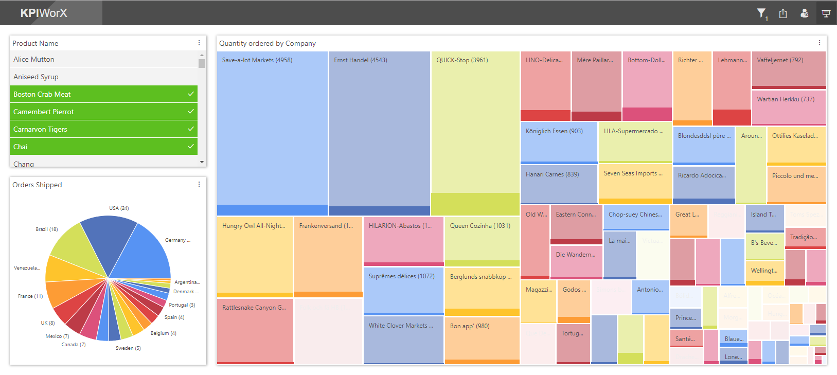
Filters can also be used to highlight relevant data in a bigger picture. We can create a widget that fades filtered data instead of hiding it completely.
Add a new cell to your canvas, then drag in a Treemap component.
Into the treemap component, drag Customers > CompanyName, then OrderDetails > Quantity > Sum. This will show us the quantity of each product ordered by each customer.
From Widget Settings, enable Labels.
From Widget Settings, select the pie icon  under Behavior.
Go into Presentation Mode and select a product. Rather than removing sections of the treemap widget, sections become faded to allow you to see what portion of each section is made up of that product. Your dashboard should now look something like the figure below.
Filtered Dashboard
The Filter  icon in the KPIWorX header will open the Filter Panel, where you can undo or redo your filter changes, remove individual filters, or clear all filters at once. If you have filters applied, the filter icon will show the number of active filters.
For more information on the widgets that support filtering and aggregation, see Working with Charts and Working with Other Components.